Designing an app from scratch can feel overwhelming, especially when you're facing steep learning curves, expensive development costs, and the complexity of building for multiple platforms simultaneously. Whether you're an entrepreneur with a game-changing idea or a business owner looking to better serve your customers, the traditional path to app development often means months of waiting, bloated budgets, and technical headaches that pull focus from what really matters—creating something valuable for your users.
That's where Adalo comes in. Adalo is a no-code app builder for database-driven web apps and native iOS and Android apps—one version across all three platforms. AI-assisted building and streamlined publishing enable launch to the Apple App Store and Google Play in days rather than months.

Why Adalo Is the Smart Choice for Designing Your App
Adalo is a no-code app builder for database-driven web apps and native iOS and Android apps—one version across all three platforms, published to the Apple App Store and Google Play. This means you can focus on what matters most—designing an app that truly serves your users—without wrestling with code or maintaining separate versions for different devices.
When you're ready to share your creation with the world, Adalo's direct publishing to both major app stores puts your app in front of millions of potential users. Combined with built-in features like push notifications to keep your audience engaged, you have everything you need to design, build, and launch a professional app from start to finish.
What if you could turn your app idea into a fully functional product—without hiring a developer or learning to code? That's exactly what modern app building platforms have made possible, transforming how entrepreneurs, small businesses, and even enterprises bring their digital products to life.
This guide walks you through the complete process of designing an app from scratch: defining your purpose and audience, planning your app's structure and database, creating intuitive screens, adding logic and integrations, and finally testing and launching across platforms. Whether you're building an internal tool to streamline operations or a customer-facing app to grow your business, you'll learn a repeatable framework that works.
Adalo is an AI-powered app builder for database-driven web apps and native iOS and Android apps—one version across all three platforms, published to the Apple App Store and Google Play. With drag-and-drop tools, visual workflows, and AI-assisted features like Magic Start and Magic Add, you can move from concept to launch faster than ever before. Here's how to get started.
Why Adalo Is Ideal for Designing Your First App
Adalo lets you focus entirely on designing an app that solves real problems for your users, without getting bogged down in complex coding or managing separate codebases for different platforms. The platform's single-codebase approach means changes you make automatically sync across web, iOS, and Android versions—no juggling multiple projects or resubmitting to different stores.
When your app is ready, publishing directly to the App Store and Google Play opens the door to millions of potential users. You'll also have access to native features like push notifications to keep users engaged and coming back. Whether you're designing a productivity tool, a marketplace, or a community app, Adalo gives you everything you need to go from initial concept to polished, published product.
The platform's AI-assisted building capabilities accelerate every stage of development. Magic Start generates complete app foundations from simple descriptions—tell it you need a booking app for a dog grooming business, and it creates your database structure, screens, and user flows automatically. Magic Add lets you add features by describing what you want in plain language. What used to take days of planning now happens in minutes.
Step 1: Define Your App's Purpose and Target Users
Before diving into app design, it's crucial to clarify its purpose and who it's for. Skipping this step can lead to wasted effort on unnecessary features. Bill Schonbrun, COO and Co-Founder of CarboNet, experienced this firsthand when his team developed a series of internal apps. By zeroing in on specific inefficiencies such as asset tracking and order management, they managed to slash their IT budget by 40% and gave employees an extra hour of daily productivity—all at a cost 30 times lower than traditional development methods.
Start by evaluating current workflows to uncover manual tasks, isolated data, or communication gaps. For customer-facing apps, focus on addressing unmet needs or frustrations users may have. The goal is to clearly define what the app should achieve before figuring out how to build it. Internal tools like CRMs or inventory systems should prioritize efficiency and data handling, while apps aimed at customers must focus on intuitive design and seamless user experience.
Identify Your Primary Audience
Your target audience influences every design choice, from color schemes to the app's tone. For example, an app for students might benefit from playful, vibrant visuals, whereas a healthcare app demands a clean and professional appearance. Define your audience by analyzing their demographics, behavior, and preferences. Are they business owners tracking inventory, students collaborating on projects, or patients scheduling appointments?
Begin by sketching wireframes that represent your users and their challenges before moving to visual builders. Test early prototypes with real users to gather feedback. Share unfinished screens and observe how users interact—look for moments of hesitation or unexpected actions. Use direct questions like, "Was this step clear?" or "What did you expect here?". This process ensures your app remains focused on user needs from the start.
Once you understand your audience, outline features that directly address their challenges.
List Core Features and Functions
Be ruthless in prioritizing features—every feature should align with user needs and business goals to avoid unnecessary complexity. Consider this: for every $1 spent on user experience (UX), businesses see a return of $100—a staggering 9,900% ROI. But this only holds true if you focus on the right features. Users form their first impressions within 10 to 20 seconds of opening your app, so it's essential to deliver immediate value.
Start with the core functionality and let user feedback guide additional features. To keep things on track, set a strict timeline (e.g., four weeks) to force prioritization. Ask yourself: Does this feature solve a specific problem? Can it be developed within the timeline? Does it improve the app's usability or performance? Avoid adding trendy features that don't address real issues—you can always revisit them later based on actual user data.
Adalo's Magic Add feature helps here by letting you describe new functionality in plain language. Instead of manually building every component, you can request "add a user profile screen with photo upload and bio" and let the AI generate the foundation, which you then customize to match your exact needs.
Step 2: Plan Your App's Structure and Data Flow
Now that you've nailed down your app's purpose and core features, it's time to lay a solid foundation. Jumping straight into screen design might seem tempting, but without a well-thought-out architecture, you risk costly mistakes and performance issues down the road.
"A well-structured database ensures that as the amount of data grows, the app performs smoothly without lag or errors."
Starting with the backend first ensures that your app can handle growth and function seamlessly. Skipping this step could lead to missing key backend features or creating inefficiencies that slow your app down as it scales. Thoughtful planning also helps prevent scope creep and ensures that your app maintains data integrity across all screens. Once your architecture is clear, map out how users will interact with your app to align its logic with its structure.
Map Out User Workflows
Understanding what your users want to achieve and designing clear workflows around their needs is critical. Break down the entire user journey step by step, detailing what each task accomplishes, its dependencies, and the expected outcomes. Flowcharts can be a lifesaver here—use simple shapes and arrows to visualize how users move through your app. Pinpoint decision points where workflows might branch based on specific conditions.
Triggers and actions are the backbone of these workflows. A trigger, such as clicking a button or submitting a form, kicks off the process, while an action, like sending an email or updating a database, is the result. Add conditional logic with "if/then/else" rules to make your app smarter. For instance, if a user's purchase exceeds $500, apply a 10% discount and notify the sales team automatically.
To avoid missteps, describe each step in plain language. For example: "The user submits a contact form, the data is added to the customer database, the profile is updated with a timestamp, and a confirmation email is sent." This kind of walkthrough helps you catch logical gaps before development begins. It's also wise to involve future users during this stage—73% of failed automation projects stem from automating broken or overly complex processes without fixing them first. Once workflows are mapped out, you can move on to designing the database that supports these interactions.
Design Your Database Structure
Your database is the brain of your app, storing everything from user profiles to transactions and messages. Organize the data into tables, where rows represent individual entries and columns define their attributes. Assign a unique primary key to each table (like a user ID) to ensure every record is accurately linked.
Naming conventions matter more than you think. Use descriptive labels like "CustomerEmail" or "OrderDate" instead of generic terms like "Email1" or "Data2". Keep your main tables streamlined by moving detailed data into secondary tables. For example, a "Users" table could store login credentials, while a separate "User_Profiles" table holds bios, locations, and preferences. To avoid performance bottlenecks, store file paths or URLs for media instead of the files themselves.
Plan indexing early by focusing on columns users will frequently search or filter, such as user IDs or timestamps. While indexes speed up data retrieval, remember that over-indexing can slow down write operations. Adalo's visual database builder makes this process straightforward—you can define relationships between tables without writing SQL queries, and paid plans include unlimited database records, so you won't hit storage ceilings as your app grows.
With the right data relationship setups, Adalo apps can scale beyond 1 million monthly active users. The platform's modular infrastructure, completely overhauled with Adalo 3.0 in late 2026, delivers 3-4x faster performance than previous versions and scales dynamically with your app's needs.
| Database Planning Step | Action Required |
|---|---|
| Define Purpose | Identify the specific business process and set measurable objectives |
| Identify Tables | List every data type your app will handle (users, orders, products, etc.) |
| Map Dependencies | Determine which data needs to exist before other data can be created |
| Set Triggers | Define events or conditions that initiate workflows |
| Plan Security | Implement access controls to restrict user permissions based on their roles |
Step 3: Create Screens and Navigation
With your database structured and workflows mapped, it's time to bring your app to life by designing the screens users will interact with. This step transforms backend logic into a clean, intuitive interface. The goal? Make every tap, swipe, and scroll feel effortless while balancing a visually appealing design with practical usability.
Build Screens with Drag-and-Drop Tools
Drag-and-drop tools make it easy to assemble screens quickly using pre-built components like buttons, forms, lists, and image blocks. Start by using the platform's built-in grids and guides to ensure consistent spacing and alignment across all screens. This helps maintain a polished and professional look.
Stick to standard UI components for better usability. Buttons, labels, and icons are already optimized by platform designers, so over-customizing them could cause confusion. Use visual hierarchy to direct user attention. For instance, make your primary Call-to-Action (CTA) buttons—like a "Checkout" button—larger, bolder, or a contrasting color compared to less critical options, such as a "Cancel" link.
Keep Miller's Law in mind: most people can only process about seven items in their immediate memory. Limit each screen to seven or fewer actions. If a screen feels cluttered, break it into smaller steps using progressive disclosure—show only what's essential, and reveal more options as needed. Also, design for the "thumb zone" by placing frequently used buttons in the lower third of the screen, making them easier to reach with one hand. Apple suggests a minimum touch target size of 44 x 44 pixels, while Microsoft recommends at least 34 pixels (with 26 pixels as an absolute minimum).
Consistency is key to reducing cognitive load. If your "Save" button is green and rounded on one screen, it should look the same everywhere else. Stick to a maximum of two fonts—one for headings and one for body text—and limit your color palette to five tones or fewer for a cohesive, professional design.
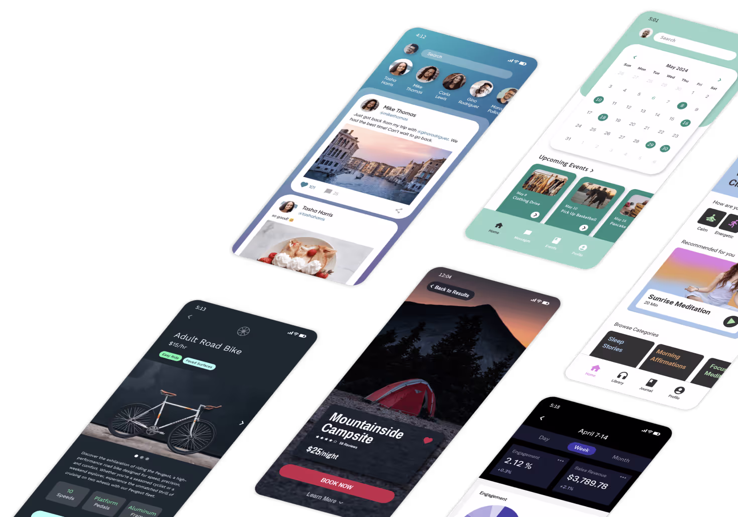
Adalo's visual builder has been described as "as easy as PowerPoint," letting you see up to 400 screens at once on a single canvas. This bird's-eye view makes it simple to maintain design consistency across your entire app and quickly spot navigation gaps or visual inconsistencies.
Plan Navigation Between Screens
Navigation ties your app together and ensures users can move through it effortlessly. For apps like shopping, banking, or travel, bottom tab bars are ideal. They provide quick access to three to five primary sections and are conveniently located in the thumb-friendly zone. For apps with many secondary features, hamburger menus (side drawers) keep the main screen clean while offering depth. If your app revolves around a single, critical action—like composing a message—a Floating Action Button (FAB) works best. It stays visible and accessible, floating above the content.
Place critical navigation elements and CTAs within easy reach. Use an 8-point grid system to maintain consistent spacing and alignment across screens. This not only ensures a polished design but also makes collaboration between designers and developers smoother.
Simplify complex workflows with progressive disclosure, revealing advanced features only when necessary. For example, a settings screen might show basic preferences upfront while hiding advanced options behind a secondary button. Always test navigation on real devices—not just desktop emulators. What looks perfect on a large monitor might feel cramped or awkward on a smaller phone screen.
"Good design is as little design as possible." - Dieter Rams
Make Your Design Responsive
Once your screens and navigation are set, make sure your app performs well across different devices. Whether users are on a smartphone, tablet, or foldable device, the interface should adapt seamlessly. Start with a mobile-first approach: design for the smallest screen first, then enhance the layout for larger devices. This avoids the common pitfall of designing for desktop and then awkwardly squeezing everything onto a smaller screen.
Use relative units like percentages or ems for scalable layouts, and define breakpoints—typically 320–480px for mobile, 768px for tablets, and 1024px or more for desktops. Ensure images scale down automatically on smaller screens without exceeding their original resolution.
With mobile devices driving 59% of global web traffic, speed is critical. About 53% of mobile users abandon a page if it takes more than three seconds to load. Compress images and videos to reduce file sizes, and use Scalar Vector Graphics (SVGs) for icons and logos—they maintain sharpness at any size. While browser developer tools are helpful for testing, always supplement with real device testing to catch issues that emulators might miss.
For typography, start with a body text size of at least 16 pixels to ensure readability across all devices. Space interactive elements adequately to avoid accidental taps. Poor usability is one of the main reasons nearly 25% of users abandon an app after just one use.
Adalo's X-Ray feature helps identify performance issues before they affect users. It highlights potential bottlenecks in your app's design and data queries, letting you optimize proactively rather than reactively troubleshooting after launch.
Step 4: Set Up App Logic and Interactions
Now that your screens are designed and workflows mapped out, it's time to make your app come alive with interactivity. App logic is what determines how your app responds when users interact with it—whether it's tapping a button, submitting a form, or swiping through a list. This step transforms static screens into a fully functional experience. Let's dive into how to configure user actions and connect external data sources to bring your design to life.
Configure User Actions
User actions are the heart of your app's interactivity. They allow users to perform tasks like creating, editing, or deleting data while triggering functions such as sending notifications or processing forms. A visual logic builder makes it easy to define these actions without needing to write code.
Start by identifying triggers—these could be button clicks, form submissions, or icon taps. For example, when a user taps a "Submit Order" button, the action could write order details to your database, send a confirmation email, and navigate the user to a success screen. Use AND/OR logic for more complex scenarios, like showing a discount only if the user is logged in and has spent over $100. You can also set up custom formulas to calculate values dynamically, such as cart totals or tax rates.
"Actions create the interactivity of a mobile or web app." - Adalo
Keep things straightforward at the start. Break complicated actions into smaller steps or split them across multiple screens. Use preview mode to test each action on different device sizes to ensure everything works seamlessly. Also, remember that database queries and third-party API calls can affect performance, so optimize your app's performance where needed. Once you've set up the core actions, you can expand your app's functionality by integrating external data sources.
Connect External Data and APIs
To enhance your app's capabilities, connect it to external data sources or APIs. This allows for real-time updates, such as syncing data or processing payments. Adalo supports integrations with services like Xano, Airtable, or any provider offering a REST API. A solid database setup from earlier steps makes this process smoother and more reliable.
With External Collections, you can sync data from existing databases in real time, ensuring your app always reflects the latest information without requiring manual updates. For broader automation, platforms like Zapier or Make can link your app to thousands of third-party services. For instance, when a user submits a form, the data could automatically create a new lead in your CRM, send a Slack notification, and add the contact to an email list—all without you lifting a finger.
If your app needs advanced backend processing or handles complex data relationships, consider using Xano, which is available on higher-tier plans. For secure payment processing, integrate tools like Stripe or IAPHUB directly into your workflows to handle global transactions and in-app purchases. Be sure to test all integrations thoroughly on physical devices to catch and resolve any issues before launch.
For users who want the simplest possible data management, Adalo's SheetBridge feature turns a Google Sheet into an actual database. This provides the easiest control without database-related learning curves—if you can manage a spreadsheet, you can manage your app's data.
Step 5: Customize Branding and Visual Design
Once the functional logic and interactions are in place, it's time to focus on your app's identity through its visual design. Your app often serves as the first mobile interaction with your brand, so maintaining a cohesive and recognizable visual identity is key. Every design choice should reflect your brand's personality and values.
Choose Colors, Fonts, and Layouts
Your app's visual identity starts with three essential elements: colors, typography, and layouts. These components work together to create a consistent and engaging user experience.
- Colors: Start by establishing a clear color hierarchy. Use a primary color for key actions and navigation elements, while secondary colors can support additional features. Neutral tones work best for text and backgrounds, while accent colors should be reserved for alerts or notifications. This approach keeps the interface clean and helps guide user attention. Always test your color combinations with contrast checkers to ensure they are accessible for everyone.
- Typography: Choose fonts that are easy to read on smaller screens. Sans-serif fonts like Arial, Helvetica, or Roboto are excellent choices for mobile apps. Align your app's typography with your website's style to create a seamless brand experience.
- Layouts: To ensure responsiveness across devices, use free app templates and flexible layout components. This will allow your design to adapt smoothly to mobile, tablet, and desktop screens. Even button shapes should align with your brand's tone—rounded edges can convey a playful vibe, while sharp edges lend a more professional feel.
These design elements form the backbone of your app's visual consistency and usability.
Add Logos and Custom Elements
Once your visual style is set, integrate branding elements like your logo to reinforce your identity throughout the app. Place your logo prominently in areas where users naturally focus, such as the top-left corner of the header. Extend this branding to splash screens, login pages, profile sections, and footers, ensuring your brand is present at every stage of the user journey.
For best results, use vector formats like SVG for logos and icons. These formats ensure crisp, high-quality visuals across all screen resolutions. If you're designing custom icons, follow these guidelines: maintain consistent line weights, stick to uniform corner styles (rounded or sharp), and use a cohesive color palette.
To elevate your app's professionalism, consider connecting a custom domain instead of relying on a generic platform URL—this often requires upgrading from free plans. Additionally, design a splash screen featuring your logo and brand colors to make a strong impression during app loading.
"Your users should feel your brand, not fight against it" - thisisglance.com
Every visual detail should feel intentional and work harmoniously to create a seamless and memorable brand experience.
Step 6: Test and Improve Your App
Testing your app during development is crucial to catching issues that could turn users away. Did you know that 88% of users abandon an app after a single bad experience? Your ultimate goal here is to ensure users can achieve their goals without frustration while your app runs smoothly across a variety of devices and screen sizes.
Run User Tests
Start by creating a test plan that highlights the essential tasks users need to complete—like signing up, booking an appointment, or making a purchase. You don't need a massive group for this; testing with just five users can uncover up to 85% of usability issues. Focus on recruiting participants who align with your target audience for the most relevant insights.
Before diving into full-scale testing, conduct a pilot test to ensure your instructions and technical setup are clear. If your budget is tight, consider remote unmoderated testing. This method lets users explore your app in their own environment, giving you a glimpse of how they naturally interact with it. While you won't be able to ask follow-up questions, you'll get honest, pressure-free feedback. For quick insights, try five-second tests using usability tools: show users a screen for five seconds, then ask what they remember. This helps confirm that your design communicates effectively at first glance.
Don't forget to test your app's responsiveness across various device types. Loading speed is another critical factor—slow apps frustrate users and hurt your SEO. Use tools like Google PageSpeed Insights to measure performance, and optimize images to stay under 100 KB with tools like TinyPNG.
Adalo's X-Ray feature provides an additional layer of testing by automatically identifying performance issues in your app's design. It highlights slow queries, inefficient data relationships, and other bottlenecks that might not be obvious during manual testing but could affect users at scale.
Once your initial testing phase confirms that the app is functional and user-friendly, shift your focus to ongoing analytics for continuous improvement.
Use Analytics to Refine Your App
After launch, analytics become your secret weapon for fine-tuning your app. Tools like Google Analytics 4 or Hotjar can track user behavior, such as where they click, how long they take to complete tasks, and where they drop off.
In the first three months post-launch, prioritize fixing bottlenecks over adding new features. Heatmaps are especially useful—they highlight which buttons and features get the most attention and which are overlooked. This data helps you reposition key actions to areas with higher user engagement. Keep an eye on drop-off rates and tweak screens or calls-to-action (CTAs) as needed. If your conversion rate is below 1%, focus on improving the user experience rather than spending money on acquiring new users.
Real-world example? Wells Fargo boosted its Customer Satisfaction scores by over 20 points by using session analysis to identify and address pain points, reducing churn risk. This proves that data-driven adjustments can lead to measurable success.
Step 7: Publish Your App
After countless hours of testing and tweaking, your app is finally ready for its grand entrance. All that planning and refining has set the stage for a smooth launch. While publishing might feel like a daunting task, with the right preparation, you can roll out your app to iOS, Android, and the web—no development team required. In fact, Apple notes that 90% of app store submissions are reviewed in under 24 hours, so once you're ready, things can move quickly.
Prepare for Publishing
Before you hit publish, take a moment to double-check everything. Look for broken links, missing elements, or glitches in how data flows between screens. Make sure all data permissions, triggers, and automation settings are in place to safeguard sensitive user information.
You'll also need to prep platform-specific assets. For Apple, this includes creating a privacy policy, generating screenshots in various sizes, and enrolling in the Apple Developer Program, which costs $99 per year. For Google Play, there's a one-time $25 fee, and you'll need to ensure your app supports the latest Android API levels. Keep in mind that Google Play reviews can take up to 7 days. Once you've checked all the boxes, you'll be ready to deploy your app across platforms.
Deploy to iOS, Android, and Web
Adalo's built-in publishing tools make it simple to launch your app on all three platforms from a single responsive build. You can publish to a custom web domain, submit your app to the Apple App Store, or roll it out on Google Play—all without writing a single line of code. Plus, thanks to Adalo's single-codebase setup, any updates you make will automatically sync across iOS, Android, and web versions, so you don't have to juggle multiple versions or resubmit to different stores.
Start by focusing on getting your core features live. Businesses using visual app builders often report saving about 40% on development costs, and apps built this way tend to launch 90% faster than those created through traditional methods. Remember, publishing isn't the end of the journey—it's the beginning. Once your app is live, you'll start collecting constructive user feedback, which will guide future updates and improvements based on how people actually interact with your app.
Adalo's paid plans start at $36/month with unlimited usage and app store publishing—including unlimited updates to apps once published. This contrasts with platforms like Bubble, where web and mobile wrapper offerings start at $59/month with usage-based charges and limits on app re-publishing. Other alternatives like Appypie require $99/month for comparable iOS app publishing capabilities.
How Adalo Compares to Other App Builders
When choosing an app builder, understanding the trade-offs between platforms helps you make the right decision for your specific needs. Here's how Adalo stacks up against common alternatives:
Adalo vs. Bubble
Bubble offers extensive customization options and is popular for complex web applications. However, this flexibility often results in slower applications that can struggle under increased load. Bubble's mobile app solution is a wrapper for the web app, which introduces potential challenges at scale and means one app version doesn't automatically update web, Android, and iOS apps deployed to their respective stores.
Bubble's pricing starts at $59/month with usage-based charges (Workload Units) that can be difficult to predict, plus limits on records and app re-publishing. Claims of millions of MAU on Bubble are typically only achievable with hired expert help. Adalo's approach—true native compilation with no data caps on paid plans and no usage-based charges—provides more predictable costs and simpler scaling.
Adalo vs. FlutterFlow
FlutterFlow is a "low-code" platform designed for technical users, not a true no-code solution. Users need to set up and manage their own external database, which requires significant learning complexity—especially when optimizing for scale, as suboptimal setups can create serious performance problems. This has spawned an ecosystem of experts because so many users need help, often spending significant sums chasing scalability.
FlutterFlow's builder is also limited in view, making it slow to see more than two screens at once, whereas Adalo can display up to 400 screens simultaneously on one canvas. FlutterFlow pricing starts at $70/month per user for easy app store publishing, but this still doesn't include a database—users must source, set up, and pay for that separately.
Adalo vs. Glide
Glide excels at spreadsheet-based apps with its template-focused approach, making it fast to build and publish. However, this creates generic, simplistic apps with limited creative freedom. While Glide is a go-to for spreadsheet apps, Adalo's SheetBridge feature offers similar convenience—turning a Google Sheet into an actual database—while providing far more design flexibility.
Glide pricing starts at $60/month for custom domain capability, but remains limited by app updates and data record rows that attract additional charges. Critically, Glide does not support Apple App Store or Google Play Store publishing—a significant limitation if you want to reach mobile users through the major app marketplaces.
Adalo vs. Softr
Softr focuses on spreadsheet app building and starts at $167/month to publish a Progressive Web App, which is still restricted by records per app and per datasource. Like Glide, Softr does not support Apple App Store or Google Play Store publishing, or native iOS and Android app creation. For teams that need true mobile apps distributed through app stores, Softr isn't a viable option.
| Platform | Starting Price | Native Mobile Apps | App Store Publishing | Database Included |
|---|---|---|---|---|
| Adalo | $36/month | Yes (true native) | Yes (iOS & Android) | Yes (unlimited records) |
| Bubble | $59/month | No (web wrapper) | Limited | Yes (with limits) |
| FlutterFlow | $70/month/user | Yes | Yes | No (external required) |
| Glide | $60/month | No | No | Spreadsheet-based |
| Softr | $167/month | No | No | Spreadsheet-based |
Note: Most third-party platform ratings and comparisons predate Adalo 3.0's infrastructure overhaul in late 2026, which delivered 3-4x faster performance and removed all database record limits on paid plans.
Conclusion
Modern app building has reshaped how digital products are created. You no longer need deep coding knowledge or a hefty budget to bring your ideas to life. By following the steps outlined in this guide—defining your purpose, planning your structure, designing intuitive screens, adding logic, customizing branding, testing thoroughly, and publishing—you can turn your concept into a fully functional app for iOS, Android, or the web.
Adalo's visual interface takes care of the technical complexities, freeing you to focus on crafting an app your users will enjoy. Organizations have reported saving between 48% and 60% on development costs, and Gartner predicts that by 2026, 70% of new applications will be built using visual development platforms.
This approach also allows for flexibility—start small and scale as your needs grow. With Adalo's free plan, you can test your idea using unlimited screens. When you're ready to go live, upgrade to publish your app. Pre-built feature templates speed up the process, while the Component Marketplace offers advanced options. Once your app is live, you can refine it based on feedback from real users.
Whether you're a small business owner, freelancer, or startup founder, the tools exist to bring your app idea to life without hiring a developer or learning to code. With over 3 million apps already created on Adalo, now's the time to start building and make your vision a reality.
Related Blog Posts
- How to Launch Your First Mobile App Without Coding
- Build a No-Code Ticketing System in 3 Days
- How to Create a Dating App for Free
- Ultimate Guide to No-Code MVP Prototyping
FAQ
| Question | Answer |
|---|---|
| Why choose Adalo over other app building solutions? | Adalo is an AI-powered app builder that creates true native iOS and Android apps from a single codebase. Unlike web wrappers, it compiles to native code and publishes directly to both the Apple App Store and Google Play Store. With unlimited database records on paid plans, no usage-based charges, and AI features like Magic Start and Magic Add, you get predictable costs and faster development. |
| What's the fastest way to build and publish an app to the App Store? | Adalo's drag-and-drop interface combined with AI-assisted building lets you go from idea to published app in days rather than months. Magic Start generates complete app foundations from descriptions, and Adalo handles the complex App Store submission process—certificates, provisioning profiles, and store guidelines—so you can focus on your app's features. |
| Can I easily design and build my first app without coding experience? | Yes. Adalo's visual builder has been described as "as easy as PowerPoint." You assemble screens using drag-and-drop components, configure logic visually, and use AI features to generate functionality from plain language descriptions. No coding knowledge required. |
| How do I plan my app's database structure without technical knowledge? | Adalo lets you visually define database tables and relationships without writing SQL queries. Simply create collections for your data types like users, orders, or products, and use descriptive naming conventions. The platform guides you through connecting related data, and paid plans include unlimited records so you won't hit storage ceilings. |
| How much does it cost to build and publish an app with Adalo? | Adalo's paid plans start at $36/month with unlimited usage and app store publishing, including unlimited updates to published apps. There are no usage-based charges or surprise bills. Compare this to Bubble at $59/month with usage limits, FlutterFlow at $70/month per user without a database, or Appypie at $99/month for iOS publishing. |
| Can I test my app on real devices before publishing? | Yes. Adalo provides preview modes that let you test functionality on different device sizes during development. You can share prototypes with real users to gather feedback, and the X-Ray feature automatically identifies performance issues before they affect users at scale. |
| How do I connect my app to external services like payment processors or CRMs? | Adalo supports integrations with external data sources and APIs, including Stripe for payments, Airtable for databases, and automation platforms like Zapier and Make. You configure these connections visually to sync data in real-time, process payments, and automate workflows without writing code. |
| What happens after I publish my app—can I make updates easily? | Yes. Adalo's single-codebase setup means any updates you make automatically sync across iOS, Android, and web versions. You can continuously refine your app based on user feedback and analytics without managing separate codebases or going through complex resubmission processes. Paid plans include unlimited app updates. |
| Which is more affordable, Adalo or Bubble? | Adalo starts at $36/month with unlimited usage and no record limits. Bubble starts at $59/month with usage-based Workload Unit charges that can be unpredictable, plus limits on records and app re-publishing. For predictable costs and simpler scaling, Adalo is the more affordable choice. |
| Is Adalo better than Glide for mobile apps? | If you need apps published to the Apple App Store or Google Play Store, Adalo is the clear choice—Glide doesn't support app store publishing at all. Adalo also offers more design flexibility compared to Glide's template-focused approach, while still providing easy spreadsheet integration through SheetBridge. |