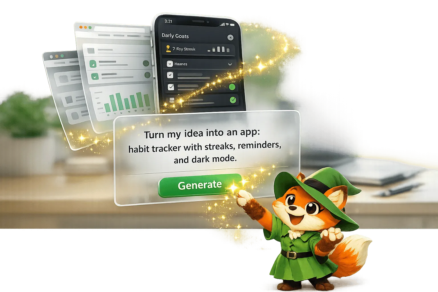
Ada, Adalo's AI builder, lets you describe what you want and generates your app. Magic Start creates complete app foundations from a description, while Magic Add adds features through natural language.
Creating apps no longer requires coding knowledge or big budgets. Adalo, a no-code app builder for database-driven web apps and native iOS and Android apps—one version across all three platforms, published to the Apple App Store and Google Play—lets you design and launch apps from one platform. Its drag-and-drop editor gives you full control over layouts, colors, and typography, while Magic Start AI builds your app's foundation in minutes based on your idea. Adalo compiles native code, ensuring apps feel smooth on every platform, and handles publishing for you.
Here’s what you can do with Adalo:
- Define your app’s look with custom colors, fonts, and responsive web app layouts.
- Use tools like contrast logic to ensure accessibility.
- Add animations, shadows, and custom icons for a polished feel.
- Easily switch between light and dark modes with global color settings.
Whether you’re building a prototype or a full-scale product, Adalo simplifies the process without sacrificing quality.
Beginner's Guide to Responsive Design in Adalo
Color Theory for Mobile Apps
Color Psychology Guide for Mobile App Design
Color has a profound effect on how users feel and interact with an app. Studies reveal that 95% of purchasing decisions happen subconsciously, with color playing a key role in these emotional triggers. Even more compelling, a signature color can boost brand recognition by up to 80%.
Adalo's Branding Tab simplifies this process by letting you define four essential colors: Primary, Secondary, Screen Background, and Text. Once set in the left toolbar, these colors become the default for all new components. The built-in color picker generates lighter and darker variations of your Primary and Secondary colors, ensuring a visually cohesive palette. When you tweak a color later, the changes automatically update across your entire app—no manual adjustments required.
Choosing a Color Palette
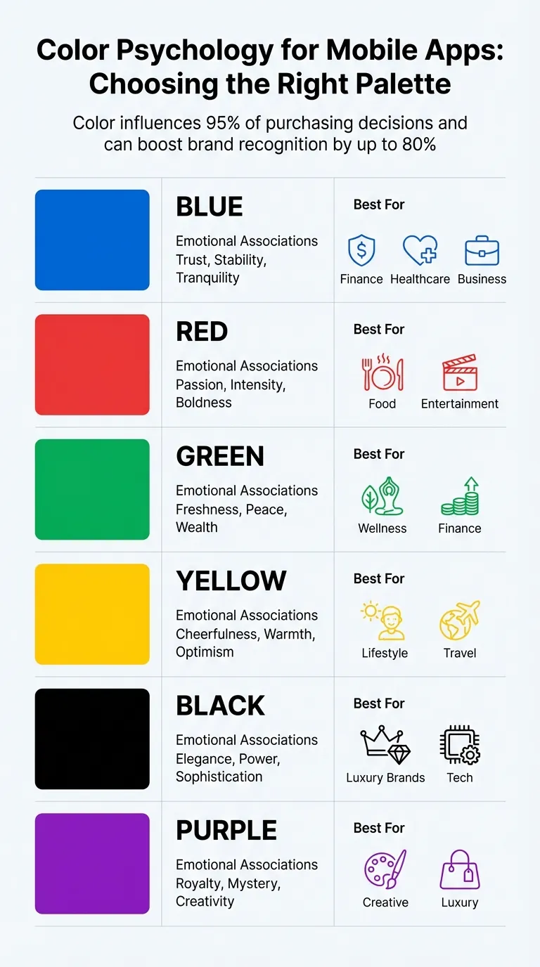
Your app's color scheme should reflect its personality. Blue conveys trust and calmness—ideal for apps in finance or healthcare mobile app design. Red and orange evoke energy and excitement, while green suggests freshness and prosperity.
Adalo's Magic Start AI gives you a head start by generating a color scheme based on your app's concept. Describe your idea as "a booking app for a dog grooming business," and it creates screens with fitting colors automatically. What used to take hours of design decisions happens in minutes. Alternatively, you can start with one of Adalo's pre-designed templates, which come with professionally curated color schemes that you can refine in the Editing Dashboard.
If you prefer a hands-on approach, tools like Coolors, Adobe Color, or Colormind can help you explore palettes and export hex codes directly into Adalo's Branding Tab. These tools provide palettes optimized for mobile apps, making it easier to transform a simple design into something polished and visually appealing.
| Color | Emotional Associations | Best For |
|---|---|---|
| Blue | Trust, stability, tranquility | Finance, Healthcare, Business |
| Red | Passion, intensity, boldness | Food, Entertainment |
| Green | Freshness, peace, wealth | Wellness, Finance |
| Yellow | Cheerfulness, warmth, optimism | Lifestyle, Travel |
| Black | Elegance, power, sophistication | Luxury brands, Tech |
| Purple | Royalty, mystery, creativity | Creative, Luxury |
Once your palette is ready, double-check that it meets readability and accessibility standards.
Ensuring Accessibility
A beautiful color palette is useless if your text becomes unreadable. For custom components, Adalo includes @contrast logic, which ensures that text color automatically adjusts for optimal contrast against the background.
"In this case, textColor will, by default, be the best contrast with backgroundColor. This means that if the background color is light, the text color will be black, and if the background color is dark, the text color will be white." – Adalo Developer Documentation
To make your app accessible to everyone, tools like "Check My Colors" can help verify that your background and text combinations meet accessibility guidelines. This step is especially important for users with color vision challenges.
Adalo's single-canvas system guarantees that your hex codes render consistently across iOS, Android, and web platforms. You design once, and your app's colors stay consistent no matter where users experience it—whether on an iPhone, Android tablet, or desktop browser.
Typography in Adalo
Typography plays a key role in guiding users as they navigate and read through your app. The right font choices help create a clear visual hierarchy, improve readability, and give your app a polished, professional look. In Adalo, you can set global fonts in the Branding Tab by defining a "Heading Font" and a "Body Font." These settings apply to all new components, and any changes you make will update across the app instantly.
These initial font settings lay the groundwork for creating a visually consistent and easy-to-navigate interface.
Selecting the Right Fonts
Once you've set global fonts, you can refine your app's style by choosing specific fonts that match its tone. On a paid Adalo plan, you'll have access to over 1,000 fonts from the Google Fonts library. Free plan users can work with Oswald, Merriweather, Source Sans Pro, and the Standard System Font. The Standard System Font adapts to the platform: Roboto for Android, San Francisco for iOS, and Segoe UI for Windows, ensuring a native look and feel.
If you're unsure about font combinations, the Popular Pairings feature can help. For instance, if you select Oswald for headings, Adalo might suggest pairing it with Open Sans, Roboto, or Lato for body text. Stick to just two fonts—one for headings and one for body text—to maintain a clean and cohesive design.
Establishing Text Hierarchy
Adalo's design system emphasizes the importance of a clear text hierarchy to enhance readability. Use bold, large headings, but keep them concise—1 to 2 words per line and no more than 3 to 4 lines total. For body text, aim for a font size between 14 and 18pt, with 5 to 9 words per line for the best reading experience.
"Maintain a 90/10 ratio - body text should dominate, with headings used sparingly for emphasis." – Megan Stansbury, Adalo Expert
For body text, opt for medium, regular, or light font weights, and avoid bold styles for extended reading sections. Use vibrant colors only for interactive elements like links or buttons. Stick to black or dark gray for titles and lighter gray shades for subtitles to create clear visual separation. If needed, you can override the global font settings using Adalo's Formatting Menu to tweak font weights, sizes, alignments, and colors for individual components.
Styling Components
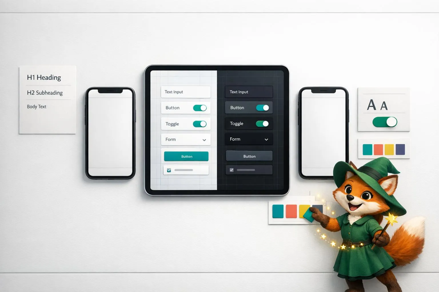
Once you've nailed down your color palette and typography, it's time to fine-tune the style of each component to boost your app's overall look. Adalo's visual editor makes this easy—just drag components from the Editing Dashboard onto your canvas, where you can resize, reposition, and customize them to fit your design vision.
For faster component creation, Magic Add lets you describe what you want and generates the component automatically. Tell it you need "a card showing user profile with avatar, name, and bio," and it creates the styled component for you—ready to customize further if needed.
Using Borders and Shadows
Borders and shadows are powerful tools for adding depth and separation to your components. Through the properties panel, you can tweak border color, width, and style, as well as adjust shadow settings like offset, blur, color, and opacity. A form with a soft shadow can appear slightly raised, naturally drawing attention and signaling interactivity.
Consistency is key when applying these effects. When creating different states for a button (like a disabled gray version versus an active colored one), you can stack elements with conditional visibility. Use the zoom feature to fine-tune alignment and adjust layering by dragging components within the Screens tab. These small details contribute to a polished and visually balanced layout.
Incorporating Animations
Animations can make your app feel more dynamic and responsive. Select any component, open the animations tab, and pick from presets like fade, slide, or bounce. You can also fine-tune the duration and easing to match your app's tone. Adalo provides a range of animation options:
- Tap effects: Scaling or glowing buttons that respond to user interaction
- Page transitions: Slide-ins for smooth navigation between screens
- List item animations: Fading effects as users scroll through content
Keep animations subtle and purposeful. A small shake on a form after submission can signal success or an error, while a hover lift effect on list items delivers feedback without overwhelming the user. For more advanced visuals, you can integrate high-quality animations using the Lottie component from the Adalo Marketplace. These animations enhance the overall experience while maintaining smooth performance.
Custom Icons and Brand Identity
Strong iconography and consistent branding are key to making your app visually appealing and professional. Just like carefully chosen colors and typography set the tone, custom icons and unified design elements bring cohesion to your app. Icons aren't just decorative—they act as visual cues, guiding users and reinforcing your brand identity at every interaction.
Uploading Custom Icons
Your app icon is your first chance to make an impression, whether users see it on the Apple App Store, Google Play, or their home screen. To ensure it looks sharp across all platforms, upload a 1024x1024 PNG file. You can upload this primary app icon in the Settings section—this is what users will tap to launch your app.
For in-app icons, Adalo supports react-native-vector-icons, including Material Icons. When specifying default icon properties in custom components, remember to use hyphens instead of underscores (e.g., "arrow-back" instead of "arrow_back"). The Adalo community also offers cloneable UI kits, such as "Supercharge your Adalo Apps! Beautiful native icons," which provide a variety of visual assets perfect for navigation menus or onboarding screens.
Maintaining Brand Consistency
Consistency in design turns individual screens into a cohesive user experience. With Adalo's preset style variables—like @primary, @secondary, @text, @background, and @contrast—you can synchronize colors across your app effortlessly. These variables not only ensure a unified look but also enhance text readability. The built-in color picker generates lighter and darker shades of your primary and secondary colors, giving you a flexible yet harmonious palette.
Want to try something new, like a dark mode or holiday-themed design? Adalo's Design Versions tool lets you experiment with alternative styles without affecting your current design. Save your current version, make sweeping changes, and revert instantly if the new direction doesn't work. These features provide a strong framework for creating a polished and unified app identity.
Spacing and Layout Principles
When it comes to design, effective spacing and layout can transform a cluttered interface into something clean and easy to navigate. Proper margins and padding ensure that users can focus on what's important without unnecessary distractions. Tools like Adalo's alignment and spacing controls make it simple to create polished, organized layouts, even if you're new to design.
Building Responsive Layouts
Starting with a mobile-first approach is a smart way to design. It's much easier to expand a compact layout for larger screens than to shrink a complex one for mobile. Adalo's responsive engine allows a single screen to adapt effortlessly across mobile, tablet, and desktop views—no need to rebuild for each device.
Using the Rectangle component as a container helps group related elements like text, buttons, and images into cohesive sections. When adjustments for different screen sizes are needed, disabling "Shared Layout Settings" lets you customize spacing and positioning independently. A horizontal row of cards on a desktop can stack vertically on a phone without affecting the desktop design. You can preview these adjustments by clicking the device icons at the top left or dragging the yellow screen borders to see how components respond across breakpoints.
The Editing Dashboard on the left provides direct access to spacing tools. Selecting a component's inner container reveals handles for visually adjusting padding and margins. For precise control, the Advanced menu in the Layout tab allows you to input exact pixel values. Adalo's snap guides also make alignment easier by showing centerlines and margins as you drag components, ensuring everything lines up perfectly.
Once your responsive layout is in place, the next step is to refine the visual balance of your design.
Creating Visual Balance
To maintain clarity and avoid overloading users, structure your screens with three to four vertically stacked sections. This approach helps establish a clear visual hierarchy. Make sure these sections don't overlap, as they need to adjust fluidly for different screen sizes. Use the Distribute tool to create equal spacing between three or more components for a neat, consistent look.
Keyboard shortcuts can speed up your alignment process significantly:
| Action | Mac Shortcut | PC Shortcut |
|---|---|---|
| Align Top | Option + W | Alt + W |
| Align Left | Option + A | Alt + A |
| Align Vertical Center | Option + V | Alt + V |
| Align Horizontal Center | Option + H | Alt + H |
| Nudge Component | Arrow Keys | Arrow Keys |
| Large Nudge | Shift + Arrow Keys | Shift + Arrow Keys |
Keep in mind that alignment and distribution only work within the same container. If you're designing a card layout but want to avoid visible borders, you can set the Rectangle container's background to transparent or match it to your screen color. This way, you maintain structure without adding unnecessary visual elements.
Designing for Dark Mode
Adding dark mode to your app isn't just about aesthetics—it's about meeting user expectations and enhancing usability in low-light environments. Adalo makes this process simple, allowing you to create a sleek dark theme without juggling multiple builds or complicated settings.
Enabling Dark Mode
To enable dark mode, head to the Branding section in the left toolbar. Here, you can tweak your app's global color scheme. Start by setting the Screen Background Color to a deep gray or black and the Text Color to white or off-white for optimal readability.
"When you change the colors in your branding tab, all of the components that are still using those branding colors will be automatically updated all at once." - Adalo Help Documentation
Before diving in, save your current design using the Design Versions tool. This safety net lets you revert to your original setup if needed. Ensure all components rely on the "Branding" color presets rather than fixed hex values. This way, switching to dark mode is as simple as updating your global palette.
Adalo's color picker makes this even easier by automatically generating lighter and darker variations of your Primary and Secondary colors. These variations help maintain depth and clear visual hierarchy in your dark mode design. For quick adjustments, the bottom row of the color picker saves your chosen text and background colors.
Once your branding colors are updated, double-check that all components align seamlessly with your dark theme.
Testing Dark Mode Consistency
After setting up dark mode, go through each screen to confirm that elements display correctly. Pay special attention to the App Bar, which defaults to the Primary Color, ensuring it contrasts well with your dark background.
Examine all interactive components—like buttons, input fields, and cards—to make sure they remain legible and visually balanced. For added assurance, use tools like "Check My Colors" to test the contrast between your background and foreground colors. This step is vital for accessibility, ensuring your app is functional for users with color vision challenges.
Test your dark mode design across all three platforms—iOS, Android, and web—to verify consistency. Adalo's single codebase approach means your dark theme renders identically everywhere, but it's worth confirming that shadows, borders, and subtle color variations appear as intended on each device type.
Publishing Your Designed App
Once your visual design is polished and tested, Adalo handles the complex process of getting your app into users' hands. From a single codebase, you can publish to the Apple App Store, Google Play Store, and the web—all from one platform.
At $36/month, Adalo offers native iOS and Android app publishing with unlimited usage: no caps on actions, users, records, or storage. This predictable pricing model stands in contrast to platforms that charge based on workload units or user tiers, where costs can spike unexpectedly as your app grows.
The platform compiles your design into true native code, not a web wrapper. This means your carefully crafted animations, shadows, and transitions perform smoothly on every device. Users experience the responsiveness they expect from native apps, and your design choices translate faithfully to the final product.
Conclusion
Building a polished, app-store-ready product no longer demands years of coding or design expertise. By focusing on key principles like color theory, typography hierarchy, component styling, custom branding, thoughtful spacing, and dark mode design, you can create apps that feel as professional as they look.
With Adalo's WYSIWYG canvas, you design and build simultaneously. This all-in-one platform lets you handle everything—design, database, and deployment—in a single, streamlined workspace. Whether you're tweaking colors in the Branding tab or uploading custom icons, the process is intuitive and efficient.
Throughout this guide, you've seen how each design element works together to elevate the overall experience. The platform's real power lies in its ability to combine flexibility with simplicity. You can precisely control every detail of your app's design without writing a single line of code or being boxed in by rigid templates.
These principles aren't just about aesthetics—they directly enhance usability. Whether you're launching an MVP, an internal tool, or a customer-facing app, this approach ensures your app is ready for publishing to app stores and the web, all from a single $36/month plan with no hidden usage charges.
Related Blog Posts
- How to Create an Invoice App
- How to Ensure UI/UX Consistency Across Platforms
- Adjusting App Layouts for Mobile and Web
- How to Build a Responsive Mobile App Without Code
FAQ
Why choose Adalo over other app building solutions?
Adalo is an AI-powered app builder that creates true native iOS and Android apps from a single codebase. Unlike web wrappers, it compiles to native code and publishes directly to both the Apple App Store and Google Play Store. At $36/month with unlimited usage and no hidden charges, it offers the most predictable pricing for native app publishing.
What's the fastest way to build and publish an app to the App Store?
Adalo's drag-and-drop interface combined with AI-assisted building through Magic Start and Magic Add lets you go from idea to published app in days rather than months. Describe your app concept, and Magic Start generates your database, screens, and logic automatically. Adalo handles the complex App Store submission process, so you can focus on design and features.
Can I customize my app's visual design without coding?
Yes, Adalo's drag-and-drop editor gives you full control over layouts, colors, typography, borders, shadows, and animations. The Branding Tab lets you set global colors and fonts that automatically update across your entire app, while the properties panel allows fine-tuning of individual components.
How do I ensure my app's colors are accessible to all users?
Adalo includes built-in @contrast logic that automatically adjusts text color for optimal contrast against backgrounds. You can also use external tools like "Check My Colors" to verify your color combinations meet accessibility guidelines, ensuring your app is usable for people with color vision challenges.
Can I add dark mode to my Adalo app?
Yes, Adalo makes adding dark mode straightforward through the Branding section. Set your components to use branding color presets rather than fixed hex values, and you can switch between light and dark themes by updating your global palette. The Design Versions tool lets you save and experiment with alternative color schemes safely.
What fonts are available in Adalo for app design?
Paid Adalo plans provide access to over 1,000 fonts from the Google Fonts library, while free plan users can use Oswald, Merriweather, Source Sans Pro, and the Standard System Font. The Popular Pairings feature suggests complementary font combinations to help you create professional typography.
How does Adalo handle responsive design across different devices?
Adalo's responsive engine allows a single screen to adapt seamlessly across mobile, tablet, and desktop views without rebuilding for each device. Preview layouts by clicking device icons or dragging screen borders, and use "Shared Layout Settings" to customize spacing independently for different screen sizes when needed.
How much does it cost to publish an app with Adalo?
Adalo's $36/month plan includes native iOS and Android app publishing with unlimited usage—no caps on actions, users, records, or storage. Unlike competitors that charge based on workload units or user tiers, Adalo offers predictable monthly pricing with no surprise charges as your app grows.
Do I need coding experience to design apps in Adalo?
No coding experience is required. Adalo's visual editor lets you design by dragging and dropping components, while AI features like Magic Start generate complete app foundations from simple text descriptions. You can create professional, app-store-ready designs entirely through the visual interface.
Can I use custom icons in my Adalo app?
Yes, you can upload custom app icons as 1024x1024 PNG files for App Store and Play Store listings. For in-app icons, Adalo supports react-native-vector-icons including Material Icons, and the community offers cloneable UI kits with additional visual assets for navigation menus and onboarding screens.
Build your app fast with one of our pre-made app templates
Begin Building with no codeRelated Content
The No-Code AI Revolution: Why Adalo Is Adding Prompt Building
Turn plain-English app ideas into native iOS, Android and web apps with AI prompt building—fast, low-cost app creation with visual editing a
Adalo's 2026 Guide to AI-Powered No-Code Mobile App Builders
Adalo's 2026 Guide to AI-Powered No-Code Mobile App Builders
Adalo offers AI-powered no-code tools to help founders and startups build and publish responsive apps using APIs and custom integrations.

Building an App on Adalo: Insights From a No-Code Expert
Learn from Adalo expert, Zaylan Jacobsen, about the benefits of building mobile apps on Adalo, the way to approach system design, and more!

Building Invoice and Receipt Apps Without Code Using Adalo
Build invoice and receipt apps in days without coding — design templates, export PDFs, accept payments, send push reminders, and publish to