


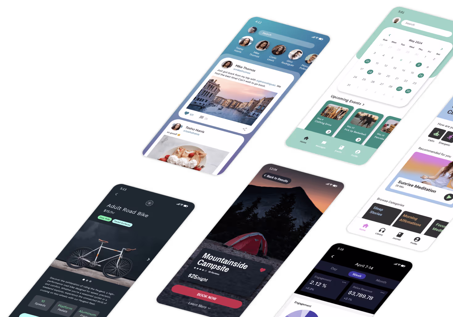
Responsive design isn't optional - it's a must. Fixed-width layouts that look fine on desktops often break on mobile, leading to poor navigation, unreadable text, and untappable buttons. With 85% of smartphone users navigating with one hand, layouts need to prioritize usability and flexibility. Mobile users expect vertical scrolling, large touch targets (44x44 pixels minimum), and accessible navigation, while web users benefit from denser layouts and keyboard shortcuts.
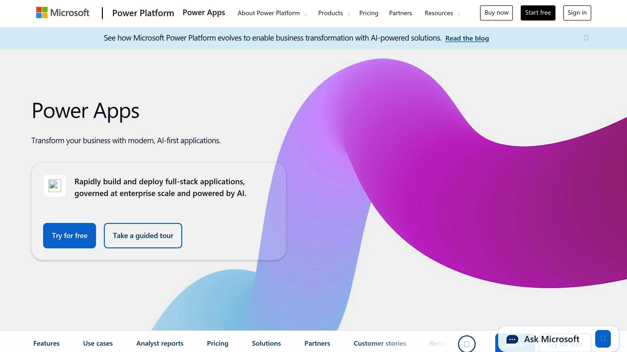
Platforms like Adalo, a no-code app builder for database-driven web apps and native iOS and Android apps—one version across all three platforms, published to the Apple App Store and Google Play, are helping teams tackle these challenges head-on. By providing responsive components and device-specific controls, Adalo enables creators to build apps that adapt seamlessly across screen sizes without writing code.
Key challenges include:
- Fixed widths: Elements break on smaller screens, forcing horizontal scrolling.
- Navigation issues: Poorly sized menus and hidden options frustrate users.
- Media overflow: Images and videos spill out of bounds or crop critical content.
Adalo simplifies the process with tools like responsive components, device-specific controls, and a single-codebase system. Use its Preview Simulator and X-Ray tool to test and refine layouts, ensuring your app works seamlessly across mobile, tablet, and desktop. The result? A polished app without the need for separate codebases or endless fixes.

Mobile vs Web Layout Requirements: Responsive Design Best Practices
How to Build Responsive Apps Designs in Power Apps with Containers
Common Layout Issues When Moving from Vibe-Coding to Production
Vibe-coding tools are fantastic for quick prototyping, but they often favor speed over adaptability. When these prototypes transition to production, design flaws that weren’t obvious during testing can create real headaches - especially for mobile users. A design that seemed flawless on a desktop in the builder can fall apart on phones and tablets, leading to user frustration. Common trouble spots include fixed dimensions, inconsistent navigation, and media overflow.
Fixed Widths Breaking on Different Screens
Using fixed pixel values can wreak havoc on mobile responsiveness. For example, a dashboard with 800-pixel-wide cards might look great on a laptop but end up cutting off half its content on a smartphone. Buttons may shift out of place, forcing users into horizontal scrolling - a design misstep that can nearly double bounce rates. This issue becomes glaring on devices like the iPhone SE, which has a screen width of just 375 pixels, while desktop monitors often exceed 1,920 pixels. When viewport metadata is missing, mobile devices render pages at desktop scale, creating usability nightmares. Data tables, in particular, can become impossible to navigate, requiring constant zooming and panning.
Inconsistent Navigation Across Devices
Navigation that works on a desktop doesn’t always translate well to touchscreens. Menus designed for mouse precision often fail when touch targets are smaller than the recommended 44×44 pixels. This leads to frequent mis-taps and user frustration. Orientation changes can also cause problems - a navigation bar might overlap content on an iPhone 12 in portrait mode, while hamburger menus may fail to expand properly on tablets in landscape orientation. On Android devices, inconsistent layering can block swipe gestures entirely. These navigation issues can increase abandonment rates by 45% and reduce conversion funnels by 25%.
Media and Content Overflow Problems
Fixed-dimension media can easily disrupt layouts across different devices. A 600×400 pixel image that looks fine on a desktop screen might overflow and crop critical visual elements when viewed in portrait mode on a phone. Full-screen videos can struggle to load on smaller devices, while lists with fixed minimum widths can force horizontal scrolling, hiding key calls to action. These problems often stem from missing responsive properties. Without tools like object-fit: cover for images or overflow: auto for lists, content can spill outside its intended boundaries. Additionally, long lists that don’t use flex wrapping can cause slow load times - a major issue, considering that 53% of mobile users abandon sites that take more than three seconds to load.
Solutions for Responsive Layouts Using Adalo
Creating production-ready apps often means tackling challenges that prototypes can't handle. Adalo's AI-powered app builder simplifies this process with tools like responsive components, device-specific controls, and a single-codebase system. These features ensure you can design once and deliver a polished app across all platforms. Here's how Adalo addresses common responsiveness issues.
Using Responsive Components in Adalo
Struggling with fixed-width layouts or content overflow? Adalo's drag-and-drop builder includes responsive components that adapt to any screen size. You can set dimensions to "match_parent" or use percentages to define how elements behave across different breakpoints - Desktop (992px+), Tablet (768–991px), and Mobile (up to 767px). This ensures your design stays consistent, no matter the device.
Adalo's design approach allows precise component placement with flexible adjustments for each breakpoint. For instance, grouping elements inside a Rectangle component ensures that the group scales together, avoiding the misalignment that happens when elements shift independently. Adalo also encourages a vertical-first design, using single-column stacking for mobile to maintain clarity and usability.
Configuring Device-Specific Actions and Visibility
With Adalo's conditional visibility rules, you can tailor your app's interface to different devices. For example, display a full navigation bar on desktops while switching to a compact hamburger menu on mobile. You can also restrict detailed data tables to larger screens. The Layout tab makes it easy to set custom visibility, scaling, and positioning for each breakpoint, ensuring that touch targets and calls-to-action remain clear and functional across devices.
Single-Codebase Responsive Publishing
Adalo's single-codebase architecture streamlines app development by eliminating the need for separate versions for mobile and web. With its Responsive Design, you can publish your app to web, iOS, and Android platforms, as well as Progressive Web Apps, all from a single design. Updates made in the builder are instantly applied across all platforms, saving time and ensuring a consistent user experience. This approach minimizes repetitive adjustments and helps teams move from prototype to a fully functional app in just days or weeks, maintaining uniform layouts across every channel.
Testing and Optimization Strategies
Before launching your app, it's crucial to test it across multiple devices to catch any layout issues. Adalo simplifies this process with built-in tools, allowing you to identify and resolve problems without creating extra test builds.
Using Adalo's Preview Simulator
Once you've addressed layout issues with responsive design, Adalo's built-in tools help you validate your fixes. The Preview Simulator, accessible via the "Preview" button in the builder, lets you see how your app looks on mobile, tablet, and desktop - all without leaving the editor. You can toggle between Mobile and Responsive modes to check how your app adapts to different screens.
The simulator supports standard breakpoints for mobile, tablet, and desktop. For more precise testing, you can use DevTools Device Mode to simulate specific dimensions, like an iPhone 14 at 390x844px or an iPad at 1024x1366px. A mobile-first design approach - starting with the smallest screen and scaling up - helps prevent components from breaking when resized. It also ensures touch targets meet the recommended 44x44 pixel minimum for usability.
Switching between devices in the simulator allows you to test core app flows. For example, you can quickly identify if a mobile navigation bar overlaps content or if a tablet's data table extends beyond the viewport. Adjust component widths from fixed pixel values to percentages or set them to "match_parent", then re-preview to confirm fixes across all breakpoints.
Once you've manually confirmed responsive design, you can move on to automated analysis for further optimization.
AI-Assisted Layout Analysis with X-Ray
After completing manual tests, Adalo's X-Ray tool offers AI-powered diagnostics to catch more subtle issues. X-Ray scans your app during development to identify performance bottlenecks and layout problems before they reach production. It generates detailed reports highlighting issues like images exceeding viewport width or components that slow load times. The tool also provides actionable fixes, such as resizing elements or adjusting visibility settings.
This tool is particularly helpful for developers transitioning from vibe-coding platforms, where prototypes often include fixed-width elements or unoptimized assets. For instance, if a 500px-wide hero image causes horizontal scrolling on mobile, X-Ray will flag it and recommend a responsive adjustment. By addressing these issues early, teams can reduce production bugs by up to 50% and maintain strong performance as their app scales.
To incorporate X-Ray into your workflow, use it after building your initial screens but before final deployment. Scan your app, review flagged components in the heatmap, and apply the suggested fixes. Then, return to the Preview Simulator to confirm that your changes work seamlessly across all devices. This combination of AI diagnostics and manual verification ensures your app delivers a polished, consistent experience on web, iOS, and Android from day one.
Conclusion
Shifting from vibe-coding prototypes to production-ready apps doesn’t have to be a daunting overhaul. The secret lies in tackling layout challenges - like fixed widths, inconsistent navigation, and media overflow - right from the start. Adalo’s responsive components and single-codebase setup make it simple to design for mobile, tablet, and web without building separate versions, saving you weeks of effort while maintaining a consistent user experience across platforms.
With tools like responsive components and device-specific controls, you can fine-tune layouts for any screen without juggling multiple codebases. The Preview Simulator helps you spot layout issues instantly, while X-Ray’s AI diagnostics pinpoint performance hiccups and offer solutions before you go live. Together, these features reduce production bugs and speed up your development process.
"Adalo is the easiest way to build an app that is available across every platform - not to mention the ONLY one." - Adalo
Whether you’re an entrepreneur launching an MVP or a developer moving on from vibe-coding tools, Adalo lets you deliver production-ready apps in days, not months. Focus on what matters - essential features and user experience - while Adalo handles the cross-platform complexities.
Related Blog Posts
- How to Optimize UI for Mobile, Tablet, and Desktop
- Best Practices for Customizing App Interfaces
- How to Ensure UI/UX Consistency Across Platforms
- Why Mobile-First Design Matters in No-Code Apps
FAQs
What are the benefits of Adalo’s single-codebase system for app developers?
Adalo’s single-codebase system takes the hassle out of app development. With this setup, you can make updates just once, and those changes automatically apply across all platforms - whether it’s web, iOS, Android, or PWAs. No need for separate builds or juggling multiple versions. It’s a huge time-saver and keeps everything consistent.
This streamlined approach also simplifies maintenance. By reducing the chance of errors and cutting down on repetitive tasks, developers can spend more time focusing on what really matters - delivering a great user experience. From small design adjustments to major updates, everything stays in sync across devices with minimal effort.
How can I test and preview my app in Adalo before publishing?
Adalo's Preview Simulator simplifies the process of testing and visualizing your app before it goes live. With a preview screen that replicates the look and feel of a real mobile device, you can see exactly how your app will function in the hands of users. This tool helps you fine-tune your app's layout, interactions, and overall user experience to ensure it looks great on various screen sizes.
One standout feature is its support for responsive design testing. You can easily toggle between mobile, tablet, and desktop views to spot and resolve layout issues. This ensures your app delivers a seamless experience, no matter the platform.
How does Adalo's X-Ray tool help optimize app performance?
Adalo's X-Ray tool is designed to fine-tune your app's performance by offering in-depth insights into its functionality under various conditions. It highlights potential issues like slow database queries or resource-heavy components that could impact speed and responsiveness, helping you tackle performance challenges head-on.
With real-time diagnostics, X-Ray lets you track app behavior during both development and post-launch phases. This means you can make timely adjustments to ensure faster load times and a smoother experience for users on mobile and web platforms alike. By leveraging X-Ray, you can build apps that not only work seamlessly but also keep users engaged and coming back.


