


Users expect your app to look and feel the same, no matter the platform. Whether they're on iOS, Android, or a desktop browser, consistency builds trust and ensures a smooth experience. But here's the challenge: each platform has its own design rules, screen sizes, and technical quirks. Without careful planning, your app can feel disjointed and frustrating.
Here’s how to maintain consistency across platforms:
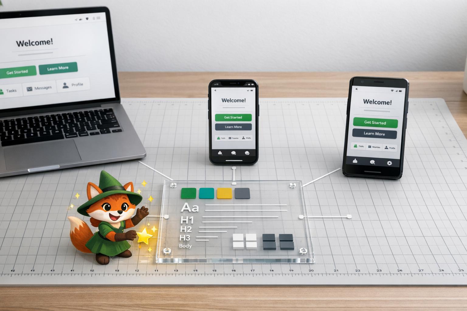
- Define visual standards: Lock in colors, fonts, icons, and spacing using design tokens. These act as a single source of truth for your team.
- Respect platform norms: Align with platform-specific guidelines (e.g., iOS haptics or Android Material Design) while keeping your brand identity intact.
- Use a unified design system: Build reusable components that work on all platforms and document them in a shared style guide.
- Combine responsive and adaptive design: Ensure layouts adjust to screen sizes and fine-tune behaviors based on platform expectations.
- Test on real devices: Catch issues like layout distortions or gesture mismatches before users do.
- Leverage tools like Adalo: Simplify cross-platform development with a single-codebase approach, responsive layouts, and AI-driven testing.
Consistency isn’t just about looks - it’s about creating a predictable, reliable experience that keeps users engaged. This guide walks you through the steps to achieve that, from setting design goals to leveraging tools like Adalo for seamless cross-platform deployment.

6-Step Process for Maintaining UI/UX Consistency Across Platforms
Config London 2025: Designing for both iOS and Android - the right way with Christine Røde
Set Clear UI/UX Consistency Goals
Before diving into coding or wireframing, take a step back and define what consistency truly means for your app. This isn't about generic aspirations - it's about setting specific visual and interaction standards that will guide every design choice across iOS, Android, and web platforms.
Start by documenting the non-negotiables: exact colors, font families, icon styles, spacing units, and layout grids. These should be recorded as design tokens, serving as a single source of truth to avoid the "why does it look different on mobile?" problem. For example, when Spotify developed their cross-platform experience, they locked in key elements like playlist navigation and playback controls. These worked seamlessly across all platforms while allowing minor adjustments for platform-specific details - such as icon-based downloads on iOS versus text toggles on Android.
Identify Core Design Elements
Break your design standards into the fundamental components that users encounter on every screen.
These core elements - colors, typography, icons, spacing, and layout grids - must have precise specifications, not rough estimates. For instance, if a button is defined as #007BFF with 16px padding and a 4px border radius, this should be documented in a shared style guide and followed without deviation.
Audit your current assets and convert them into reusable design tokens that the entire team can access. Properly implemented design tokens allow you to make updates - like changing a primary color - instantly across all platforms. This can save 30–50% of the time spent on manual adjustments.
Balance Consistency with Platform Guidelines
The next step is to align your core design elements with the native conventions of each platform.
This is where things can get tricky. iOS users expect features like bottom navigation, haptic feedback, and rounded corners, while Android users are accustomed to Material Design patterns, such as floating action buttons, navigation drawers, and elevation shadows. If you ignore these expectations, your app may feel out of place - even if it looks consistent.
The key isn't to favor one platform's guidelines over another. Instead, preserve your brand identity through consistent colors, typography, and interactions while adapting navigation and system-level behaviors to match user expectations. For example, allow platform-specific adaptations like haptic feedback on iOS or a navigation drawer on Android. Aim for 90% visual consistency with thoughtful adjustments for each platform - not a rigid, one-size-fits-all design that feels unnatural to users.
Defining these core elements and balancing them with platform norms lays the groundwork for building a unified design system in the next stages.
Build a Unified Design System
A unified design system takes your app's goals and translates them into practical, reusable components. This centralized framework includes design tokens, reusable elements, and documented standards that ensure consistency across web, iOS, and Android platforms. It serves as a living reference for your entire team, evolving alongside your app.
The system defines key elements like typography, color palettes, icons, spacing, and grids. The result? A cohesive look and feel across platforms. For example, a button designed within this system will work seamlessly on iOS, Android, and the web while respecting platform-specific conventions. Companies like Spotify and Airbnb have mastered this approach, creating interfaces that not only adapt to different screen sizes but also maintain their brand identity.
At the heart of any design system are design tokens. These are atomic variables that store core values such as colors, font sizes, spacing units, and border radii. With design tokens, any updates to these values are applied instantly across all platforms. As design expert Gulshan Rahman puts it:
"Consistency goes beyond making things look the same - it's about making the experience feel the same."
This foundation paves the way for creating reusable components that ensure a consistent user experience across devices.
Create Reusable Design Components
Reusable design components are the backbone of a uniform and efficient development process. Think of elements like buttons, forms, navigation bars, and modals. These components should reflect your brand's style while adapting to the nuances of each platform. For instance, a primary button might have a specific color, padding, and border radius that work seamlessly on iOS, Android, and the web.
Once designed, these components can be used repeatedly throughout your project, saving time and effort. For example, AAA Digital & Creative Services implemented a custom React Design System using UXPin Merge. The result? Increased productivity, better quality, and smoother developer handoffs. To make the most of your components, document each one in a shared style guide. This guide should cover everything from typography and color schemes to spacing and interaction states. Tools like Percy can help with visual regression testing, ensuring your library stays aligned as your app evolves.
Next, let’s explore how Adalo's Visual Builder simplifies this process further.
Use Adalo's Visual Builder for Consistency
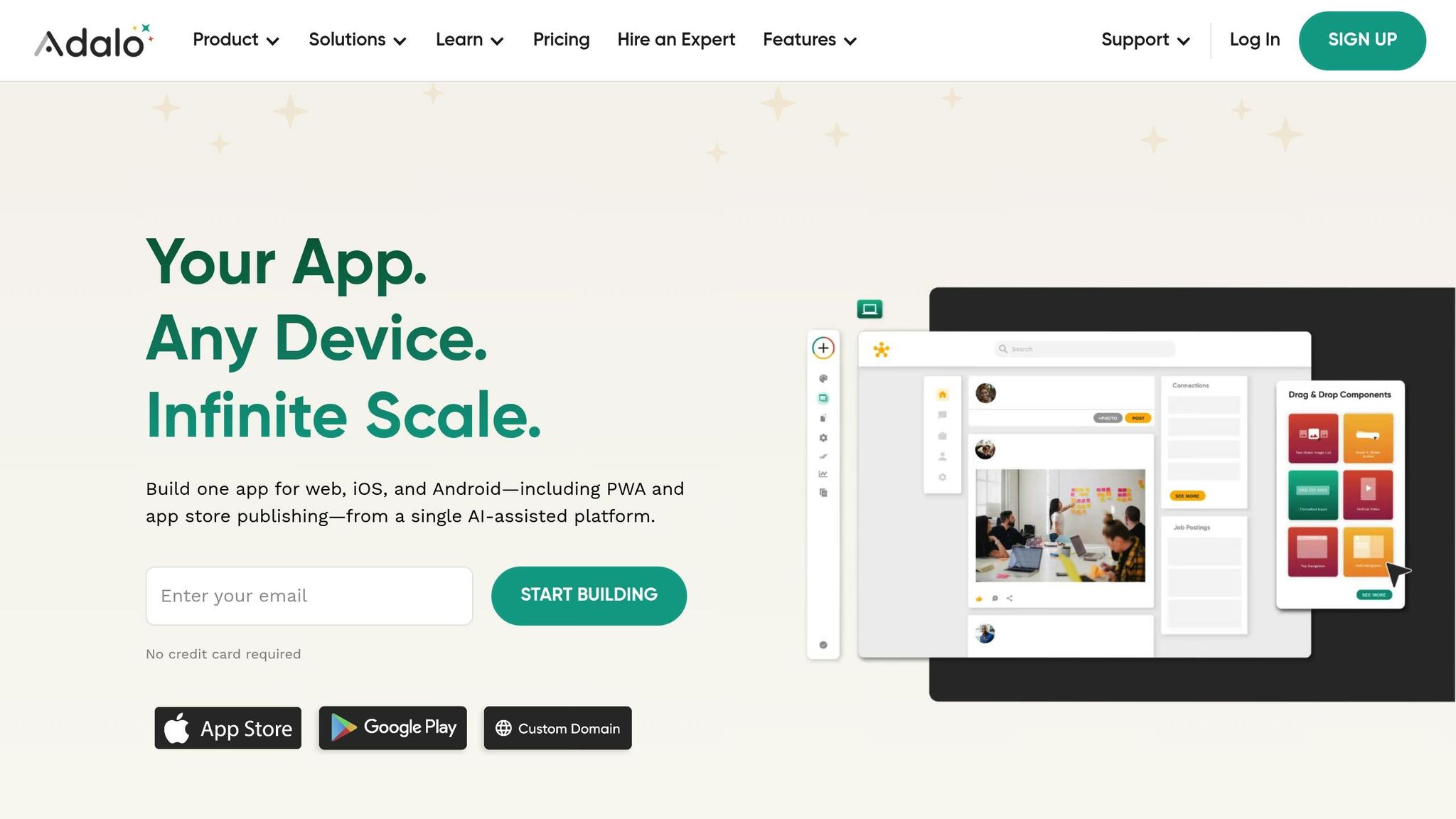
Adalo's Visual Builder is designed to help teams maintain consistent designs across platforms without the hassle of managing multiple codebases. With its single-codebase architecture, you can design your app once using a drag-and-drop editor and deploy it seamlessly to web, iOS, and Android - including PWAs and native app stores. Any updates you make to a component are automatically reflected across all platforms, eliminating the risk of fragmentation.
One standout feature is the screen size switcher, which lets you toggle between mobile, tablet, and desktop views in real time. This ensures that your reusable components adapt perfectly to different screen sizes. You can organize elements into containers, tweak shared and custom layout settings, and group related items to maintain alignment and spacing. Adalo’s responsive app engine - launched in December 2023 - takes this further by enabling simultaneous publishing to the Apple App Store, Google Play Store, and the web.
Adalo also simplifies branding. New components automatically adopt the "App Branding" colors defined in your manifest, reducing the chances of visual inconsistencies. Whether you're building an MVP or delivering apps for clients, Adalo's single-build deployment ensures your design system remains intact across all platforms, saving time and effort while keeping your app polished and professional.
sbb-itb-d4116c7
Implement Responsive and Adaptive Design
Once your design system is in place, the next step is ensuring it works seamlessly on every screen size. This involves combining responsive design, which adjusts layouts automatically, with adaptive design, which fine-tunes the experience for specific platforms. Together, these approaches make your app look polished and feel natural, whether it’s being used on an iPhone, an Android tablet, or a desktop browser. Here's how these strategies improve usability and user satisfaction.
Responsive Design: Flexible Layouts That Adjust Automatically
Responsive design relies on flexible grids and media queries to make layouts adjust to any screen size. Instead of creating separate designs for mobile, tablet, and desktop, you design once and let the layout scale using relative units like percentages. This ensures elements like columns and containers resize proportionally.
A mobile-first approach is the most efficient way to get started. Begin by designing for the smallest screen, then progressively add complexity for larger displays. For instance, on mobile, content can stack vertically, while on desktop, it can align horizontally. A navigation menu might transform from a horizontal bar on desktop into a vertical menu hidden behind a hamburger icon on mobile.
This method ensures readability and usability across devices. Take Spotify as an example: their playback controls and playlists adjust effortlessly to different screen sizes, maintaining a consistent and user-friendly experience.
Adaptive Design: Tailoring the Experience for Each Platform
While responsive design focuses on layout flexibility, adaptive design hones in on platform-specific details. Different platforms come with different user expectations. For example, iOS users often prefer minimalist designs and thumb-friendly navigation, while Android users might expect bold colors and Material Design principles. Adaptive design customizes these elements to match platform norms while keeping your brand identity intact through consistent design tokens, like colors and typography.
The goal is to offer consistent interactions - such as navigation and search - while adapting layouts and behaviors for each platform. For example, button sizes might be adjusted for thumb zones on iOS, while Android designs could incorporate platform-specific gestures. Following guidelines like Apple’s Human Interface Guidelines or Google’s Material Design ensures your app feels "native" to each platform.
Consistency is key here. Studies show that up to 90% of a user’s first impression is influenced by design consistency. Regularly auditing your app ensures that platform-specific adjustments don’t dilute your brand identity.
Adalo’s Single Build Deployment: Simplify Cross-Platform Design
Adalo makes managing both responsive and adaptive design straightforward. With Adalo’s visual builder, you can create your app once and deploy it across multiple platforms - including web apps, PWAs, iOS, and Android - from a single build.
Adalo’s screen size switcher lets you preview how your design will look on mobile, tablet, and desktop in real time. Flexible grids and containers adjust automatically to different resolutions, while features like native app store publishing, push notifications, and user authentication are tailored for iOS and Android - all from the same interface.
This unified approach not only saves time but also cuts costs significantly - up to 5–10× compared to custom development. Whether you’re launching a new MVP or delivering a polished client app, Adalo ensures your responsive and adaptive designs stay consistent across every platform. This consistency builds user trust and reinforces your brand’s reliability.
Test and Iterate for Multi-Platform Consistency
Testing is the backbone of ensuring your app performs seamlessly across platforms. It helps uncover and address platform-specific glitches before users experience them. By combining real-device testing with AI-driven tools, you can quickly detect and fix issues that might disrupt your app's visual appeal, performance, or usability. These efforts ensure your unified design system stays intact and effective.
Conduct Real-Device Testing
Nothing beats testing on actual devices. Emulators might be convenient, but they can't mimic everything - like touch sensitivity, network fluctuations, or how colors display on different screens. To catch the nuances emulators miss, you need to test on a variety of real devices.
Choose devices that mirror your user base. This means covering a mix of screen sizes, operating systems, and hardware specs - think iPhone 15, Samsung Galaxy S24, tablets, and desktop browsers. Perform identical tasks on each platform, such as navigating through the app, completing a search, or running through a checkout process. Pay attention to load times, responsiveness, and any inconsistencies in design elements like typography, spacing, or navigation.
"Make sure you test every platform, not just web. When you press 'Preview' in the editor, you are viewing the 'Web' version of your component." - Adalo
The aim is to create a seamless experience where users can effortlessly switch between devices without having to relearn how to use your app. This is critical, as poor navigation across platforms can drive user abandonment rates up to 70%.
Some common issues to watch for include color variations between iOS and Android, layout distortions on different screen sizes, and gesture mismatches. To tackle these, rely on standardized design tokens, implement responsive grids for adaptable layouts, and make platform-specific adjustments when necessary. Regular audits and user testing are key to catching these problems early and refining your designs over time.
Once you've covered manual testing, turn to AI tools to supercharge the process.
Use Adalo's X-Ray for AI-Driven Issue Detection
Automated tools like Adalo's X-Ray are a game-changer for streamlining issue detection. This AI-powered feature scans your app during development, pinpointing slow performance, UI glitches like misaligned elements, and UX problems such as confusing navigation - all before you dive into manual testing on every device.
X-Ray evaluates your app's performance across web, iOS, and Android from a single build. It provides actionable insights, such as visual comparisons and optimization tips, enabling you to address issues quickly. For example, X-Ray might detect a slow database query impacting load times or flag an accessibility issue like low color contrast - problems that could easily slip through manual testing.
Conclusion
Maintaining UI/UX consistency starts with clear design goals, a unified design system, responsive and adaptive layouts, and thorough testing - especially with the help of AI-driven tools.
Why does this matter? Consistency strengthens user trust and lowers abandonment rates. When users can move effortlessly between your mobile app and desktop version without a learning curve, they’re much more likely to stay engaged.
Adalo simplifies this process by combining design and development into one seamless workflow. With its single-codebase approach, you can build your app once and deploy it across web, iOS, and Android platforms - including PWA and app store distribution. The visual builder enables you to create reusable components, ensuring a consistent design, while features like an integrated database, user authentication, and push notifications provide a cohesive user experience.
Adalo’s AI tools take it a step further. The X-Ray tool scans your app during development to catch UI glitches and performance issues, while the responsive builder lets you toggle between mobile, tablet, and desktop views in real time, making it easy to spot and fix layout problems as they arise.
FAQs
What are design tokens, and how do they ensure consistent UI/UX across platforms?
Design tokens are like the DNA of a design system. They store visual properties - think colors, fonts, spacing, and similar elements - in a standardized, reusable format. These tokens ensure consistency across platforms and components by acting as the single source of truth for design attributes.
Centralizing these values has some clear benefits. It simplifies updates, keeps the design cohesive, and allows teams to adapt designs for different platforms without extra work. Plus, it bridges the gap between designers and developers, making collaboration smoother and helping create a polished, unified user experience.
What’s the difference between responsive and adaptive design?
The key distinction between responsive and adaptive design lies in how they adjust user interfaces to accommodate various devices and screen sizes.
Responsive design works with flexible grids and media queries to ensure the interface automatically adjusts to any screen size. This approach creates a fluid experience, maintaining visual harmony across devices without the need for separate designs tailored to each one.
Adaptive design, in contrast, involves creating multiple fixed layouts tailored to specific screen sizes or device types. The system identifies the device in use and delivers the most appropriate layout. While this method offers more precise control over the design for each device, it demands greater effort to create and manage.
Ultimately, both methods aim to provide a smooth, user-friendly experience. The choice between them depends on your project’s objectives, available resources, and the level of customization required for various devices.
How does Adalo's Visual Builder simplify creating consistent apps across platforms?
Adalo's Visual Builder streamlines cross-platform app creation by letting you build one app with a single codebase. Make an update once, and it automatically applies to web, iOS, and Android platforms, ensuring users get the same experience no matter where they access your app.
Forget the hassle of rebuilding for each platform. With Adalo, you can focus entirely on perfecting your app's design and functionality. The platform takes care of the backend complexities, saving you time and effort while delivering a seamless, professional look across all devices.
Related Blog Posts


