
Why Adalo Is Perfect for Building Responsive Mobile Apps
Adalo is a no-code app builder for database-driven web apps and native iOS and Android apps—one version across all three platforms, published to the Apple App Store and Google Play. This cross-platform capability makes it an ideal solution for entrepreneurs and businesses who want to create responsive mobile apps without writing a single line of code.
Having your app available on both major app stores means you can reach the widest possible audience while maintaining a consistent experience across devices. With Adalo's unified approach, any updates you make automatically sync across iOS, Android, and web versions—saving you time and ensuring your users always have access to the latest features, whether they're on a smartphone, tablet, or desktop browser.
Building a mobile app no longer requires coding skills. With tools like Adalo, you can create responsive apps for iOS, Android, and web using a drag-and-drop interface. Adalo’s features include pre-built templates, AI-powered design tools, and automatic updates across platforms. By 2026, 70% of new enterprise apps are expected to use low-code or no-code platforms, saving time and reducing costs by up to 40%. This guide walks you through designing, building, and publishing your app step-by-step.
Ada, Adalo's AI builder, lets you describe what you want and generates your app. Magic Start creates complete app foundations from a description, while Magic Add adds features through natural language.
Key Points:
- Adalo’s Magic Start: Describe your idea, and it generates a working app foundation.
- Responsive Design: Works across mobile, tablet, and desktop with layout customization options.
- Database Management: Organize data with collections and relationships.
- Publishing: Deploy to app stores or web from a single build.
Adalo simplifies app creation, making it accessible and efficient. Start building your app today.
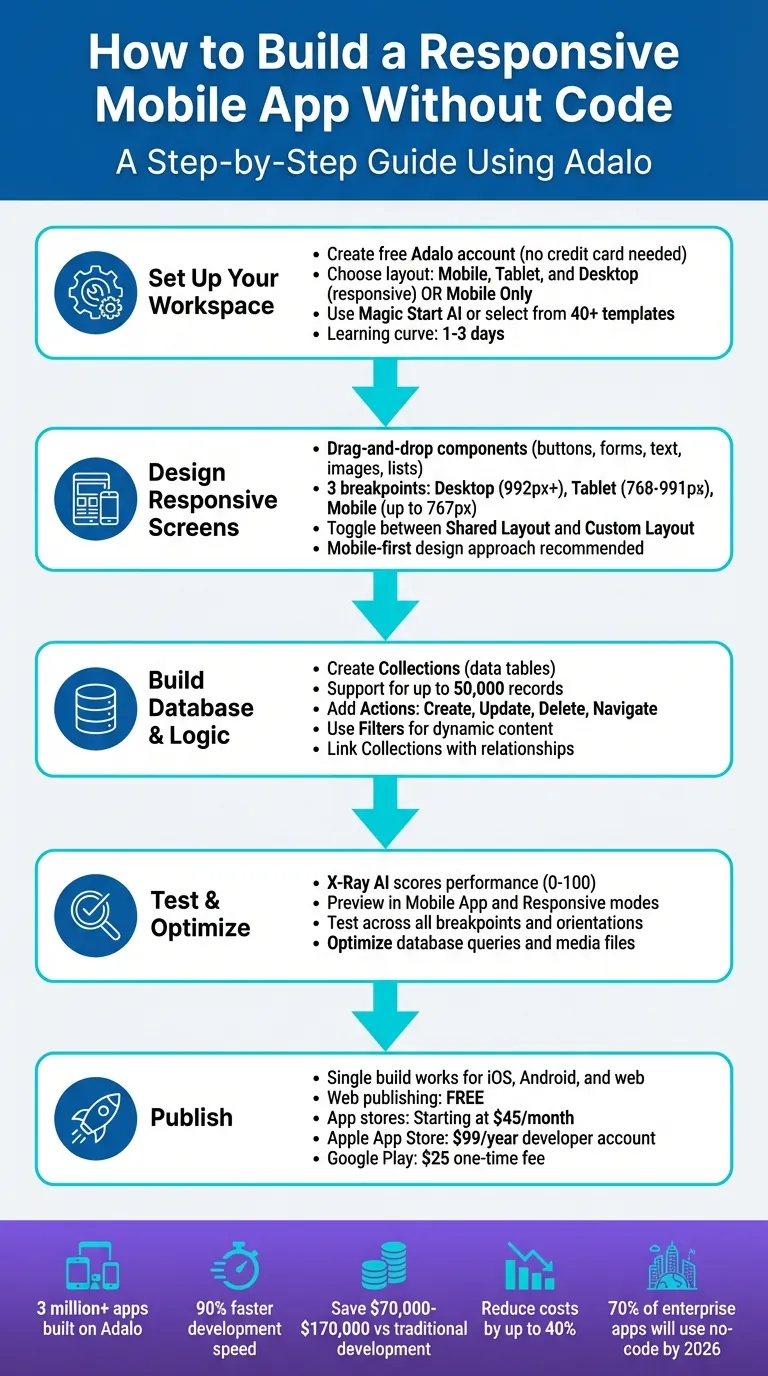
5-Step Process to Build and Publish a No-Code Mobile App with Adalo
Setting Up Your Adalo Workspace
Create an Adalo Account and Start a New Project
Head over to Adalo's homepage to create a free account—no credit card required. The sign-up process takes just a few minutes, and you'll gain instant access to the builder interface. Once logged in, use the app selector dropdown to click "Create New App" and kick off your first project.
You'll choose between two layout options: "Mobile, Tablet, and Desktop" (responsive) or "Mobile Only". For beginners, "Mobile Only" offers simplicity, but for this guide, select "Mobile, Tablet, and Desktop" to create a fully responsive app from the start.
Give your app a name, assign it to a team, and pick initial branding colors (you can adjust these later). With that, you're ready to dive into building.
Before jumping straight into design, take a moment to outline your app's goals and structure. A clear plan makes the design process significantly smoother and helps you avoid rework later.
Define Your App's Purpose and Structure
Before opening the visual editor, clarify your app's purpose. Adalo offers two approaches to define your app's structure: Magic Start AI or pre-built templates.
With Magic Start, type a plain-language description like "a booking app for a dog grooming business." The AI generates a complete foundation for your app—including database structure, screens, and user flows—within minutes. What used to take days of planning and wireframing now happens automatically, giving you a solid starting point that you can customize to your exact needs.
If you'd rather not use Magic Start, Adalo also provides a library of nearly 40 templates. Popular options include:
- Course/Booking Template: Perfect for educators and coaches managing appointments.
- E-commerce/Online Store Template: Ideal for selling products with inventory management.
- Social Media Template: Great for building niche communities with feeds and profiles.
These templates come with pre-designed screens, logic, and database setups, making it easier to understand how components work across different device sizes. This is especially helpful when you're getting familiar with responsive design principles.
Once your project is set up, you'll enter the builder interface. The central canvas is your workspace for dragging and dropping components. On the left-hand side, the Editing Dashboard gives you access to screens, components, integrations like Stripe, and other customization tools. The builder can display up to 400 screens, giving you a complete view of your app's architecture at any time.
Designing Responsive Screens with Adalo's Visual Editor
Using Drag-and-Drop Components
The visual editor keeps things simple with intuitive drag-and-drop functionality. From the Editing Dashboard, access core components like buttons, forms, text fields, images, and lists. Click on the component you need, drop it into your design, and customize its appearance and behavior using the properties panel.
Want to tweak colors? No problem. Need a button to navigate to another screen? Set that action up in seconds. If you're working with data, drag in a "List" to display database feeds or add a "Form" to collect user input directly into your collections.
This intuitive interface has empowered creators to build over 1 million apps—all without writing a single line of code. Since the platform uses a single codebase for web, iOS, and Android, every component you add works seamlessly across all platforms. You won't have to rebuild your app for different devices or maintain separate codebases.
Once your components are in place, it's time to fine-tune their layout for various screen sizes.
Making Your Layout Work Across Devices
After setting up your components, ensure your layout adapts smoothly to different devices.
The responsive builder includes three breakpoints: Desktop (992px+), Tablet (768px–991px), and Mobile (up to 767px). Use the Screen Size Switcher at the top of the builder to preview how your design will look on each device type.
By default, components follow Shared Layout settings, meaning any layout changes apply across all screen sizes. But what if you want a different arrangement—like stacking buttons vertically on mobile but aligning them horizontally on desktop? Simply disable Shared Layout for that screen size to switch to Custom Layout mode. This lets you adjust positioning, scaling, and anchoring independently for each device type.
A mobile-first design approach works best. It ensures components don't overflow or misalign when viewed on smaller screens. To make adjustments easier, use Rectangle components as containers to group related elements like text, images, and buttons. This way, you can move entire sections as a unit when refining layouts. Additionally, visibility toggles allow you to control what users see based on their device—like showing a full sidebar on desktop but replacing it with a compact menu icon on mobile.
Building Logic and Database for Dynamic Functionality
Creating and Managing Collections
Data in Adalo is organized into Collections, which function like tables in a database. Every app includes a default Users collection that serves as the foundation and cannot be removed. Beyond this, you can create additional Collections tailored to your app's needs. For example, a marketplace app might require Collections like Products, Orders, and Reviews, while a fitness app might rely on Workouts, Progress, and Goals.
To set up a Collection, head to the Database tab (the red icon), click "Create Collection", and assign a name that reflects its purpose. Next, define the properties for the data each record will hold. The platform supports various property types, including Text, Number, True/False (boolean), Date/Time, Image, and File. Images and files have a 50MB limit, while the Number property accommodates up to 15 digits, including decimals and negative values.
Relationships allow you to link Collections, enabling more complex data structures. For example, a one-to-many relationship works well when a single user can create multiple posts, while a many-to-many relationship suits situations like events with multiple hosts. As you set up relationships, rename the related properties in both Collections to keep your database organized as it grows. You can populate Collections manually, import data via CSV files, or let users contribute by submitting records through Forms.
One significant advantage: paid plans include unlimited database records—no caps on how much data your app can store. This removes the scaling constraints that plague many competing platforms, where you might hit record limits just as your app gains traction.
Once your Collections are ready, you can move on to building interactivity that makes your app dynamic and engaging.
Adding Actions and Filters for Interactivity
With your data structured, the next step is bringing your app to life using Actions and Filters. Actions define the logic triggered by user interactions. For instance, when a user clicks a button or submits a form, Actions like "Create Record" (adding new data), "Update Record" (editing existing data), "Delete Record" (removing entries), or "Navigate to Screen" (switching pages) are executed.
Adding a Form to your app is straightforward. Drop a Form component onto your screen, link each input field to its corresponding Collection property (e.g., connecting an email input to Users.Email), and set the Form Action to "Create" a new record in the Users Collection. For a polished experience, you can add visibility conditions to show a success message after submission, ensuring the process feels seamless across iOS, Android, and web platforms.
Filters make your app dynamic by tailoring content to each user. Filters query your Collections in real time, displaying only the relevant data. For example, in a social feed, you might filter the "Posts" Collection to show content from "Current User Followers" where the User matches the current user. Pair Filters with Actions for added interactivity—like a "Like" button that updates a post's like count while refreshing the list in real time. This approach ensures responsiveness without requiring backend coding.
The platform's infrastructure handles 20 million+ daily requests with 99%+ uptime, so your database queries and filters perform reliably even as your user base grows. Unlike platforms that charge based on database operations or impose record limits, you get predictable performance without worrying about usage-based billing surprises.
An Overview of Adalo | A No Code App Builder Tutorial
Testing and Optimizing Your App for Responsiveness
Adalo provides tools that combine performance analysis with cross-device testing, making it easier to ensure your app is both responsive and efficient before you publish.
Using X-Ray AI for Performance Analysis
X-Ray AI evaluates your app's performance and assigns it a score between 0 and 100. This score reflects how well your app performs in terms of speed and reliability across devices, helping you identify and address issues before users encounter them.
X-Ray focuses on three key areas:
- Database queries: Ensures data loads efficiently into lists without bottlenecks.
- Page rendering: Tracks how quickly components display on the screen.
- Network interactions: Monitors third-party integrations, like Google Maps.
When X-Ray detects issues—such as overloaded lists or large image files—it suggests actionable fixes, like optimizing filters or compressing media. This proactive approach helps you build apps that scale smoothly as your user base grows.
To test your app's responsiveness, use the Screen Size Switcher in the builder's top-left corner. This feature lets you see how your layout adjusts across different breakpoints. For example, you can spot and resolve issues like text overflowing on mobile screens or buttons disappearing on tablets in real time.
These tools allow you to fine-tune your app so it performs consistently across all devices before going live.
Previewing and Testing on Multiple Devices
Once you've addressed performance bottlenecks with X-Ray AI, the next step is to preview and test your app on various devices.
Adalo offers two preview modes through the Preview button:
- Mobile App Preview: Displays your app within a device frame for realistic testing.
- Responsive App: Adapts the app's layout to match your browser size dynamically.
These modes allow you to experience your app as users would on iOS, Android, and the web. You can also test your app's behavior on desktop, tablet, and mobile breakpoints using the Screen Size Switcher or by manually setting a custom width. Be sure to test both portrait and landscape orientations for a complete picture of how your app behaves.
For more precise testing, use Responsive App mode with browser simulation tools to mimic specific device resolutions, such as an iPhone SE or iPad Pro. A mobile-first approach—designing for smaller screens first and scaling up—can help avoid issues like desktop layouts spilling over on mobile. Additionally, grouping related components inside a Rectangle component ensures layouts stay consistent as screen sizes vary.
| Device Type | Screen Width | Testing Focus |
|---|---|---|
| Mobile | Up to 767px | Touch targets, text readability, vertical scrolling |
| Tablet | 768px – 991px | Two-column layouts, navigation transitions |
| Desktop | Over 992px | Multi-column grids, expanded navigation |
When you're confident in your app's performance, publish it and share the URL for broader testing. Since the platform builds one app that works seamlessly across iOS, Android, and the web from a single codebase, any improvements you make will apply across all platforms automatically, saving you time and effort.
Publishing Your App to Web and App Stores
Once your app has been thoroughly tested, it's time to bring it to life by publishing. Adalo's unified build system allows you to deploy your app to the web, Apple App Store, and Google Play Store—all from a single build.
Generating Native Builds
The platform simplifies the creation of native builds for both iOS and Android. Head to the Publish tab in your app dashboard and choose either Native App for mobile platforms or Web App for browser deployment. Before starting, ensure you've uploaded essential assets like app icons (1024x1024px) and splash screens. If anything is missing, the dashboard will notify you.
When you're ready, click Generate Build, and the system compiles your app into the appropriate native files: an .ipa file for iOS and either an .apk or .aab file for Android. Publishing to app stores requires a paid plan starting at $36/month—the lowest price point for native app store publishing among major platforms. Web publishing is available for free, making it easy to test your responsive web app before committing to mobile deployment.
The same project you use to create mobile builds can also deploy as a responsive web app. Simply select Web App in the Publish tab, set up your domain, and deploy instantly. This unified approach means you maintain one codebase while reaching users on every platform.
Submitting to App Stores
For the Apple App Store, you'll need an Apple Developer account, which costs $99 per year. In the Launch tab, enter your Bundle ID, Apple ID, and App-Specific Password. Keep in mind that Apple requires sign-ins to be approved from a Mac, iPhone, iPad, or Apple Watch with two-factor authentication enabled. Once ready, upload your .ipa file via App Store Connect, including screenshots, privacy labels, and release notes. Following Apple's Human Interface Guidelines and testing your app's responsiveness can help increase your chances of approval.
For Android, log into the Google Play Console, which has a one-time registration fee of $25. Upload your .aab or .apk file, then complete your store listing with descriptions, graphics, and content ratings. Make sure your app targets the required SDK version. The platform handles many technical details, like signing keys and image optimization, to help you avoid common errors. After submission, Apple typically reviews apps within 1-7 days, while Google Play approvals often happen faster.
Manual publishing is also available, allowing you to test updates without affecting your live app. When you're ready to release a new version, regenerate your build with a single click and resubmit to the app stores. For web apps, updates are instant and don't require store approval, making it easy to keep your app fresh and up-to-date.
Pricing Comparison for App Publishing
Understanding the cost landscape helps you make an informed decision. Here's how Adalo compares to alternatives for publishing native mobile apps:
| Platform | Monthly Cost | Key Limitations |
|---|---|---|
| Adalo | $36/mo | None—unlimited usage, records, and actions |
| Bubble | $69/mo | Hard limits + Workload Units (usage-based charges) |
| Glide | $60/mo | No native mobile apps, custom domains require Maker plan |
| Softr | $69/mo+ | Scales with users, PWA requires $167/mo plan |
| Thunkable | $189/mo | Required for app store publishing, token limits |
| FlutterFlow | $80/mo/seat | No database included, higher technical barriers |
Adalo offers the lowest price for native app store publishing with truly unlimited, predictable pricing. No usage-based charges, no record caps on paid plans, no surprise bills as your app scales. This predictability is crucial for budgeting, especially for startups and small businesses where unexpected costs can derail projects.
Conclusion
Creating a responsive mobile app without writing code is entirely achievable with the right tools. From setting up your workspace to publishing natively, the process outlined in this guide demonstrates how AI-assisted building has transformed app development from a months-long endeavor into something you can accomplish in days.
The combination of Magic Start for rapid prototyping, drag-and-drop design for visual building, and X-Ray AI for performance optimization creates a streamlined workflow that eliminates traditional development bottlenecks. With a learning curve of just 1-3 days and development speeds up to 90% faster than traditional coding, you can launch polished, professional apps starting at $36 per month with predictable, flat pricing.
The platform's modular infrastructure supports apps with millions of monthly active users, processing 20 million+ daily requests with 99%+ uptime. Whether you're an entrepreneur testing a new idea, a small business building internal tools, or an agency working on client projects, you can deliver high-quality results without needing a team of developers. The mobile-first design approach guarantees your app will look and perform beautifully on any device.
With AI-powered tools like Magic Start and Magic Add, you can speed up development even further, and native publishing gets your app directly into app stores. Over 1 million apps have already been built on the platform, proving that modern app builders can deliver both quality and performance at scale.
Related Blog Posts
- How to Launch Your First Mobile App Without Coding
- How to Create an Invoice App
- How to Build an Employee Onboarding App Without Coding
- Why Mobile-First Design Matters in No-Code Apps
FAQ
Why choose Adalo over other app building solutions?
Adalo is an AI-powered app builder that creates true native iOS and Android apps. Unlike web wrappers, it compiles to native code and publishes directly to both the Apple App Store and Google Play Store from a single codebase—the hardest part of launching an app handled automatically. At $36/month with unlimited usage, it offers the lowest price for native app store publishing among major platforms.
What's the fastest way to build and publish an app to the App Store?
Adalo's drag-and-drop interface combined with AI-assisted building through Magic Start lets you go from idea to published app in days rather than months. Describe your app concept, and Magic Start generates your database, screens, and user flows automatically. The platform then handles the complex App Store submission process, so you can focus on features instead of wrestling with certificates and provisioning profiles.
Can I easily build a responsive mobile app without coding?
Yes, with Adalo's visual builder, you can create a responsive mobile app without writing a single line of code. Using the drag-and-drop interface, you design screens, add components, and set up database logic that works seamlessly across mobile, tablet, and desktop devices—all from one project.
What is Magic Start and how does it help build apps faster?
Magic Start is Adalo's AI-powered feature that generates a working app foundation from a simple text description. Just describe your app idea in plain language, like "a booking app for a dog grooming business," and Magic Start creates the database structure, screens, and user flows within minutes, giving you a customizable starting point that would otherwise take days to plan manually.
How does Adalo handle responsive design across different screen sizes?
Adalo includes three breakpoints—Desktop (992px+), Tablet (768px–991px), and Mobile (up to 767px)—with a Screen Size Switcher to preview each. You can use Shared Layout settings for consistent designs or Custom Layout mode to adjust positioning independently for each device type, ensuring your app looks great everywhere.
What is X-Ray AI and how does it improve my app?
X-Ray AI is Adalo's performance analysis tool that scores your app from 0 to 100 based on speed and reliability. It evaluates database queries, page rendering, and network interactions, then provides actionable suggestions like optimizing filters or compressing images to fix issues before users encounter them.
How much does it cost to publish my Adalo app to the app stores?
Publishing to iOS and Android app stores requires a paid Adalo plan starting at $36/month—the lowest price for native app store publishing among major platforms. You'll also need an Apple Developer account ($99/year) and Google Play Console registration ($25 one-time fee). Web publishing is available for free, and the platform handles technical details like signing keys to streamline submission.
Are there limits on database records or app usage?
No. Paid Adalo plans include unlimited database records, unlimited users, and unlimited actions. Unlike competitors that charge based on usage or impose hard caps, Adalo offers predictable monthly pricing with no surprise bills as your app scales.
How long does it take to build a responsive mobile app?
With Adalo's learning curve of just 1-3 days and development speeds up to 90% faster than traditional coding, most users can build and publish a functional app within one to two weeks. Magic Start accelerates this further by generating your app's foundation automatically from a text description.
Can Adalo apps scale to handle many users?
Yes. Adalo's modular infrastructure supports apps with 1 million+ monthly active users, processing 20 million+ daily requests with 99%+ uptime. Unlike app wrappers that hit performance constraints under load, the platform's purpose-built architecture maintains speed and reliability at scale.
Build your app fast with one of our pre-made app templates
Begin Building with no codeRelated Content

Free No-Code Mobile App Development for Startups: Adalo's Free Tier Guide
Build and test mobile app prototypes for free with a drag-and-drop no-code builder, AI setup, a 200-record database, and shareable previews.

Building Your Mobile App: Adalo's Complete Development and Deployment Guide
Step-by-step guide to design, build, test, and publish cross-platform mobile apps and PWAs with AI tools, databases, testing, and app store

How to Launch Your First Mobile App Without Coding
No coding required — build, test, and publish a fully functional mobile app using drag-and-drop tools and no-code workflows.

How to Build a Mobile App Without Coding (2026 Guide) | Adalo
Learn how to plan, design, and launch iOS & Android apps with Adalo’s no-code builder. This step-by-step guide covers tools, templates, etc.