


How do you ensure your web app looks stunning and functions flawlessly whether someone views it on a phone, tablet, or desktop? Responsive design holds the answer, but understanding how it works across multiple devices can feel like navigating uncharted territory.
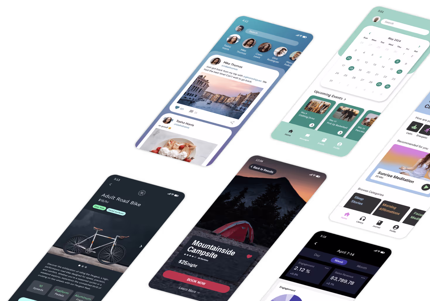
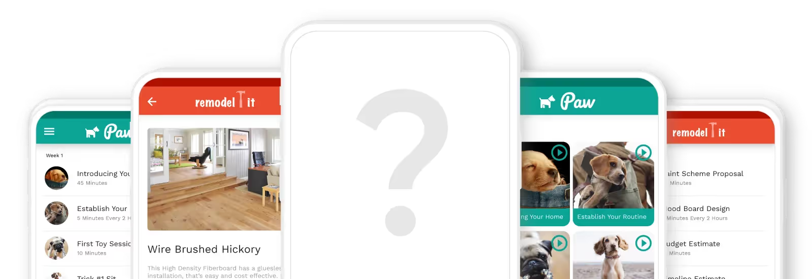
Adalo lets you build database-driven web apps and native iOS and Android apps — published to the App Store and Google Play — from a single no-code editor. With responsive design principles built into your workflow, you can create seamless experiences that adapt beautifully to any screen size.

Not only does responsive design enhance accessibility and usability, but it can also help to boost your web app's performance. By serving up only the necessary content for a specific device, responsive design cuts down on the amount of data that needs to be processed and downloaded, making your app run more smoothly.
Platforms like Adalo, a no-code app builder for database-driven web apps and native iOS and Android apps—one version across all three platforms, published to the Apple App Store and Google Play, make implementing responsive design more accessible than ever. With visual development tools and built-in responsive features, creators can ensure their apps look great on any device without writing complex code.
And that's not all! Responsive design can also improve your web app's search engine optimization (SEO). Since search engines love mobile-friendly websites that look great on all devices, incorporating responsiveness into your design can help boost your web app's visibility and rank higher on search results pages.

What are some common terms you’ll become familiar with when designing with responsive?
Are you designing with responsive design and feeling overwhelmed by all the technical terms? Don't worry, understanding these terms will help you create a responsive design that looks great and functions well on any device!
Here are some key terms that you'll probably come across:
Viewport
The visible area of a website or app on a user's device. In responsive design, the viewport is critical because it determines the size and layout of the content that is displayed. To ensure that the content displays correctly, designers need to optimize the viewport for different devices.
Breakpoints
Specific screen sizes at which the layout of a responsive system changes. By choosing appropriate breakpoints, designers can ensure that the design works well across all devices. Typically, breakpoints are set using media queries, which allow designers to apply different styles based on the size or orientation of a webpage or app.
Media Queries
A key component of responsive design that enables designers to apply different styles based on a device's size or orientation. Media queries typically contain rules for different screen sizes, such as "min-width" or "max-width," and can be used to adjust the layout, typography, and other design elements.
Fluid Grids
A layout system that adjusts to different screen sizes and resolutions. Fluid grids ensure that the design works well on all devices by adapting to the screen's size. To create a fluid grid, designers typically use percentages instead of fixed units like pixels.
Flexible Images
Images that adjust to different screen sizes and resolutions. This is important because images that are too large or too small can negatively impact the user experience. By using flexible images, designers can ensure that images look good on all devices. To create flexible images, designers typically use the "max-width" property in CSS.

What should you keep in mind when designing responsive websites, apps, and software?
Who is it for?
When you're designing a responsive system, it's crucial to think about how people will be using it on different devices. For example, mobile users might have different priorities and goals than desktop users, and may prefer touch-based interactions. By understanding these differences, you can create a system that works well for all users.
What comes first?
Next, let's talk about content prioritization. This is all about deciding which content is most important and making sure it's front and center, no matter what device is being used. For instance, on a mobile device, you might want to display a simplified version of a page with key information, while on a desktop, users may expect to see more detailed content.
When does it ‘respond’?
Now, let's get technical and talk about breakpoints! These are specific screen sizes at which the layout of a responsive system changes. Choosing the right breakpoints is essential to make sure your design works flawlessly across all devices.
What about images?
Media optimization is also super important. You need to make sure all images and other media are optimized for different screen sizes and resolutions. That might mean using multiple versions of an image or video and serving up the right version based on the user's device.
How about input?
And let's not forget about device-specific interactions! Different devices may have different input methods, like touch versus mouse input. So, designers must plan for these device-specific interactions and ensure that the system works well with all input methods.
How do we know it works?
Last but not least, testing is critical. You need to test your design on a variety of devices to make sure it works smoothly across all of them. Whether you're using emulators or physical devices, testing is the key to making sure your responsive system is top-notch.

Why Mobile-First Design is Recommended Over Desktop
If you're unsure whether to start with your desktop or mobile design when creating a responsive system, here’s a quick lowdown on why starting with your mobile design is generally the way to go!
This approach, known as "mobile-first design," is becoming more and more popular these days. Here are some reasons why:
It Ensures That Your System Works Well on All Devices
Mobile devices tend to have more limitations than desktop devices, such as smaller screens and slower processing speeds. Starting with the mobile design helps designers create a system that is optimized for all devices.
It Prioritizes Content and Features
Mobile devices have limited screen space, so designers must choose which content to display and how to display it. This results in a more streamlined and focused design with only the most important elements included.
Takes Advantage of Unique Mobile Capabilities
Touch-based interactions and location-based services are just some of the features that can be optimized for mobile, creating a system that provides a better user experience.
When Desktop Design Makes More Sense
Of course, there are some cases where it may make more sense to start with the desktop design. For example, if the system is primarily used on desktop devices or if the desktop design has already been completed. However, in most cases, starting with the mobile design is the way to go!
Once the mobile design is complete, designers can then scale up to larger devices and add additional content and features as needed. So, if you're still unsure where to start, go mobile-first!

What you need are tools that let you build software with responsive design
It's amazing how a responsive design tool can help you create a user-friendly web app that works seamlessly on all devices, whether it's a desktop, a smartphone, or a tablet. With responsive design, your app will look fantastic and work smoothly, no matter the screen size!
The best part? Using a responsive design tool can save you time and effort. These tools automate the process of adapting your app to different screen sizes, reducing the need for manual coding and testing. This can lead to faster development times and increased efficiency for your team. Imagine being able to focus on other aspects of your app while the responsive design tool does the heavy lifting for you!
A tool that lets you design seamless responsive software can greatly improve the usability and accessibility of your web app, while also improving your development workflow. It's a win-win situation that can make your users happy and your work easier!
Wrapping it up
As you may have learned, responsive design is crucial for ensuring that your web app functions smoothly on any device, from desktops to smartphones. By adapting to different screen sizes and resolutions, responsive design enhances accessibility and usability while improving performance and search engine optimization.
When designing a responsive system, it's essential to keep in mind who it's for and how they'll be using it on different devices. Content prioritization, choosing the right breakpoints, media optimization, and device-specific interactions are also crucial considerations. And don't forget about testing your design on various devices to ensure it works smoothly across all of them!
So, whether you're designing for desktop or mobile, responsive design is essential for creating a top-notch web app that meets the needs of your users. Good luck and have fun designing!
FAQ
| Question | Answer |
|---|---|
| Can I easily implement responsive design in my app? | Yes, with Adalo's No Code App Builder, you can easily implement responsive design in your app. Adalo's visual development tools and built-in responsive features ensure your apps look great on any device—desktop, tablet, or smartphone—without writing complex code or managing breakpoints manually. |
| Why choose Adalo over other App Builder solutions? | Adalo is a no-code app builder for database-driven web apps and native iOS and Android apps—one version across all three platforms. AI-assisted building and streamlined publishing enable launch to the Apple App Store and Google Play in days rather than months. This seamless app store publishing capability is crucial because getting your app into the hands of users through the App Store and Google Play is often the hardest part of launching a new app or business—Adalo removes this major barrier to distribution and marketing success. |
| What's the fastest way to build and publish a responsive app to the Apple App Store and Google Play Store? | Adalo is the fastest way to build and publish a responsive app to the Apple App Store and Google Play. With No Code App Builder's drag-and-drop interface and AI-assisted building, you can go from idea to published app in days rather than months. Adalo handles the complex App Store submission process, so you can focus on your app's features and user experience instead of wrestling with certificates, provisioning profiles, and store guidelines. |
| What is mobile-first design and why is it recommended? | Mobile-first design is an approach where you start designing for mobile devices before scaling up to larger screens like tablets and desktops. This method is recommended because mobile devices have more limitations like smaller screens and slower processing, so designing for them first ensures your system is optimized for all devices and prioritizes the most important content and features. |
| What are breakpoints in responsive design? | Breakpoints are specific screen sizes at which the layout of a responsive system changes to accommodate different devices. They are set using media queries and allow designers to apply different styles based on the size or orientation of a webpage or app, ensuring the design works well across all devices from smartphones to desktops. |
| How does responsive design affect SEO and app performance? | Responsive design can significantly boost both SEO and app performance. Search engines favor mobile-friendly websites, so incorporating responsiveness helps your web app rank higher in search results. Additionally, responsive design serves only the necessary content for each device, reducing data processing and download times for smoother performance. |
| What should I consider when designing a responsive web app? | When designing a responsive web app, consider your target users and how they interact with different devices, prioritize content based on screen size limitations, choose appropriate breakpoints, optimize all media for various resolutions, plan for device-specific interactions like touch versus mouse input, and thoroughly test your design across multiple devices to ensure smooth functionality. |

