


Mobile-first design isn’t just a preference - it’s a requirement. With 59% of global web traffic coming from mobile devices and apps driving 88% of mobile internet usage, your app needs to prioritize smartphones first. Why? Because half of mobile users leave if a site takes over 3 seconds to load, and even a 0.1-second speed improvement can boost conversion rates by 8.4%. Starting with mobile ensures your app focuses on core features, performs better, and scales easily to larger screens.
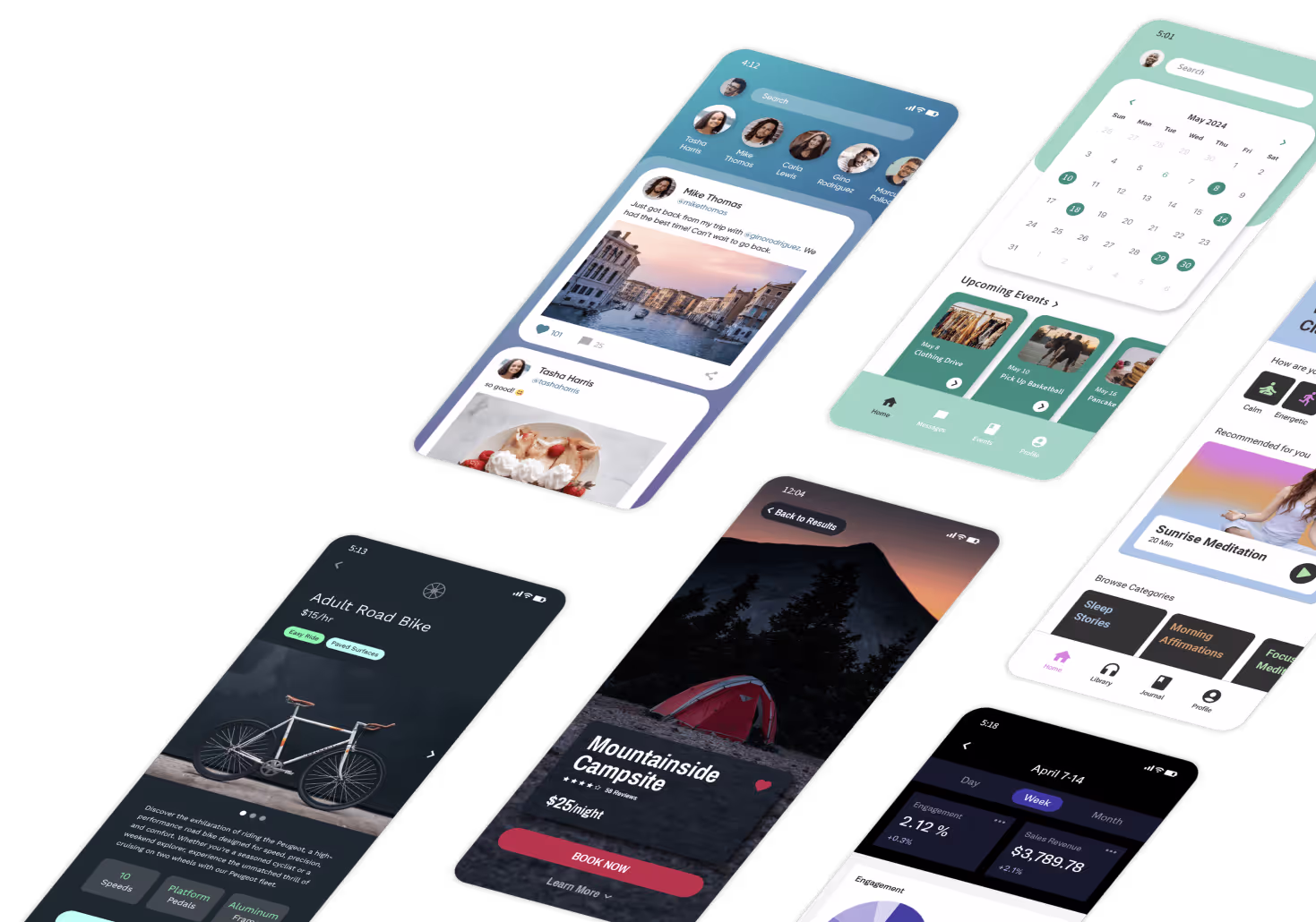
Platforms like Adalo, a no-code app builder for database-driven web apps and native iOS and Android apps—one version across all three platforms, published to the Apple App Store and Google Play, are helping teams embrace mobile-first design without extensive coding knowledge. These tools make it easier than ever to prioritize mobile users from the start.
Here’s what makes mobile-first design critical:
- Faster load times: Lightweight designs improve performance, especially for slower networks.
- Better user retention: Apps designed for mobile see up to 30% more retention and 75% repeat visits.
- Cost-effective development: Mobile-first strategies cut costs by 70% and speed up development by 90%.
- SEO advantages: Mobile-friendly apps rank higher thanks to Google’s mobile-first indexing.
No-code platforms like Adalo make this process easier than ever. They provide responsive frameworks, drag-and-drop builders, and pre-built templates, allowing you to design apps that work perfectly on mobile before scaling up. With tools like AI builders and single-codebase deployment, you can launch faster and reach users across all devices.
Bottom line: If your app isn’t optimized for mobile, you’re losing users and revenue. Start mobile-first to deliver faster, better, and more accessible experiences.

Mobile-First Design Statistics: User Engagement, Performance & Cost Benefits
What Mobile-First Design Means
Mobile-First Design Defined
At its core, mobile-first design focuses on crafting the best experience for smartphone users before scaling up to tablets and desktops. It starts with the limitations and opportunities of smaller screens, then builds outward.
This method follows the concept of progressive enhancement. The idea is simple: prioritize the features and content that matter most on a small screen. Once these essentials are solidified, you can add more complexity as the screen size increases. The result? A streamlined app where every feature serves a purpose, avoiding unnecessary clutter.
"While responsive design is about adaptability, mobile-first design is about intentionality - ensuring that the mobile user's experience is not just accommodated but prioritized." - Webflow Team
Why does this work so well? Trying to shrink a desktop layout down to a mobile screen often leads to poor usability. Elements can become hard to navigate or even break the design. Starting with mobile forces you to focus on what’s truly important, creating a solid foundation that scales seamlessly.
This emphasis on essentials lays the groundwork for why mobile-first design has become so critical.
Why This Approach Became Necessary
The shift to mobile-first design didn’t happen by chance - it’s a direct response to how people use digital products today. Over the last decade, mobile usage has skyrocketed. In fact, users now spend about 88% of their mobile internet time within apps. By 2026, global app revenue is projected to hit $935 billion, with Google Play alone serving over 2.5 billion monthly active users.
The old desktop-first model, known as graceful degradation, started with a feature-rich desktop site and then stripped it down for mobile. The problem? Mobile users often ended up with a subpar experience. Mobile-first flips this approach, ensuring mobile users get top priority, with enhancements added for larger screens.
Search engines have also adapted to this shift. Mobile-first strategies now play a key role in search rankings, as algorithms favor sites that are fast and user-friendly on mobile. And the trend doesn’t stop there - by 2026, Gartner predicts 70% of new enterprise apps will rely on low-code or no-code platforms. The takeaway is clear: if your app doesn’t deliver a seamless mobile experience, you’re already falling behind.
Mobile Design 101: How to Design for Mobile First
Benefits of Mobile-First Design in App Development
Focusing on mobile-first design delivers clear advantages in user experience, app performance, and cost management.
Improved User Engagement and Accessibility
Mobile-first design prioritizes touch-friendly layouts, which makes sense given that smartphones now account for 83% of online interactions. By emphasizing essential features and simplifying navigation, this approach reduces user frustration and speeds up interactions. The results speak for themselves: mobile-first responsive designs lead to 75% more repeat visits and encourage 74% of users to return, while non-optimized sites often suffer bounce rates as high as 60%. Companies adopting mobile-first strategies report measurable success, with a 30% boost in user retention when apps are designed with mobile users in mind.
Enhanced Performance and SEO Outcomes
Building with mobile in mind encourages the use of lightweight designs, optimized images, and clean code - key factors in speeding up app performance. Even a small improvement, like a 0.1-second reduction in load time, can increase conversions by 8.4%. Additionally, mobile-friendly sites have a leg up in search rankings. With Google's mobile-first indexing, smartphone crawlers now account for 59% of site evaluations, making faster load times a critical quality signal for search algorithms. Modern app builders, equipped with responsive frameworks, further ensure smooth adaptation across devices while avoiding unnecessary code bloat.
The benefits extend beyond user experience and performance, offering significant savings in time and money.
Faster Development and Reduced Costs
Designing for mobile first means focusing on core functionalities from the start. This eliminates the need for extensive redesigns when scaling to larger screens. Mobile-first platforms can cut development time by up to 90% and reduce costs by 70%. On average, organizations report a 362% ROI and annual savings of $1.7 million by avoiding the need for additional developer hires. These cost efficiencies translate into real business impact: customer-facing apps built with mobile-first platforms often see revenue increases of around 58%. Speed is another major advantage - 72% of developers using modern app builders deliver their applications within three months, compared to the 6–12 months typically required for custom development. For instance, Schneider Electric managed to deliver nearly 60 apps in just 10 weeks, achieving a fivefold increase in development speed.
| Benefit | Key Metric | Impact |
|---|---|---|
| User Engagement | +75% repeat visits; 30% higher retention | More active users, reduced churn |
| Performance & SEO | 8.4% conversion lift per 0.1s speed gain | Higher rankings and increased conversions |
| Development Speed | 90% faster development; 72% of apps shipped in under 3 months | Faster market entry, competitive edge |
| Cost Savings | 70% cost reduction; $1.7M annual savings | More resources for growth and innovation |
These advantages lay the groundwork for building apps that truly prioritize the mobile user experience.
How to Build Mobile-First Apps
Creating mobile-first apps no longer requires coding skills. Modern app builders provide the tools to design, test, and launch apps that function smoothly across all devices - starting with the smallest screens. These strategies help simplify development while keeping the mobile user experience front and center.
Responsive Design Frameworks
Responsive frameworks take care of adjusting your app's layout for different screen sizes automatically. You design it once, and the framework ensures it looks great on mobile, tablet, and desktop screens. Many platforms include a Screen Size Switcher, letting you toggle between device views in real time to see exactly how your app will appear on each screen.
You can also customize layouts for specific devices. For instance, a desktop version might include a visible sidebar, while the mobile version replaces it with a hamburger menu. Using anchoring and constraints, you can control how elements behave as the screen size changes. For example, a button could stay centered, while a navigation bar sticks to the top, ensuring usability across devices.
Visual Builders and Pre-Built Components
Drag-and-drop visual builders with WYSIWYG (What You See Is What You Get) editors make it easy to position text, images, buttons, and other elements without any coding. These tools let you focus on design rather than technical details.
Pre-built templates take it a step further. Whether you need an e-commerce checkout flow or a social media feed, templates come with ready-to-use screens, database structures, and user actions already set up. This can reduce development time by as much as 90% compared to traditional coding methods.
Platform-Specific Design Guidelines
Following platform-specific guidelines ensures your app delivers a smooth experience. For example, iOS apps should align with Apple's Human Interface Guidelines, while Android apps follow Material Design principles. These rules influence how users interact with your app, from navigation patterns to button placements. iOS users often expect swipe gestures, while Android users are used to different menu layouts.
Compliance is equally important. Apple's App Store Review Guidelines and Google Play's content rating requirements dictate whether your app gets approved. Features like in-app purchases must also meet specific platform standards. Thankfully, app builders handle these complexities for you, so you can concentrate on your app's features rather than memorizing rules.
| Tool | Mobile-First Benefit |
|---|---|
| Screen Size Switcher | Instantly preview and tweak layouts for mobile, tablet, and desktop |
| Anchoring & Constraints | Ensure UI elements stay properly positioned across all screen sizes |
| Visibility Controls | Show or hide components based on the device (e.g., hide sidebars on mobile) |
| Component Marketplace | Access pre-made, mobile-friendly elements like carousels and navigation bars |
Best Practices for Mobile-First Design
Creating a solid app structure is just the beginning. These best practices help refine your mobile-first design approach for an optimized user experience.
Focus on Key Content and Features
With limited screen space on mobile devices, it's all about prioritization. Pinpoint the core functions your mobile users need most and focus on those. Any secondary features can be saved for larger screens. Start by designing for the smallest screens, then scale up for tablets and desktops. Begin with simple wireframes for essential screens like login, profile, or settings. Use placeholder elements to ensure these layouts adapt well to different screen sizes before layering in finer details like buttons and text.
Use Minimalist Design Principles
A clean, uncluttered design isn't just visually appealing - it’s essential for usability on smaller screens. Generous white space draws attention to key content and makes touch targets easier to interact with. Features like collapsible menus (e.g., hamburger menus) can save space while keeping navigation accessible. Structuring content with container-based layouts ensures logical stacking and shifting as screen dimensions change. Interactive elements should be designed for touch, enabling taps, swipes, and pinches, and avoiding reliance on mouse clicks. Pop-ups that monopolize the screen are especially jarring on mobile devices, so keep them to a minimum. Additionally, compress images and optimize media early to maintain quick loading times, especially for users on cellular networks.
Test Across Devices and Platforms
Even if your app looks flawless during development, real-world testing is crucial to ensure usability across different devices. Test your app on a variety of devices and browsers, including Chrome, Safari, Firefox, and Edge. Use both preview panels and physical devices to confirm that breakpoints work seamlessly. Sharing test builds via QR codes or preview apps allows you to experience your app as users would, highlighting touch interaction nuances that might be missed with a mouse.
"Testing is the key to making sure your responsive system is top-notch." - Sonia Rebecca Menezes, Expert Tips Author, Adalo
Don’t stop at basic testing. Assess performance on devices with different processing speeds and network capabilities. Platforms like Apple’s TestFlight and Google Play’s testing program are excellent for gathering early user feedback before the final launch. Consistent, thorough testing ensures that your mobile-first design delivers a smooth, reliable experience for all users.
The Future of Mobile-First Design
Mobile-first design is shifting gears. With AI tools and app builder platforms advancing rapidly, teams are moving away from manually designing layouts to relying on automation that simplifies the process. This shift continues to build on the mobile-first principles already established.
AI's Role in Design Processes
AI is reshaping the creation of mobile-first apps. Platforms like Adalo's AI Builder allow teams to input their needs in plain language while the system generates mobile-optimized layouts automatically. For instance, it evaluates user inputs to craft interfaces that highlight critical content and navigation for smaller screens. From there, it suggests responsive tweaks for larger devices. This process slashes prototype development time from days to just hours.
Looking ahead to 2026, AI in app-building platforms will likely advance even further. Future features could include automated selection of design elements, predictive loading, and real-time layout adjustments. These tools will enable non-technical users to create scalable, mobile-first apps using AI-generated templates - no coding required. By 2026, 70% of new business applications are expected to use low-code or no-code technologies.
Scalability and Diverse Use Cases
App builder platforms are proving their capability to handle far more than basic prototypes. The concept of a single codebase, which streamlines updates across all platforms, exemplifies how mobile-first principles scale effectively. Adalo's single-codebase architecture, for example, ensures that updates roll out instantly across web, iOS, Android, PWAs, and app stores. It also supports hosted databases, user authentication, and integrations with tools like Airtable and PostgreSQL, making it possible to manage larger user bases and more complex features without losing performance.
This scalability benefits a wide range of users - from startups to large enterprises - while maintaining the efficiency of mobile-first design principles. 72% of apps built with low-code platforms are completed in under three months, compared to the 6–12 months typically required with traditional development approaches.
As these platforms grow, they are also addressing the need for improved performance and security.
Performance and Security Improvements
AI-powered optimizations are pushing performance to new heights. Faster load times are achieved through leaner pages and smoother interactions. Responsive frameworks now adapt automatically to different screen sizes, while automated testing reduces technical debt and enables ongoing improvements.
Security features are advancing alongside performance upgrades. Platforms like Adalo are introducing enterprise-level tools through offerings like Adalo Blue, which include single sign-on (SSO), advanced permissions, and secure integrations via tools like DreamFactory for legacy systems. Built-in workflows for publishing to app stores and robust user authentication ensure that mobile-first apps meet modern standards for data security and compliance - all without requiring custom code. Additionally, seamless connections to data sources like Google Sheets, MS SQL Server, and PostgreSQL allow apps to access real-time data while maintaining consistent performance. The single-build deployment ensures uniformity across all platforms.
Conclusion
Designing with mobile in mind is no longer optional - it's the starting point. With most users accessing apps on their phones, focusing on mobile ensures you're meeting them where they spend their time. This approach not only enhances user experience with faster load times and smoother interactions but also simplifies scaling to larger screens. Plus, it keeps development cycles lean and cost-effective.
App builder platforms have transformed the development landscape, cutting down both time and expenses. Most apps can now be completed in under three months, a speed that's critical for testing ideas and adapting to market needs.
Adalo takes this even further with its single-codebase platform, which allows instant deployment across web, iOS, Android, and PWAs. By blending AI-driven tools, a visual builder, and built-in features like databases, authentication, and push notifications, Adalo empowers teams to go from idea to production-ready app in days or weeks. Whether you're an entrepreneur launching an MVP, a company creating mobile interfaces for existing systems, or an enterprise leveraging Adalo Blue for internal tools, the mobile-first approach adapts to your goals.
As AI continues to advance and platforms expand their capabilities, mobile-first development will only become more efficient and accessible. The message is clear: prioritize mobile-first design to create flexible, market-ready apps. The only question is - how soon can you start?
Related Blog Posts
- 8 Ways to Optimize Your No-Code App Performance
- Checklist: Reducing Enterprise App Costs with No-Code
- How AI Transforms No-Code Prototyping
- Responsive Images: Why They Matter in No-Code Apps
FAQs
Why is mobile-first design essential for building successful apps?
Mobile-first design puts the mobile experience front and center, ensuring apps work seamlessly on smaller screens and with touch-based interactions. By optimizing for mobile devices, this approach minimizes data usage and processing demands, resulting in faster load times and smoother performance.
Focusing on mobile users first makes apps easier to use and more accessible. This improves user satisfaction and encourages people to stick around, increasing retention rates. When users enjoy a consistent experience across all their devices, they’re more likely to stay engaged - helping your app thrive.
How does mobile-first design improve SEO for app builders?
Mobile-first design is a game-changer for SEO. It ensures that apps are tailored for mobile devices, which search engines like Google prioritize when ranking content. By offering a responsive and user-friendly experience, mobile-first apps naturally see better engagement and usability - key factors that can boost search visibility. Plus, faster load times and smoother accessibility on mobile devices improve performance metrics, giving these apps an extra edge in search rankings.
Why is mobile-first design important for building apps?
Mobile-first design focuses on creating an app experience that works effortlessly on smartphones, where most users interact with apps. By starting with mobile usability, you ensure your app has responsive, user-friendly interfaces that keep people engaged and coming back.
Platforms like Adalo make this process simpler by allowing you to design apps that automatically adjust to various screen sizes - no coding required. This not only saves development time but also ensures your app looks and works great on both mobile and desktop, making it easier to connect with more users.


