


Customizing an app interface is all about making it look and feel like it belongs to your brand while keeping it simple for users to navigate. Here's what matters most:
Platforms like Adalo, a no-code app builder for database-driven web apps and native iOS and Android apps—one version across all three platforms, published to the Apple App Store and Google Play, make it easier than ever to implement these customization best practices without writing code.
- Responsive Design: Ensure your app works smoothly on phones, tablets, and desktops. Start with smaller screens and scale up using fluid grids and consistent spacing.
- Navigation: Use bottom tabs for 3–5 sections or a side menu for apps with more options. Keep key actions visible and easy to access.
- Branding: Stick to 3–5 colors from your brand palette and 2–3 fonts for a clean, professional look. Prioritize readability and test in light/dark modes.
- User Experience: Focus on accessibility, fast loading times, and smooth interactions. Use animations and optimized images to keep users engaged.
- Testing: Test across devices, gather user feedback, and use A/B testing to refine your design.
Adalo, an AI-powered app builder, simplifies this process with drag-and-drop components, conditional logic, and AI-assisted design features like Magic Start and Magic Add. You can create polished native iOS and Android apps—plus web apps—all from a single codebase, with direct publishing to the App Store and Google Play Store.

5 Essential Best Practices for Customizing App Interfaces
Layout Best Practices for App Interfaces
Responsive Design Basics
Your app needs to work seamlessly across smartphones, tablets, and desktop browsers. Responsive design ensures your interface adjusts to various screen sizes and orientations without breaking or feeling cramped. A smart approach is to start designing for the smallest screen and scale up from there.
"It's easier to make screens bigger and rearrange components, than it is to make them smaller - components tend to hang off the mobile screen in that scenario." – Adalo
Begin by using fluid grids with percentage-based layouts instead of fixed pixel widths. This approach allows your elements to scale proportionally as the screen size changes. Stick to consistent grid systems for alignment, ensuring a clean and organized layout across devices. For mobile users, place interactive elements in the bottom third of the screen to make one-handed use more intuitive.
With Adalo's visual builder—described by users as "as easy as PowerPoint"—you can design responsive layouts that automatically adapt across web, iOS, and Android from a single codebase. This eliminates the need to rebuild interfaces for each platform separately.
Grid Systems and Alignment
Grid systems act as the backbone of an organized and visually consistent interface. A 12-column grid is a great choice—it offers the flexibility needed to create balanced layouts that adapt across devices while keeping a predictable structure.
Use containers to group related elements, such as an image, a headline, and a button, so they move together as the layout adjusts to different screens. To avoid clutter, maintain 16-24 pixels of spacing between elements. For text alignment, left-align body text for better readability, center-align key sections like hero banners for impact, and reserve right-alignment for secondary elements.
This structured alignment reduces cognitive effort and naturally guides users' eyes through your interface. Adalo's canvas can display up to 400 screens at once, giving you a bird's-eye view of your entire app architecture—something particularly valuable when ensuring grid consistency across dozens of screens. Once your layout is set, focus on integrating navigation patterns that enhance usability.
Navigation Patterns That Work
Navigation is a cornerstone of app usability. For mobile apps with 3–5 primary sections, bottom tabs are ideal. They keep core actions within easy thumb reach and ensure a clean, uncluttered interface. Stick to 4–5 clearly labeled icons with uniform styling, and consider adding haptic feedback to enhance the user experience.
If your app has six or more sections, a side menu (commonly referred to as a hamburger menu) is a better choice. This keeps the main view simple while allowing users to access additional features with a swipe or tap. However, make sure critical actions remain visible without requiring users to open the menu.
On iOS, tab bars align with platform norms, while Android users expect material design principles. Whatever navigation style you choose, keep components separate—don't embed navigation elements within other layout sections. Adalo's platform handles these platform-specific conventions automatically, compiling true native code for iOS and Android rather than wrapping a web view, which ensures navigation feels natural on each operating system.
FULL UI Design Mobile Apps Course
Adding Your Brand to Your App
Your app should reflect your brand's identity in every detail, from colors to typography, to create trust and make your app instantly recognizable. Start by selecting a focused color palette—stick to 3–5 core colors from your brand guidelines and apply them consistently throughout the app. Take Airbnb, for example: they use a signature red accent color (#FF5A5F) paired with custom icons, making their brand unmistakable. Once your colors are set, refine your typography to further solidify your brand's look and feel.
Choosing Colors and Typography
Stick to 2–3 fonts to keep things clean and professional. Use a bold sans-serif font for headings and a simple sans-serif for body text. For a native feel, consider system fonts like Roboto (Android), San Francisco (iOS), or Segoe UI (Windows). Keep font weights to a maximum of two or three per screen, and ensure readability by maintaining a line height that's 1.4–1.6 times the font size.
High contrast is crucial—follow WCAG standards with a ratio of at least 4.5:1 for regular text and 3:1 for larger text. Test your brand colors in both light and dark modes to guarantee legibility in any theme.
Adalo's visual style editor lets you input hex codes from your palette and apply them globally. This ensures that your app looks consistent across web, iOS, and Android platforms without requiring extra coding. The platform's Magic Add feature can even help you implement design changes through natural language—describe what you want ("make all buttons use our brand blue"), and it applies the changes across your app. Once your colors and typography are locked in, it's time to add logos and icons to visually anchor your brand.
Adding Logos and Icons
Place your logo thoughtfully—headers or splash screens are great spots. Scale the logo to about 20–30% of the screen width for balance. When it comes to touch targets, follow platform guidelines: 44×44 pixels for iOS and 48×48 pixels for Android. For icons, use recognizable libraries like SF Symbols (iOS) or Material Icons (Android), and always include descriptive labels for accessibility with screen readers.
To ensure crisp visuals, save your logos and icons as scalable, compressed SVG files. Add sufficient padding around these elements to avoid cropping, especially in circular frames. If your app uses logos across multiple screens, manage them through a centralized database. This approach ensures that any updates are applied universally without manual edits.
With Adalo's unlimited database records on paid plans, you can store extensive brand asset libraries without worrying about hitting storage caps—a common limitation on platforms like Bubble, where Workload Units and record limits can create unexpected constraints as your app grows.
Keeping Your Theme Consistent
Consistency is key—it helps users feel at home in your app. Research shows that apps with uniform layouts can boost engagement by 20–30% thanks to their predictability. Define your primary, secondary, background, and text colors in a central branding tab so all components automatically inherit your brand's style.
Leverage design tokens like @primary or @secondary to ensure that every new component matches your branding without extra tweaking. Use the same button shapes, colors, and typography across interactive elements to create a polished and cohesive experience.
Group related elements within containers to ensure they scale and move as a single unit, whether viewed on mobile, tablet, or desktop. Because Adalo compiles to true native iOS and Android apps from a single codebase, your theme consistency carries through to every platform automatically—one update syncs everywhere, unlike platforms that require separate maintenance for web and mobile versions.
Improving User Experience Through Design
A well-designed app ensures that every user can navigate it effortlessly, no matter their abilities or the device they're using. Accessibility, smooth interactions, and fast performance are the cornerstones of a great user experience. Consider this: about 40% of users will abandon a website if it takes more than three seconds to load. Similarly, 53% of users will delete a mobile app if it's slow or crashes frequently. These numbers highlight just how crucial it is to refine every aspect of your app's interface.
Meeting Accessibility Standards
Accessibility isn't just a feature—it's a necessity. Use high contrast ratios for text and interactive elements to meet WCAG guidelines: at least 4.5:1 for standard text and 3:1 for larger text. Test your design in both light and dark modes to ensure readability across all settings. Keep your layout intuitive by grouping related content, creating a clear visual hierarchy that works seamlessly on any device.
Centralize commonly used assets like icons in a shared database. This way, updates—like higher-contrast versions—can be applied consistently across your app's screens. Adalo's X-Ray feature helps identify potential performance and accessibility issues before they affect users, flagging problems during development rather than after launch. Once accessibility is in place, the next step is to focus on interactivity.
Using Animations and Interactions
Accessible design lays the foundation, but smooth interactions take the experience to the next level. Use Lottie components for vector-based animations that deliver sharp visuals without bloating file sizes. Add interactive states to buttons and toggles to provide users with immediate feedback when they interact with your app. These small details reassure users that their actions have been registered.
Simplify your interface by conditionally displaying elements based on user needs. And don't forget to test animations across devices—mobile, tablet, and desktop—to ensure they perform smoothly everywhere.
Following Adalo 3.0's infrastructure overhaul in late 2025, the platform now runs 3-4x faster than before, making animations and interactions noticeably smoother. This performance improvement is particularly evident in data-heavy apps where previous versions might have shown lag during complex operations.
Keeping Custom Elements Fast
Speed is non-negotiable when it comes to retaining users. Optimize images using modern formats like WebP and AVIF, which offer excellent quality at smaller file sizes compared to traditional formats like JPEG or PNG. Define image dimensions to prevent layout shifts, keeping your CLS score below 0.1.
For animations, stick to CSS-based techniques using properties like transform and opacity. These leverage GPU acceleration, ensuring smooth rendering without taxing the system. Implement lazy loading for images and videos so they load only when users scroll to them, cutting down on initial load times. Airbnb, for instance, dynamically resizes and compresses images based on device type and uses code splitting to load non-essential assets only when needed.
Regular performance audits are critical. Tools like Google Lighthouse or PageSpeed Insights can help pinpoint and resolve bottlenecks before they impact your users. Adalo's modular infrastructure scales dynamically with your app's needs, maintaining performance even as user counts grow—apps built on the platform have scaled to serve over 1 million monthly active users without hitting speed constraints.
"A slow website isn't just an inconvenience. It's a silent business killer." - Lera Klopova, Frontend Developer, Rubyroid Labs
Advanced Customization with Visual Builders
Once you've nailed down your design and branding basics, advanced visual builders take things to the next level. These tools let you fine-tune your app's interface without diving deep into code. Think of it as assembling a puzzle with drag-and-drop pieces and smart logic instead of painstakingly coding every detail. The result? You can go from concept to a polished app in days, not months, blending the adaptability of custom development with the speed of pre-built tools.
Using Drag-and-Drop Components
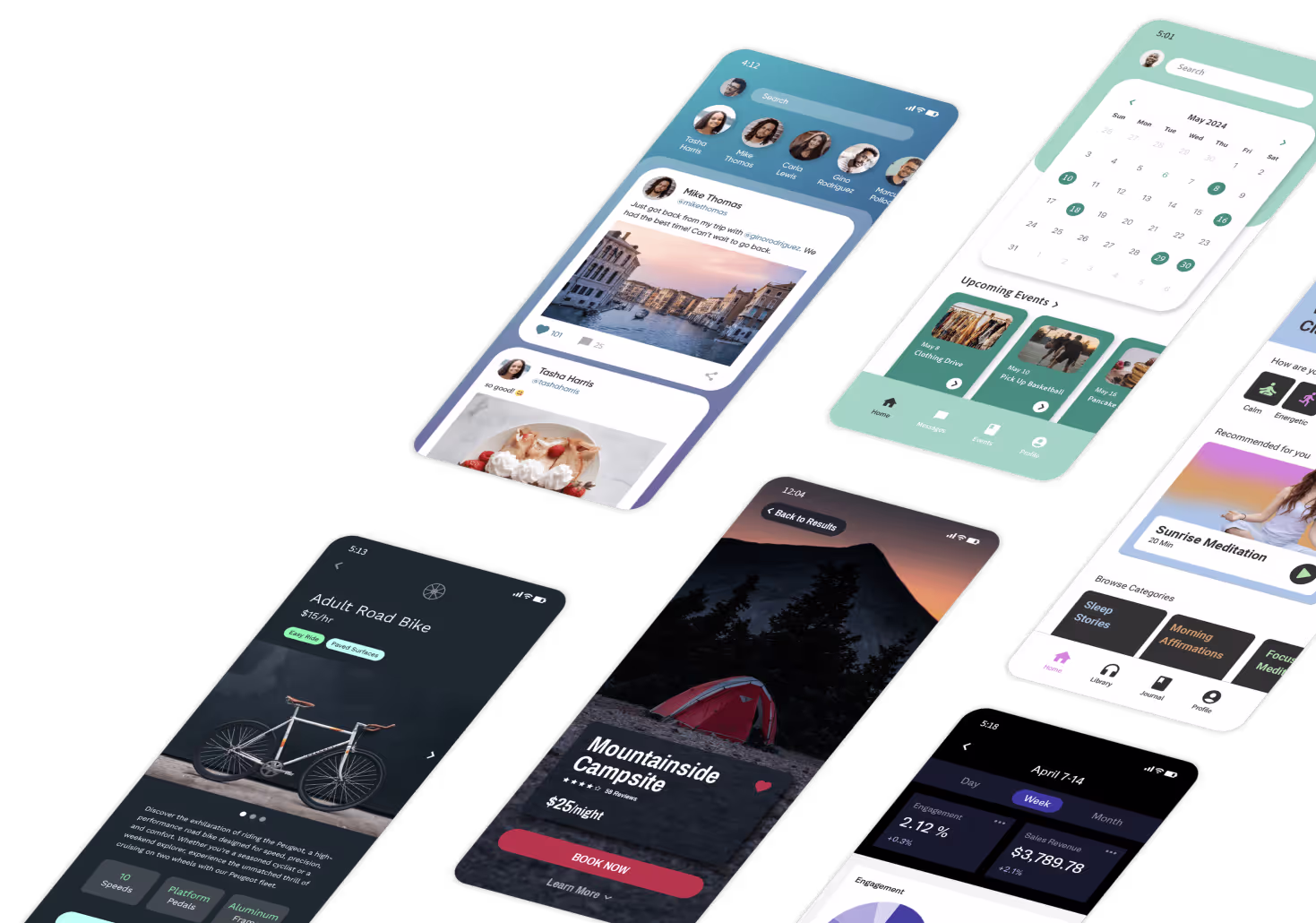
Drag-and-drop functionality makes app building faster and simpler by removing the need to code every element from scratch. With Adalo's visual builder, you can grab components—buttons, forms, lists, navigation bars—and drop them onto your canvas. These components are designed to automatically adjust for iOS, Android, and web platforms.
Adalo offers over 150 pre-designed Sections, which are fully responsive UI blocks. These blocks stack vertically and adapt to different screen sizes, letting you build a complete screen with just three or four blocks. With over 3 million apps created on the platform, these components have been battle-tested across countless use cases.
Start by designing for the smallest screen size first. Group related elements into containers to ensure they stay aligned when resized or moved across devices. For sticky elements like navigation bars or action buttons, keep them independent. Nesting these elements inside Sections can mess up their fixed positioning. Once your components are in place, you can add dynamic behavior using conditional logic.
Adding Conditional Logic for Dynamic Features
Conditional logic is where your app really starts to feel smart. It allows your app to respond to user actions, preferences, or data in real time. For example, you can set visibility rules so users only see content that's relevant to them.
This not only simplifies the user experience but also makes it more personal. And personalization matters—a lot. Studies show that 58% of smartphone users are more likely to engage with brands that offer tailored mobile experiences based on their profiles or past behavior. By using conditional logic, you can streamline your app, reduce unnecessary clutter, and build trust with your users.
With Adalo's no data caps on paid plans, you can create sophisticated conditional logic based on extensive user data without worrying about hitting record limits. This is a significant advantage over platforms like Bubble, where Workload Units can create unpredictable costs as your conditional logic processes more data, or Glide, where record row limits restrict how much user data you can store and query.
AI-Assisted Design Tools
AI tools take customization even further by speeding up the design process and ensuring everything looks and works just right. Adalo's Magic Start feature can create an entire app foundation from a simple text description. You tell it what you need—like a booking system or a product catalog—and it generates a production-ready interface, complete with database structure, screens, and user flows.
Magic Add extends this capability by letting you add features through natural language requests. Describe what you want ("add a user profile screen with photo upload"), and the AI implements it. This approach—sometimes called "vibe coding"—dramatically accelerates development without sacrificing customization.
AI also takes care of the finer details, like ensuring your color palette meets accessibility standards (e.g., WCAG contrast ratios of at least 4.5:1 for text) and maintaining consistent typography across light and dark modes. Once the AI sets up the base, you can step in to refine the design using drag-and-drop tools and conditional logic.
This combination of AI-driven speed and hands-on precision saves both time and money compared to traditional custom development. The AI Builder for full prompt-based app creation and editing is due for release in early 2026, promising even more powerful natural language capabilities for building and modifying apps.
Comparing Visual Builder Options
When choosing a visual builder for app interface customization, understanding the trade-offs between platforms helps you make the right decision for your specific needs.
| Platform | Starting Price | Native Mobile Apps | Database Limits | Best For |
|---|---|---|---|---|
| Adalo | $36/month | Yes (true native iOS & Android) | Unlimited on paid plans | Native mobile apps with scalability |
| Bubble | $59/month | Web wrapper only | Limited by Workload Units | Complex web apps with custom logic |
| FlutterFlow | $70/month per user | Yes (requires separate database) | External database required | Technical users comfortable with code |
| Glide | $60/month | No App Store publishing | Limited by record rows | Simple spreadsheet-based apps |
| Softr | $167/month | No (PWA only) | Limited per app and datasource | Spreadsheet-to-web conversions |
Bubble offers extensive customization options but uses web wrappers for mobile, which can introduce performance challenges at scale. Their Workload Unit pricing model can also create unpredictable costs as your app grows. Claims of millions of MAU on Bubble often require hiring experts to optimize performance—something to factor into total cost of ownership.
FlutterFlow is positioned as "low-code" rather than no-code, targeting technical users comfortable with development concepts. Users must source, set up, and pay for their own external database, which adds complexity and cost. The builder's limited viewport (showing only 2 screens at once) can slow down design work compared to Adalo's ability to display up to 400 screens simultaneously.
Glide excels at turning spreadsheets into simple apps quickly, but its template-focused approach limits creative freedom. It doesn't support App Store or Play Store publishing, restricting distribution options. For spreadsheet-based apps that need true mobile publishing, Adalo's SheetBridge feature connects Google Sheets directly to native apps while maintaining full design flexibility.
Note that many third-party platform comparisons and ratings predate Adalo 3.0's infrastructure overhaul in late 2025, which delivered 3-4x performance improvements and removed previous scaling constraints.
Testing and Refining Custom Interfaces
Creating a custom interface is just the beginning. The real challenge lies in testing it under real-world conditions to uncover issues that even the most polished designs might hide. This process bridges the gap between what you believe works and what actually works for your users.
Testing Across Devices and Platforms
Your app needs to deliver a seamless experience, whether it's being used on an iPhone, an Android tablet, or a desktop browser. Always test on real devices, not just emulators. While the editor preview often shows only the web version, it won't reveal how iOS or Android handle touch targets, gestures, or haptic feedback.
Start testing with the smallest screen size first; scaling up is far easier than trying to shrink a design later. Flexible grids and multiple breakpoints are essential tools for catching layout issues early. If your app serves users outside the U.S. and your servers are based domestically, test for geographic latency to see how performance changes across regions.
Tools like GTMetrix and Lighthouse can help pinpoint performance issues, such as unoptimized images or overly complex on-screen logic, by grading your app on a 0-100 scale. Adalo's X-Ray feature complements these tools by identifying performance bottlenecks specific to your app's architecture before they affect users in production. Once you've confirmed device performance, the next step is to gather direct user feedback.
Collecting and Using User Feedback
Real users often spot problems you might never anticipate. In-app surveys, rating prompts, and Net Promoter Score (NPS) tools are invaluable for identifying pain points and areas of confusion. Analytics tools with features like heatmaps and session recordings provide a visual map of where users get stuck or abandon tasks.
For example, one team simplified their app's navigation after learning that an overwhelming menu was frustrating users—this change improved satisfaction by 30%. Another app reduced onboarding drop-off by 25% by replacing unclear icons with more intuitive visual cues based on user feedback.
Timing is key when collecting feedback. Ask for input at natural moments, like after a user completes a task or hits a milestone. This approach increases the likelihood of receiving honest and actionable responses. When prioritizing fixes, focus on issues that affect multiple users or have a high impact—these are the areas where refinements will make the biggest difference.
With Adalo's unlimited usage on all plans (App Actions usage-based charges have been removed), you can collect and process as much user feedback data as needed without worrying about bill shock from increased activity.
A/B Testing Design Variations
A/B testing eliminates guesswork by letting you see which design performs better with real users. Test two variations—such as button colors, navigation layouts, or call-to-action text—by splitting your audience and tracking metrics like conversion rates, session duration, and engagement levels. Tools like Google Optimize, Optimizely, or Firebase make it easy to measure these outcomes. For reliable results, run tests for 1–2 weeks with at least 1,000 users per variation.
Even small tweaks can lead to big gains. In one test, a brighter call-to-action button boosted conversions by 15-20%. However, it's important to evaluate changes holistically. For example, adding high-resolution images or complex logic might improve aesthetics but could negatively affect performance scores.
With Adalo's single-codebase system, updates made during testing are instantly reflected across web, iOS, Android, and PWAs. This means you can refine your app without having to rebuild it for each platform, saving time and effort. And because Adalo handles App Store and Play Store publishing directly, you can push updates to production apps without limits—unlike some platforms that restrict how often you can republish.
Conclusion
Tailoring your app's interface creates a seamless experience that encourages users to return. Features like responsive layouts, consistent branding, and accessible design work hand in hand to minimize frustration, boost recognition, and enhance usability. By focusing on thumb-friendly touch zones, intuitive navigation, and thoughtfully crafted elements, you ensure your app feels effortless to use across any device.
Effective customization strikes a balance between style and functionality. Visually pleasing designs build trust in your brand, while subtle touches like microinteractions and animations add refinement without compromising performance.
Adalo's AI-powered visual builder simplifies this entire process—from Magic Start generating your app foundation to X-Ray catching performance issues before launch. With a single codebase publishing to web, iOS App Store, and Google Play Store, you can focus on perfecting your interface rather than managing multiple platform versions.
Regularly reviewing user journeys helps identify pain points and prioritize impactful improvements. Whether it's clearer navigation, better accessibility, or faster loading speeds, these changes can significantly elevate the user experience. With the right tools, customization transforms from a lengthy challenge into a repeatable, efficient process that grows with your app.
Related Blog Posts
- How to design an app
- How to Create an Invoice App
- How to Optimize UI for Mobile, Tablet, and Desktop
- Top 5 Fixes for Common App Store Rejections
FAQ
Why choose Adalo over other app building solutions?
Adalo is an AI-powered app builder that creates true native iOS and Android apps. Unlike web wrappers, it compiles to native code and publishes directly to both the Apple App Store and Google Play Store from a single codebase—the hardest part of launching an app handled automatically. With unlimited database records on paid plans and no usage-based charges, you avoid the unpredictable costs that come with platforms using Workload Units or record limits.
What's the fastest way to build and publish an app to the App Store?
Adalo's drag-and-drop interface combined with AI-assisted features like Magic Start lets you build production-ready apps in days rather than months. Describe your app concept, and Magic Start generates your database structure, screens, and user flows automatically. The platform handles the entire App Store submission process, so you can go from idea to published app without managing certificates, provisioning profiles, or app review guidelines manually.
How can I make sure my app looks great and works consistently on all devices?
Start with the smallest screen size—mobile phones—and scale up for tablets and desktops. Use flexible layouts with containers or sections to ensure content adjusts automatically. Adalo's visual builder creates responsive designs that work across web, iOS, and Android from a single codebase, eliminating the need to maintain separate versions for each platform.
How can I effectively incorporate my brand into an app's design?
Build a consistent visual identity by choosing 3-5 brand colors and 2-3 fonts, then apply them uniformly across every screen. Use Adalo's visual style editor to input hex codes and apply them globally. The Magic Add feature can implement design changes through natural language—describe what you want, and it applies changes across your entire app.
How can conditional logic improve the user experience in app design?
Conditional logic makes your app respond to user actions and preferences in real time. Elements can appear or disappear based on user data, keeping the interface uncluttered and personalized. With Adalo's unlimited database records on paid plans, you can create sophisticated conditional logic based on extensive user data without hitting storage limits.
Which is more affordable, Adalo or Bubble?
Adalo starts at $36/month with unlimited usage and no record limits on paid plans. Bubble starts at $59/month but uses Workload Units that can create unpredictable costs as your app scales. Bubble's mobile solution is also a web wrapper rather than true native, which may require additional optimization work—often requiring hired experts—to achieve good mobile performance.
Which is faster to build with, Adalo or FlutterFlow?
Adalo is generally faster for non-technical users because it includes an integrated database and AI features like Magic Start that generate complete app foundations from descriptions. FlutterFlow is "low-code" rather than no-code, requiring users to source and configure their own external database. FlutterFlow's builder also shows only 2 screens at once, while Adalo can display up to 400 screens simultaneously for faster navigation.
Is Adalo better than Glide for mobile apps?
For true mobile apps, yes. Glide doesn't support Apple App Store or Google Play Store publishing—it creates web apps only. Adalo compiles to native iOS and Android code and handles app store submission directly. If you need spreadsheet connectivity, Adalo's SheetBridge feature connects Google Sheets to native apps while maintaining full design flexibility, unlike Glide's template-restricted approach.
How long does it take to build a custom app interface?
With Adalo's visual builder and AI features, you can create a polished app interface in days rather than months. Magic Start generates your initial app foundation from a description, and the drag-and-drop editor with 150+ pre-designed sections lets you customize quickly. The single-codebase approach means you're building once for web, iOS, and Android simultaneously.
Do I need coding experience to customize app interfaces?
No. Adalo's visual builder is described by users as "as easy as PowerPoint." You drag and drop components, set up conditional logic through visual interfaces, and use AI features like Magic Add to implement changes through natural language. The platform handles all the underlying code, including native iOS and Android compilation.


