


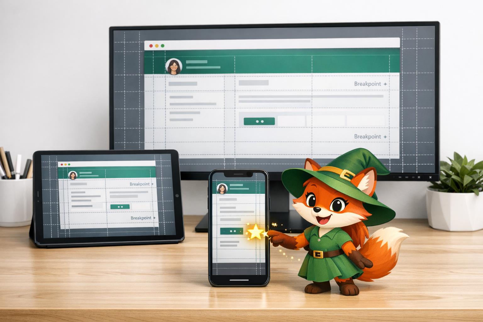
Users move between devices constantly—mobile during commutes, tablets on the couch, desktops at work. If your app or site doesn't work well across these, you lose users. Over 60% of web traffic comes from mobile and tablets, so getting this right matters.
Adalo, a no-code app builder for database-driven web apps and native iOS and Android apps—one version across all three platforms, published to the Apple App Store and Google Play, makes achieving cross-device consistency far more accessible. Instead of coding separate responsive layouts from scratch, you can design once and deploy everywhere—publishing native iOS and Android apps alongside web apps from a single codebase.
- Responsive Design Basics: Use fluid grids, flexible layouts, and CSS media queries to create adaptable designs.
- Breakpoints: Adjust layouts at key screen sizes (e.g., mobile under 500px, tablets 500–1,200px, desktops 1,200px+).
- Mobile-First Approach: Start with small screens, focusing on core features, then scale up for larger devices.
- Responsive Media: Optimize images and videos using
srcset,sizes, and the<picture>element for faster loading. - Testing: Use browser tools and real devices to ensure smooth performance everywhere.
AI-assisted platforms simplify this process, letting you design once for all devices. By following these steps, you'll deliver a consistent, user-friendly experience across mobile, tablet, and desktop.
Complete guide to responsive Web Design (advanced level)
Core Principles of Responsive Design
Responsive design is built upon three key principles that ensure websites look and perform well on any device. The concept of "Responsive Web Design" was introduced by Ethan Marcotte in 2010, emphasizing the use of fluid grids, flexible media, and media queries to adapt content seamlessly across various screen sizes. By understanding these principles, you can create interfaces that feel intuitive, whether users are tapping on a smartphone, swiping on a tablet, or clicking on a desktop.
Fluid Grids and Flexible Layouts
In the early days of web design, layouts often relied on fixed pixel dimensions—for example, a column might be set at exactly 960 pixels wide. While this worked when most users had similar screen sizes, it's ineffective in today's world of diverse devices. Fluid grids solve this problem by using relative units like percentages, rem, or viewport units, allowing elements to scale proportionally to the screen size. For instance, a sidebar designed to take up 25% of the page width will maintain that proportion whether it's displayed on a smartphone or a large desktop monitor.
Modern CSS tools like Flexbox and CSS Grid make it much easier to create these adaptive layouts. CSS Grid's fr unit, for example, divides available space into adjustable fractions, ensuring elements resize smoothly as the container changes.
CSS Media Queries
Fluid grids handle scaling, but sometimes the layout needs a more significant adjustment at specific screen sizes. This is where media queries come in. Media queries allow you to apply specific styles based on conditions like screen width, resolution, or orientation (portrait vs. landscape). For example, navigation links might appear as a horizontal bar on desktops but transform into a hamburger menu on mobile devices.
Media queries also support user preferences, such as dark mode, and can be defined using relative units like em or rem. This approach ensures the design remains adaptable, even when users zoom their browsers or adjust settings.
Responsive Images and Media
Designing layouts is only part of the equation—managing media assets like images and videos is equally important for a fully responsive experience. High-resolution images that look great on a desktop can be overkill for mobile devices, leading to wasted bandwidth and slower load times. To address this, you can style images with max-width: 100% and height: auto, ensuring they scale properly without distortion.
"Much like water, fluid images take on the size of their container." – Interaction Design Foundation
For even more control, HTML offers tools like the srcset and sizes attributes, as well as the <picture> element. These features help browsers load the most appropriate image size for each device, improving performance. For icons and simple graphics, Scalable Vector Graphics (SVG) are a smart choice because they remain sharp at any resolution.
Lastly, the viewport meta tag is essential for tying everything together. Adding <meta name="viewport" content="width=device-width,initial-scale=1"> to your HTML ensures mobile browsers display pages at the device's actual width rather than defaulting to a desktop view. This simple step enables all responsive techniques to function as intended.
Choosing Breakpoints for Different Screen Sizes

Responsive Design Breakpoints and Grid Structures for Mobile, Tablet, and Desktop
A breakpoint marks the viewport width where your layout adapts to fit various devices. Designers often group these by device size, focusing on the screen dimensions that matter most for their audience. The goal? Adjust your design to deliver the best user experience across devices.
Common Breakpoints and When to Use Them
Popular frameworks like Bootstrap 5 and Tailwind CSS define breakpoints that generally align with device categories: mobile (under 500px), tablet (500px–1,200px), and desktop (1,200px and above).
Common screen resolutions, such as 1920×1080, 360×800, and 1366×768, highlight the variety of displays your users might have. When layouts hit a breakpoint, typical adjustments include:
- Replacing horizontal navigation with a hamburger menu
- Shifting multi-column layouts into a single vertical column
- Enlarging buttons for easier touch interaction on smaller screens
Breakpoints play a critical role in implementing fluid grids and media queries effectively.
| Device Category | Common Breakpoint Range (Width) | Typical Grid Structure |
|---|---|---|
| Extra-Small (Mobile Portrait) | 320px – 480px | 4-column grid |
| Small (Mobile Landscape / Tablet Portrait) | 481px – 768px | 8-column grid |
| Medium (Tablet Landscape / Small Laptop) | 769px – 1,280px | 12-column grid |
| Large (Desktop) | 1,281px – 1,440px | 12-column grid |
| Extra-Large (High-Res Monitors) | 1,441px and up | 12-column grid (expanded) |
Instead of relying solely on device categories, consider using content-driven breakpoints. These let you adjust layouts when design elements begin to misalign. As MDN Web Docs puts it:
"By using a flexible grid, you can change a feature or add in a breakpoint and change the design at the point where the content starts to look bad".
This ensures your design adapts to actual usability needs, not arbitrary device classifications.
Adjusting Breakpoints Based on Your Users
Before locking in specific breakpoints, analyze your audience's device data to identify the most common screen sizes they use. Your analytics tools can reveal popular display widths, helping you prioritize dimensions that matter most to your visitors. As Kelley Gordon from NN/G explains:
"A starting point for determining the exact values for these breakpoints would be to analyze the range of devices that your audience uses when accessing your site and then establish the breakpoints so you optimally accommodate the more common display sizes".
For flexibility, define breakpoints using rem or em units to account for user browser zoom settings. And don't just rely on browser emulators—test on actual devices to catch potential touch interaction issues.
Starting with Mobile-First Design
Designing with a mobile-first approach means starting with the smallest screen and gradually adding features as screen size increases. This method, often called progressive advancement, ensures you focus on what truly matters to your users right from the beginning.
"By focusing on the essential features required on the smallest screen, you target the core functionality of the site or app".
Adalo highlights a key advantage of this approach: scaling up is far easier than trying to shrink down.
"It's easier to make screens bigger and rearrange components, than it is to make them smaller—components tend to hang off the mobile screen in that scenario".
A mobile-first design naturally prioritizes touch-based interactions—like taps, swipes, and pinches—making it simpler to layer on desktop-specific features, such as hover states, later. The first step is to identify the most important mobile elements before expanding for larger screens.
Identifying Core Content for Mobile
Start by pinpointing essential screens—such as home, profile, settings, and signup. Focus on delivering core functionality, like intuitive navigation and fast load times, while eliminating anything that could clutter the small screen or slow performance.
Break your content into containers, which are simple sections that group related information. On mobile, these containers typically stack vertically or collapse into hidden menus (like hamburger icons). Always test how layouts respond before adding more detailed content.
Interactive elements should be touch-friendly. Buttons and tap zones must be large enough to use comfortably, and navigation should remain clear and straightforward. Compress images and optimize your code early on, as mobile users often deal with limited bandwidth.
Adding Features for Tablet and Desktop
Once the mobile foundation is solid, you can expand the design to take advantage of the extra space and capabilities of larger devices. Each device type has its strengths: mobile is ideal for quick actions and location-based features, while tablets and desktops excel at tasks like content creation, organization, and detailed work.
Avoid stretching mobile components to fill desktop screens. Instead, use grid layouts or set maximum widths to maintain readability. Breaking large components into smaller, reusable pieces can improve performance and make layout adjustments easier.
For desktops, add features like hover states and keyboard shortcuts. Adjust visual density to suit the precision of a mouse compared to touch. Flutter documentation suggests tailoring features to specific devices:
"Consider whether it makes sense to focus on specific capabilities, or even remove certain features, on some device categories".
Ensure your app maintains state—like keeping the scroll position in a list—when users rotate their device or resize windows. Support keyboard navigation to meet accessibility standards and avoid locking the orientation to portrait mode. This flexibility is particularly important for foldable devices and multi-window setups. These practices build on the responsive principles established earlier, ensuring a smooth experience across all devices.
Testing and Refining Your UI
To create a user interface (UI) that performs seamlessly across devices, rigorous testing and fine-tuning are essential. While browser tools offer a quick way to check your responsive design, testing on actual devices is key to uncovering issues that emulators might miss. Let's dive into how you can refine your UI for the best user experience.
Using Browser Tools and Emulators
Modern browsers come equipped with tools to simulate various screen sizes, touch interactions, and even network conditions. For example, device mode lets you preview how your layout adapts to different breakpoints. These breakpoints are often displayed as colored bars—blue for max-width, orange for min-width, and green for ranges—making it easy to verify how your design adjusts.
You can also simulate lower-end device performance using CPU and network throttling. Touch emulation is another handy feature, allowing you to mimic gestures like taps and swipes while disabling hover states to better replicate touchscreen behavior. Additionally, the Sensors panel in these tools enables you to test features like geolocation, device orientation, and idle states. Always ensure your viewport settings align with the actual widths of the devices you're targeting.
Testing on Actual Devices
While emulators are helpful for initial checks, nothing beats testing on real devices. As Microsoft Edge Developer Documentation points out:
"Device Emulation is a first-order approximation of the look and feel of your page on a mobile device. Device Emulation doesn't actually run your code on a mobile device."
The key takeaway? Emulators provide a glimpse, but they can't fully replicate how your UI behaves on physical hardware. Mobile devices often use different CPU architectures, which can lead to variations in performance and execution speed. Real-device testing ensures that touch interactions—like swipes, pinch-to-zoom, and multi-touch gestures—work as intended.
For deeper insights, use remote debugging tools to inspect and profile your code directly on a mobile device. As Chrome DevTools Documentation advises:
"When in doubt, your best bet is to actually run your page on a mobile device."
Combining emulator results with real-world testing ensures your UI performs consistently under diverse conditions.
Improving Performance for Responsive Layouts
Once you've tested your UI, it's time to optimize performance. Start with images—use CSS rules like max-width: 100% and attributes like srcset and sizes to ensure they load efficiently. Compress image files and consider replacing image-based elements with CSS effects, such as gradients or shadows, to reduce HTTP requests.
Leverage modern layout systems like Flexbox and CSS Grid, which adapt layouts efficiently and minimize the need for complex workarounds. When defining media query breakpoints, use relative units like em or rem instead of fixed pixels. This approach ensures your layout adjusts proportionally, even when users modify default font sizes.
Finally, test your UI under throttled conditions to identify bottlenecks, especially for users with slower connections. Features like skeleton screens and progressive loading for large datasets can significantly improve perceived performance. Adalo 3.0's infrastructure overhaul, launched in late 2025, delivered 3-4x faster app performance—optimizations that reduce initial load times dramatically for data-heavy applications.
Building Cross-Platform UIs with Adalo
Why rebuild your app for different platforms when you can create one design that works everywhere? That's exactly what Adalo offers—an AI-powered app builder that lets you design once and publish seamlessly to iOS, Android, and the web.
One Design, Multiple Platforms
With Adalo's single-codebase approach, you don't need to juggle separate versions of your app. Design your interface once, and it automatically adjusts for desktop (screens wider than 992px), tablet (768–991px), and mobile (up to 767px). Plus, when you make updates, those changes are reflected across all platforms instantly. This ensures your app stays consistent, no matter where it's viewed.
Adalo's Responsive App Builder provides true cross-platform deployment from a complete codebase overhaul. From one dashboard, you can publish your app to the Apple App Store, Google Play Store, or host it on a custom domain. For businesses and agencies, this means saving both time and money—5-10x cost reductions and development timelines that shrink from months to just weeks or even days.
Unlike platforms like Bubble, which use web wrappers for mobile apps (introducing potential performance challenges at scale and requiring separate updates for each platform), Adalo compiles to true native iOS and Android code. One update to your Adalo app automatically propagates to web, iOS, and Android deployments.
AI-Powered Tools and Drag-and-Drop Design
Ada, Adalo's AI builder, lets you describe what you want and generates your app. Magic Start creates complete app foundations from a description, while Magic Add adds features through natural language.
Adalo simplifies development with a mix of AI tools and a drag-and-drop interface. Forget about writing manual CSS media queries—the platform's AI helps generate your app's database structure and provides an initial layout based on your needs. Magic Start generates complete app foundations from a simple description: tell it you need a booking app for a dog grooming business, and it creates your database structure, screens, and user flows automatically—what used to take days of planning happens in minutes.
Magic Add lets you add features by describing what you want in natural language. Need a payment screen? A user profile section? Just describe it, and the AI builds it. X-Ray identifies performance issues before they affect users, highlighting potential bottlenecks so you can address them proactively.
What sets Adalo apart is its flexibility. Unlike tools limited by rigid grid systems, Adalo's freeform design lets you create fluid layouts while maintaining responsiveness. You can apply universal "Shared Layout" settings or switch to "Custom Layout" mode for device-specific adjustments. The platform also offers over 150 pre-designed sections that automatically adapt to different screen sizes. The visual builder has been described as "easy as PowerPoint," with the canvas capable of displaying up to 400 screens at once for complex projects.
Testing and Publishing Made Easy
Testing your app is critical to ensure it looks and functions perfectly across devices. Adalo's Screen Size Switcher lets you preview your app on mobile, tablet, and desktop directly in the builder. This tool ensures your layouts and grids behave as expected before you hit publish.
When your design is ready, Adalo takes care of the entire publishing process. Whether it's submitting to app stores, hosting on the web, or setting up push notifications, the platform has you covered. Paid plans include unlimited database records with no data caps, and all plans now feature unlimited usage—no App Actions charges, no bill shock.
For enterprise users, Adalo Blue offers advanced features like SSO and integration with older systems, even those with limited APIs. This all-in-one solution makes Adalo a go-to choice for entrepreneurs launching MVPs, businesses bringing their data to mobile, and agencies delivering polished apps without needing specialized mobile developers.
Comparing Cross-Platform Approaches
When choosing a platform for responsive, cross-device apps, understanding the trade-offs between different solutions helps you make an informed decision.
Adalo vs. Bubble
Bubble, a visual web app builder, offers extensive customization but focuses primarily on web applications. Its mobile solution uses a web wrapper rather than compiling to native code, which can introduce performance challenges at scale. Bubble's pricing starts at $59/month with usage-based Workload Unit charges that can be difficult to predict, plus limits on app re-publishing and database records.
Adalo's approach differs fundamentally: true native iOS and Android compilation from a single codebase, starting at $36/month with unlimited usage and no record limits on paid plans. While Bubble offers more granular customization, that flexibility often results in slower applications that struggle under increased load—claims of millions of MAU typically require hiring experts to optimize.
Adalo vs. FlutterFlow
FlutterFlow is a low-code (not no-code) platform designed for technical users. Users must set up and manage their own external database, which requires significant learning complexity—especially when optimizing for scale, as suboptimal setups create performance problems. The ecosystem is rich with experts precisely because so many users need help and end up spending significant sums chasing scalability.
FlutterFlow's builder is also limited in view, making it slow to see more than two screens at once. Pricing starts at $70/month per user for easy app store publishing, but that still doesn't include a database—you'll need to source, set up, and pay for that separately. Adalo includes an integrated database with unlimited records on paid plans.
Adalo vs. Glide
Glide excels at spreadsheet-based apps with a heavily template-focused approach. This makes it fast to build and publish, but creates generic, simplistic apps with limited creative freedom. Pricing starts at $60/month for custom domain publishing, but you're still limited by app updates and data record rows that attract additional charges. Critically, Glide does not support Apple App Store or Google Play Store publishing.
For spreadsheet-based workflows, Adalo's SheetBridge feature connects Google Sheets directly to your app as a database—the easiest control without database-related learning curves, while still enabling native app store publishing.
| Platform | Starting Price | Native Mobile Apps | Database Included | Usage Limits |
|---|---|---|---|---|
| Adalo | $36/month | Yes (iOS & Android) | Yes, unlimited records | None |
| Bubble | $59/month | Web wrapper only | Yes, with limits | Workload Units |
| FlutterFlow | $70/month/user | Yes | No (external required) | Varies |
| Glide | $60/month | No | Limited rows | Row limits |
Note: Most third-party platform ratings and comparisons predate Adalo 3.0's infrastructure overhaul in late 2025, which delivered 3-4x faster performance and modular infrastructure that scales to 1M+ MAU with no upper ceiling.
Conclusion
Creating smooth cross-device interfaces begins with a mobile-first approach, flexible containers, and well-planned breakpoints—like 768px for tablets or 992px for desktops.
Responsive design ensures a consistent and user-friendly experience across all devices. It also eliminates the need for separate builds, which can save both time and money.
"Responsive design is essential for any app that wants to provide a great user experience." – Adalo
Platforms such as Adalo make this process easier by removing technical barriers. With over 3 million apps created on the platform and handling more than 20 million data requests daily, Adalo enables you to build apps for the web, iOS, and Android—all from a single responsive build.
Whether you're launching an MVP, presenting data on mobile, or delivering client-ready apps, following these principles—fluid layouts, thoughtful breakpoints, mobile-first design, and thorough testing—will ensure your interfaces look and function beautifully on any screen. Start applying these strategies to create responsive, cross-platform apps with ease.
Related Blog Posts
- How to Create an Invoice App
- How To Create an AI Scanning and Checking App
- How to Create a Tradesperson Quoting Web and Mobile App
- Why User-Centric Design Matters for MVPs
FAQ
Why choose Adalo over other app building solutions?
Adalo is an AI-powered app builder that creates true native iOS and Android apps. Unlike web wrappers, it compiles to native code and publishes directly to both the Apple App Store and Google Play Store from a single codebase—the hardest part of launching an app handled automatically.
What's the fastest way to build and publish an app to the App Store?
Adalo's drag-and-drop interface combined with AI-assisted building through Magic Start and Magic Add lets you go from idea to published app in days rather than months. The platform handles the entire App Store submission process, removing the technical complexity of app store publishing.
Which is more affordable, Adalo or Bubble?
Adalo starts at $36/month with unlimited usage and no record limits on paid plans. Bubble starts at $59/month with usage-based Workload Unit charges that can be unpredictable, plus limits on app re-publishing and database records.
Which is easier for beginners, Adalo or FlutterFlow?
Adalo is designed for non-technical users with a visual builder described as "easy as PowerPoint." FlutterFlow is a low-code platform for technical users that requires setting up and managing an external database separately, adding significant learning complexity.
Is Adalo better than Glide for mobile apps?
For native mobile apps, yes. Adalo publishes true native iOS and Android apps to the App Store and Play Store. Glide does not support app store publishing at all—it's limited to web apps and progressive web apps.
What is mobile-first design and why does it matter?
Mobile-first design means starting your layout with the smallest screen and progressively adding features for larger devices. With over 60% of web traffic coming from mobile and tablets, this approach ensures you prioritize core functionality and create touch-friendly interfaces that scale up elegantly to desktops.
What are breakpoints and how should I choose them?
Breakpoints are specific viewport widths where your layout adjusts to fit different devices—typically under 500px for mobile, 500-1200px for tablets, and 1200px+ for desktops. Rather than using arbitrary values, analyze your audience's device data to determine which screen sizes matter most to your users.
Do I need to test on real devices or are browser emulators enough?
While browser emulators are useful for initial checks, testing on actual devices is essential. Emulators can't fully replicate touch interactions, performance variations, or how your UI behaves on physical hardware. Combining emulator results with real-world testing ensures your app performs consistently across all conditions.
How can I optimize images and media for responsive layouts?
Use CSS rules like max-width: 100% along with HTML attributes such as srcset and sizes to serve appropriately sized images for each device. Consider using SVGs for icons and graphics since they remain sharp at any resolution, and compress image files to improve load times on mobile connections.
Can I migrate from Bubble to Adalo?
Yes, you can rebuild your Bubble app in Adalo. While there's no automatic migration tool, Adalo's Magic Start can generate your app foundation from a description, and you can export your Bubble data to import into Adalo's database. The benefit is moving from web wrappers to true native mobile apps with predictable pricing.


