


Responsive images are a must for modern apps. They automatically adjust to fit different devices, improving speed and user experience while reducing data usage. Here’s why they’re important:
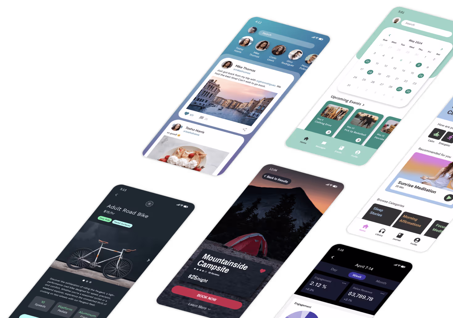
Platforms like Adalo, a no-code app builder for database-driven web apps and native iOS and Android apps—one version across all three platforms, published to the Apple App Store and Google Play, make implementing responsive images straightforward for developers of all skill levels. With built-in optimization features, these tools help ensure your app delivers the right image size to every device automatically.
- Speed is critical: 53% of mobile users leave a page if it takes over 3 seconds to load. Responsive images help your app load faster by delivering smaller, optimized files for mobile users.
- Better performance: Tools like Adalo and Imgix make it effortless to optimize images, cutting file sizes by up to 97% and load times by 91%.
- SEO advantage: Google prioritizes mobile-friendly sites. Responsive images improve rankings by meeting mobile-first indexing standards.
- User retention: Faster loading times boost engagement and conversions - just a 0.1-second speed improvement can increase conversion rates by 8.4%.

Responsive Images Impact on App Performance and User Engagement Statistics
How Responsive Images Improve User Experience
Displaying Correctly Across Different Screen Sizes
Responsive images adapt effortlessly to different devices, whether it's a smartphone, tablet, or desktop. This flexibility is crucial since 59% of global web traffic came from mobile devices in 2026. Users expect apps and websites to function flawlessly, no matter the screen size.
The technical challenge lies in meeting diverse display requirements. Take the iPhone 14, for example - it has a Device Pixel Ratio of 3. This means it requires images three times the size of their CSS pixel width to avoid blurriness. Without responsive images, you might end up delivering files that are either too large, slowing down mobile users, or too small, resulting in pixelated visuals on high-resolution screens. To address this, app builders often rely on container-based layouts that ensure images behave predictably across predefined breakpoints.
"Responsive design allows you to create a consistent and enjoyable experience for all users, regardless of the device they use." - Adalo
By maintaining this visual consistency, you're not just improving aesthetics - you’re also contributing to faster load times.
Faster Load Times Lead to Higher Engagement
Optimizing images goes beyond making them look good; it directly impacts app speed and user retention. Speed is critical, especially when 61% of users will switch to another site or app if they can’t quickly find what they need on mobile. Tailoring images to specific devices minimizes unnecessary data transfer, keeping performance snappy.
Consider this: on a 20 Mbps LTE connection, downloading a 10-image gallery of uncompressed 1 MB files takes 4 seconds. Compress those images to 40 kB each, and the download time drops to just 0.16 seconds. That’s the difference between users waiting impatiently and enjoying a smooth experience. In January 2026, Adalo showcased this with an iPhone 16 Pro photo. Originally 6.7 MB, the image was reduced to 2.1 MB - a 68% reduction - by applying a quality parameter through Imgix (?q=30).
These improvements aren’t just about speed - they drive results. Faster-loading images keep users engaged, encourage them to stick around longer, and make them more likely to complete desired actions. That’s a win for both user experience and business outcomes.
Performance Benefits of Responsive Images
Reducing Bandwidth Usage
Responsive images significantly lower data usage, which is a game-changer for mobile users. On an average LTE connection (20–30 Mbps), compressing a 1 MB image down to 40 kB can reduce download time from 0.4 seconds to just 0.16 seconds. That’s a noticeable improvement, turning sluggish load times into nearly instant experiences. Adalo simplifies this process by leveraging Imgix URL parameters, eliminating the need for manual adjustments.
Another effective technique is lazy loading, which delays image downloads until they’re actually needed. By eagerly loading above-the-fold images and deferring the rest, lazy loading can reduce image data by as much as 70%. This is particularly beneficial for users with limited data plans or slower network connections, making their browsing experience smoother and more efficient.
Maintaining Speed Across Web, iOS, and Android
Responsive images don’t just save bandwidth - they also ensure consistent performance across platforms. While building once and deploying everywhere sounds straightforward, different platforms (web, iOS, and Android) handle content rendering in unique ways. Responsive images adapt to each device’s screen size and rendering engine, ensuring your app runs smoothly everywhere. For instance, optimizing an iPhone 16 Pro photo from 6.7 MB to 2.1 MB provides faster load times across devices without requiring separate image libraries or manual resizing.
This consistency in speed isn’t just about user experience - it directly impacts business outcomes. Faster, optimized images across all platforms help keep users engaged, ultimately driving better conversions.
How to Implement Responsive Images in App Builders
Using Built-In Tools and Features
App builders simplify the process of managing responsive images through visual interfaces, making it easier to optimize images for different devices. This not only improves load times but also ensures a seamless user experience across mobile, tablet, and desktop screens. Platforms like Adalo include a screen size switcher, allowing designers to preview and adjust layouts for various devices without needing to write CSS code.
Adalo also integrates Imgix, a tool that automatically optimizes images. By appending parameters like ?q=30 to image URLs, you can control quality and file size. This method significantly reduces file sizes while ensuring users receive images tailored to their device's requirements.
To start, use container-based design by placing images within responsive "Rectangle" components that define boundaries. Then, configure anchoring and scaling rules in the Layout Tab. These settings act as visual representations of CSS properties like max-width and object-fit. You can also decide between "Shared Layouts" for uniformity across devices or "Custom Layouts" to hide or resize images specifically for smaller screens.
For those who need more advanced control, HTML and CSS techniques can complement these built-in tools.
Using HTML and CSS Techniques
While app builders handle much of the heavy lifting, developers can enhance image responsiveness by applying standard HTML and CSS practices. Visual settings in app builders translate directly into CSS properties. For example, when you adjust anchoring in the Layout Tab, you're essentially setting properties like position: absolute and defining top, bottom, left, or right. The screen size switcher functions as a visual representation of media queries, defining breakpoints for different screen sizes.
For even greater precision, developers can use srcset and sizes attributes to let browsers select the most appropriate image based on the device's pixel density and viewport width. Platforms like Adalo simplify this by leveraging Imgix, which dynamically optimizes images through URL parameters. For instance, adding ?w=500&q=75 to an image URL ensures the system delivers a version with the right dimensions and quality. This approach eliminates the need for manual coding while maintaining consistent performance across the app.
Best Practices for Optimizing Responsive Images
Compressing and Scaling Images
The size of your image files has a direct impact on how quickly your app loads. For example, a 1 MB uncompressed image takes about 0.4 seconds to download on a 20 Mbps LTE connection. Now imagine a gallery of 10 such images - users would be stuck waiting 4 seconds for them to load. That’s enough time to lose over half of your mobile visitors .
To avoid this, compress your images before uploading them and opt for modern file formats. Tools like compressor.io can shrink a typical web image from 1 MB down to just 40 kB. Formats like WebP and AVIF are game-changers, slashing file sizes by up to 95% compared to older formats like JPEG or PNG. If you're using platforms like Adalo, you can take advantage of built-in services like Imgix to dynamically adjust image quality through simple URL parameters, saving you time and effort.
Another must-do: specify width and height attributes for your images. This prevents layout shifts during loading, which not only improves the user experience but also boosts your Core Web Vitals scores. For instance, achieving a Largest Contentful Paint (LCP) time of around 1 second can lead to a 13% increase in conversion rates.
Once your images are optimized, focus on how they’re delivered by deferring non-critical image loads.
Implementing Lazy Loading
File size isn’t the only factor in performance - load order matters too. Lazy loading is a smart way to manage this. By deferring the download of images until they’re needed, you can save bandwidth and speed up your app’s initial load time. This approach ensures that only the images visible in the user’s viewport load first, while others load as the user scrolls.
That said, don’t apply lazy loading to images above the fold. Studies show that lazy loading all images can increase the median LCP from 2,922 ms to 3,546 ms - a 21% slowdown. Instead, load key images, like the first featured image or main content image, eagerly. For everything else below the fold, use the loading="lazy" attribute to strike the right balance between speed and efficiency.
Using Content Delivery Networks (CDNs)
Content Delivery Networks (CDNs) play a crucial role in image optimization by delivering files from servers closer to your users, reducing latency and improving load times - especially for apps with a global audience. But modern CDNs like Imgix and Cloudinary don’t stop there. They allow you to resize, compress, and even convert images to different formats on the fly, all through URL parameters .
The results speak for themselves. Converting an image to WebP can cut file size by 39–55%, and AVIF can shrink it by up to 74% with no noticeable quality loss. When combined with responsive loading, CDNs can slash load times by 91% and reduce file sizes by 97% compared to serving a single, unoptimized image. Adalo’s infrastructure, which leverages CDN distribution, processes over 20 million daily requests with 99% uptime, proving how CDNs enable apps to scale while maintaining stellar performance.
Conclusion
Responsive images play a crucial role in creating apps that perform well and keep users engaged. When images are optimized to adapt seamlessly to different screen sizes, load quickly, and minimize data usage, they directly address user expectations. Consider this: 53% of mobile users abandon an app if it takes more than 3 seconds to load, and even shaving off 0.1 seconds from load time can boost conversion rates by 8.4%. Clearly, speed matters.
Fortunately, implementing responsive images doesn’t have to be complicated. Platforms like Adalo simplify the process by automatically optimizing images across web, iOS, and Android from a single build. Combine this with techniques such as compression (turning a hefty 1 MB image into a slim 40 kB), using modern formats like WebP and AVIF, and employing lazy loading, and you can achieve impressive results - up to a 97% reduction in file size and 91% faster load times. These tools and methods ensure your app delivers a faster, smoother experience.
"No one ever said, 'Please make me wait longer.' But if you're not optimizing the images on your website, that's exactly what you're doing: you're making your users needlessly wait and wasting their mobile data along the way."
– Ryan Feigenbaum, UX Designer
The benefits of responsive images extend beyond user satisfaction. Faster load times lead to higher user retention, better search rankings, and improved conversion rates. Whether you're launching a new MVP, modernizing your development approach, or building tools for internal use, responsive images ensure your app scales efficiently while delivering reliable, fast performance.
Related Blog Posts
- 8 Ways to Optimize Your No-Code App Performance
- How to Reduce App Load Times with Data Optimization
- 5 Metrics to Track No-Code App Performance
- Scaling No-Code Apps for Large Data Sets
FAQs
Why are responsive images important for app performance?
Responsive images play a key role in boosting app performance. They adapt automatically to the user's device by adjusting size, format, and resolution, ensuring your app loads faster and runs more efficiently. This means shorter load times, less bandwidth usage, and a smoother experience for users.
Optimizing image handling doesn't just improve speed - it also helps users save data, making your app more accessible, especially for those on mobile devices. Given the wide range of network speeds and hardware capabilities, this kind of optimization is crucial for meeting user expectations.
How can I optimize images for better performance in app-building platforms?
Optimizing images plays a key role in boosting app performance and ensuring a smooth user experience. The first step is to compress your image files to make them smaller without losing their quality. You can achieve this with tools or scripts designed specifically for image compression. It's also important to resize images to fit their intended dimensions and use modern formats like WebP, which are designed for faster loading.
Another smart approach is implementing lazy loading. This technique loads images only when they’re about to appear on the screen, cutting down on initial load times and saving bandwidth - especially handy for mobile users. By combining these strategies, you can create an app that’s not just faster but also more responsive for your audience.
What makes lazy loading important for responsive images?
Lazy loading plays a key role in handling responsive images, offering benefits for both user experience and application performance. By postponing the download of images until they’re actually needed, it helps save data, speeds up the initial load time, and minimizes unnecessary strain on the network.
That said, balance is crucial. Images that appear in the initial viewport - those immediately visible to users - should load right away to prevent any delays in rendering. For everything else, lazy loading keeps your app running efficiently and ensures responsiveness without compromising on speed.


