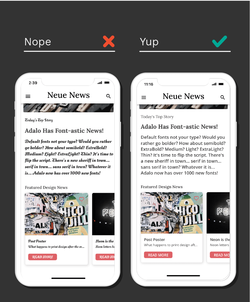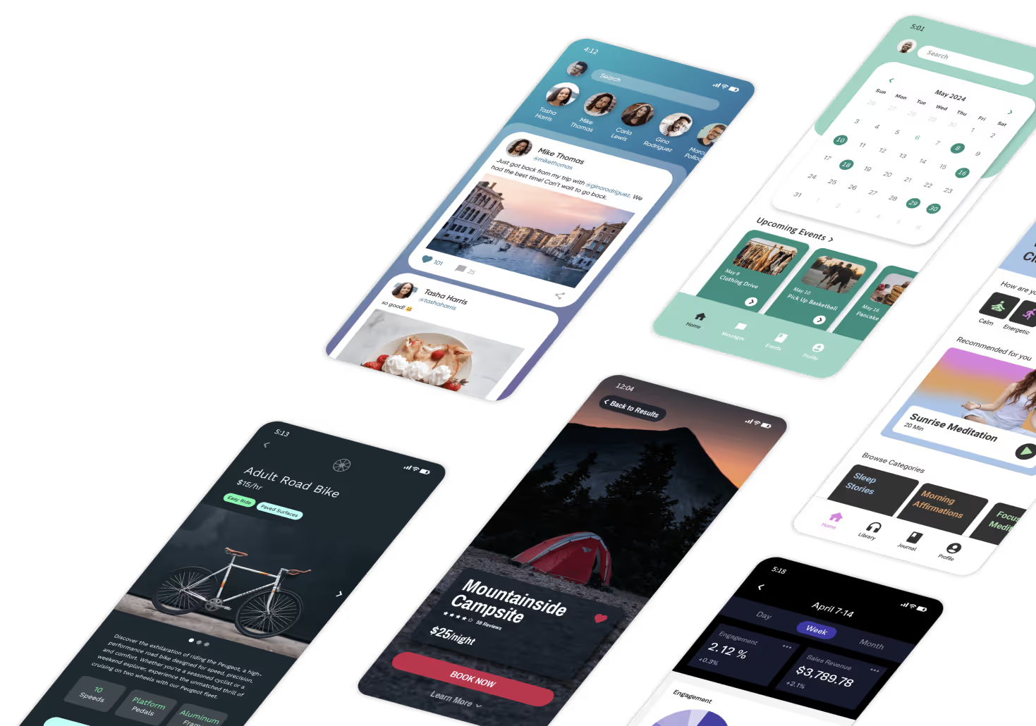
Typography can make or break your app's user experience. The right font choices create visual hierarchy, reinforce your brand, and keep users engaged. The wrong choices create confusion and friction. Here's how to nail your app's typography—whether you're building with Adalo's AI-powered app builder or designing from scratch.
Limit App Design to 2 Fonts
One font is often enough. Many successful apps use a single typeface with different weights to create hierarchy. If you're going with one, use the system default or a similar sans serif font for maximum compatibility.

If you use two fonts, assign one for headers (titles and high-level type) and one for body content (article copy, descriptions). Maintain a 90/10 ratio—body text should dominate, with headings used sparingly for emphasis.
Pro Tip: Different weights and capitalization can extract a full range of styles from just two fonts without adding visual complexity.
Maintain Legibility While Styling
Header fonts can be decorative, serif, or sans serif—they're meant to catch attention. But body copy, buttons, and overlines should use a sans serif with low contrast for easy reading.

Leave plenty of margin space around components. Keep high contrast between text and background colors—this isn't just aesthetic, it's an accessibility requirement.

Pro Tip: While it may be tempting to think outside the box while designing, legibility and easy information transfer should be your top priority. Keep it clean, accessible, and simple.
Consider Hierarchy of Information
List headings should be bold and larger than body font. Body text works best in medium, regular, or light weights—never bold for extended reading.

Pro Tip: Beyond weight and point size, experiment with capitalization to distinguish between headings, subheadings, overlines, body copy, and captions.

Keep Font Sizes Consistent
Body copy should be 14-18pt for comfortable reading on mobile screens. Aim for 5-9 words per line—too wide and eyes lose their place, too narrow and reading becomes choppy.

Headlines should be 3-4 lines maximum with 1-2 words per line. This creates scannable content that users can quickly parse.
Pro Tip: Limit hierarchy levels on each screen and keep those levels consistent across similar screens throughout your app.

Set Rules for Your Font Colors
Vibrant colored text signals clickability. Users expect colored text to be interactive, so reserve bright colors for links and buttons.

Titles work best in black or dark gray. Subtitles should be lighter shades of gray to create visual separation. Don't use too many colors—a limited palette keeps your design cohesive.

Pro Tip: You can use color for subtitles or headings, but maintain consistency and don't mix that with button text of the same color on the same screen.
Consider Your Brand Voice and Audience

Get inspiration from fonts used by other apps in your industry. Use Google Fonts' suggested pairing feature to find complementary combinations that work well together.

If your preferred font isn't available on your platform, find a similar alternative using resources like Typewolf and Google Fonts.
Pro Tip: Pairing a serif with a sans serif is a safe bet for balanced design. You can also explore FontsinUse for real-world inspiration.
Bringing Typography to Life in Your App
Adalo is a no-code app builder for database-driven web apps and native iOS and Android apps—one version across all three platforms, published to the Apple App Store and Google Play. This AI-powered platform makes implementing these typography principles straightforward. Customize fonts, weights, sizes, and colors across your entire app from one place, so your typography stays consistent across every platform.
Need help perfecting your app's design? Work with any of our Adalo experts for 1:1 coaching, custom builds, or design refinements.
FAQ
Why choose Adalo over other app building solutions?
Adalo is an AI-powered app builder that creates true native iOS and Android apps from a single codebase. Unlike web wrappers, it compiles to native code and publishes directly to both the Apple App Store and Google Play Store—handling the hardest part of launching an app automatically.
What's the fastest way to build and publish an app to the App Store?
Ada, Adalo's AI builder, lets you describe what you want and generates your app. Magic Start creates complete app foundations from a description, while Magic Add adds features through natural language.
Adalo's drag-and-drop interface lets you build visually, with AI-assisted features like Magic Start generating complete app foundations from descriptions. The platform handles the entire App Store submission process, so you can go from idea to published app without coding.
How many fonts should I use in my app design?
Limit your app to a maximum of two fonts—one for headers and one for body text. Many successful apps use just one font with different weights and capitalization to create visual hierarchy while keeping the design clean.
What font size should I use for body copy in my app?
Body copy should be 14-18pt for optimal readability. Aim for 5-9 words per line, and keep headlines to 3-4 lines maximum with 1-2 words per line for a scannable layout.
How do I choose the right font colors for my app?
Use vibrant colored text primarily for clickable elements. Titles should be black or dark gray, subtitles in lighter gray shades. Always ensure high contrast between text and background for accessibility.
Can I easily customize fonts and typography in Adalo?
Yes, Adalo lets you customize fonts, weights, sizes, and colors throughout your app. You can create professional typography hierarchy that aligns with your brand—all without writing code.
How can I find fonts that match my brand voice?
Look at fonts used by apps in your industry for inspiration. Use Google Fonts' suggested pairing feature, and explore resources like Typewolf and FontsinUse. Pairing a serif with a sans serif is a reliable approach for balanced design.
Do I need coding experience to build a well-designed app?
No. Adalo's visual builder has been described as "easy as PowerPoint," letting you implement professional typography and design principles without any coding knowledge.


