


Why Adalo Works for Building a Design Collaboration Tool
Adalo is a no-code app builder for database-driven web apps and native iOS and Android apps—one version across all three platforms, published to the Apple App Store and Google Play. This cross-platform capability makes it uniquely suited for creating design collaboration tools, where team members need seamless access whether they're reviewing projects on desktop or providing quick feedback from their mobile devices.
App store distribution is essential for design tools that teams rely on daily. With native iOS and Android apps, your Figma-style clone can send push notifications when collaborators leave comments, share new designs, or request feedback—keeping everyone in sync without constant email checking. This real-time connectivity transforms how distributed teams collaborate on visual projects.
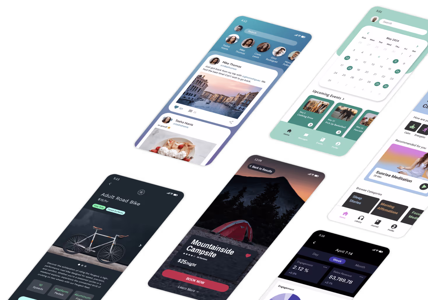
Design collaboration tools have transformed how teams create digital products, but building one from scratch typically requires significant engineering resources and months of development. What if you could create a functional Figma-style design tool without writing code?
Adalo, an AI-powered app builder, makes this possible. The platform creates native iOS and Android apps alongside web apps from a single codebase—all publishable to the Apple App Store and Google Play. This cross-platform capability is ideal for design tools that teams need to access from any device, whether reviewing projects on desktop or providing feedback on mobile.
This comprehensive tutorial walks you through building a functional design collaboration tool using Adalo's visual builder. While replicating every Figma feature would require advanced engineering, you'll learn how to create a working design app with project management, canvas editing, component libraries, commenting, and collaboration features. By the end, you'll have a deployable design tool that can serve teams needing simplified design workflows.
Why Adalo Works for Building a Design Collaboration Tool
Building a design collaboration app requires robust database functionality to manage projects, user permissions, and comments—all strengths of Adalo's platform. With unlimited database records on paid plans, you won't hit storage walls as your user base grows. The platform processes over 20 million daily data requests, demonstrating infrastructure capable of handling collaborative team workflows.
Native app store publishing means you can distribute your design tool to team members who prefer mobile access, complete with push notifications for new comments or design updates. One build updates web, iOS, and Android simultaneously—no managing separate codebases for each platform.
Prerequisites and Initial Setup
Step 1: Create Your Adalo Account and Project
- Visit Adalo.com and sign up for a free account
- Click "Create New App" from your dashboard
- Choose "Web App" (recommended for design tools, though mobile support is included)
- Name your project (e.g., "DesignHub" or "CollabCanvas")
- Select "Start from Scratch" since no design tool templates are available
Adalo's free plan is suitable for prototyping your design tool. Check the current pricing page for up-to-date limits and entitlements.
Step 2: Configure Your App Theme
- Select a primary color that reflects professional design software (e.g., dark blue or charcoal)
- Choose a secondary accent color for interactive elements (e.g., bright blue or purple)
- Pick a clean, readable sans-serif font for UI elements
- Click "Continue" to enter the Adalo builder interface
Step 3: Plan Your Feature Scope
Before building, understand what's realistic with visual development:
Achievable Features:
- Project and file management
- Canvas workspace with layers
- Shape and text elements
- Component libraries
- Commenting and feedback
- Version history
- Team member management
- Export capabilities
Advanced Features (Require Workarounds):
- Real-time cursor tracking (limited without WebSocket infrastructure)
- Operational transformation for simultaneous editing (complex)
- Vector path editing (best approached with simplified tools)
- Advanced pen tool functionality
Since 70% of applications will use visual development tools by 2026, starting with core features and iterating is a proven approach.
Building the Database Structure
Step 4: Enhance the Users Collection
- Click the Database icon in the left sidebar
- Select the existing "Users" collection
- Add these properties (click "+ Add Property" for each):
- Full Name (Text)
- Profile Photo (Image)
- Role (Text) - Values: "Admin", "Editor", "Viewer"
- Company (Text)
- Job Title (Text)
- Last Active (Date & Time)
- Notification Preferences (True/False)
- Active Status (Text) - Values: "Online", "Away", "Offline"
Learn more about Adalo's database
Step 5: Create the Projects Collection
- Click "+ Add Collection"
- Name it "Projects"
- Add these properties:
- Project Name (Text)
- Description (Text - Multiline)
- Thumbnail (Image)
- Status (Text) - Values: "Active", "Archived", "Template"
- Created Date (Date & Time - Automatic)
- Last Modified (Date & Time)
- Color Tag (Text)
- Folder (Text)
Step 6: Create the Artboards Collection
- Click "+ Add Collection"
- Name it "Artboards"
- Add properties:
- Artboard Name (Text)
- Width (Number) - Default: 1920
- Height (Number) - Default: 1080
- Background Color (Text) - HEX code
- Order (Number)
- Zoom Level (Number) - Default: 100
- Is Template (True/False)
- Created Date (Date & Time - Automatic)
- Last Modified (Date & Time)
Step 7: Create the Design Elements Collection
- Click "+ Add Collection"
- Name it "Elements"
- Add properties:
- Element Type (Text) - Values: "Rectangle", "Circle", "Text", "Image", "Component"
- Element Name (Text)
- X Position (Number)
- Y Position (Number)
- Width (Number)
- Height (Number)
- Fill Color (Text) - HEX code
- Stroke Color (Text) - HEX code
- Stroke Width (Number)
- Opacity (Number) - Default: 100
- Rotation (Number) - Default: 0
- Layer Order (Number)
- Text Content (Text - Multiline)
- Font Family (Text)
- Font Size (Number)
- Font Weight (Text)
- Image URL (Image)
- Is Locked (True/False)
- Is Visible (True/False)
- Created Date (Date & Time)
Step 8: Create the Components Collection
- Click "+ Add Collection"
- Name it "Components"
- Add properties:
- Component Name (Text)
- Category (Text) - Values: "Buttons", "Forms", "Navigation", "Cards", "Icons"
- Thumbnail (Image)
- Description (Text)
- Is Shared (True/False)
- Use Count (Number)
- Created Date (Date & Time)
Step 9: Create the Comments Collection
- Click "+ Add Collection"
- Name it "Comments"
- Add properties:
- Comment Text (Text - Multiline)
- X Position (Number) - Pin location
- Y Position (Number) - Pin location
- Status (Text) - Values: "Open", "Resolved", "Archived"
- Created Date (Date & Time - Automatic)
- Resolved Date (Date & Time)
- Is Edited (True/False)
Step 10: Create the Version History Collection
- Click "+ Add Collection"
- Name it "Versions"
- Add properties:
- Version Number (Number)
- Version Name (Text)
- Snapshot Data (Text - JSON format for storing state)
- Change Description (Text)
- Created Date (Date & Time - Automatic)
- Thumbnail (Image)
Step 11: Set Up Database Relationships
- In the Projects collection:
- Add relationship to Users: "Owner" (Many Projects to One User)
- Add relationship to Users: "Team Members" (Many-to-Many)
- Add relationship to Artboards: One-to-Many
- In Artboards collection:
- Add relationship to Projects: Many-to-One
- Add relationship to Elements: One-to-Many
- Add relationship to Comments: One-to-Many
- Add relationship to Versions: One-to-Many
- In the Elements collection:
- Add relationship to Artboards: Many-to-One
- Add relationship to Components: Many-to-One (optional)
- In Comments collection:
- Add relationship to Users: "Author" (Many-to-One)
- Add relationship to Artboards: Many-to-One
- Add relationship to Comments: "Parent Comment" (for replies)
- In the Versions collection:
- Add relationship to Artboards: Many-to-One
- Add relationship to Users: "Created By" (Many-to-One)
With Adalo's relational database and no record limits on paid plans, this structure handles design team workflows efficiently. The platform's 3.0 infrastructure overhaul (launched late 2025) made apps 3-4x faster, with modular infrastructure that scales with your needs.
Installing Required Components
Step 12: Explore the Component Marketplace
- Navigate to the Adalo Marketplace
- Search for and install these components:
- Color Picker component
- Rich Text Editor (if available)
- File Upload component for images
- Canvas/Drawing components (check for community options)
Step 13: Set Up Image Upload Component
- In Marketplace, search for "Image Upload" or "File Upload"
- Click "Install" on a suitable component
- Note: You may need cloud storage integration (Cloudinary, AWS S3) for production use
Step 14: Install Collaboration Components
- Search for "Comment" or "Annotation" components
- Look for any real-time update components (though functionality may be limited)
- Install notification components for team alerts
Creating User Authentication and Onboarding
Step 15: Build the Welcome Screen
- On the default home screen, rename it to "Welcome"
- Add your app logo image at the top
- Add heading text: "Design Together, Build Faster"
- Add subheading: "Collaborative design tool built for modern teams"
- Add two buttons:
- "Sign Up" → Link to new screen "Sign Up"
- "Log In" → Link to new screen "Login"
- Add sample screenshots or design previews
Step 16: Create Sign Up Screen
- Add a new screen "Sign Up"
- Add Form component connected to Users collection:
- Email (Email Input)
- Password (Password Input)
- Full Name (Text Input)
- Company (Text Input - optional)
- Job Title (Text Input - optional)
- Add terms of service checkbox
- Submit button action:
- Create a User account
- Set Role to "Editor" (default)
- Link to "Dashboard" screen
Step 17: Build Login Screen
- Add a new screen "Login"
- Add Form component for authentication:
- Email (Email Input)
- Password (Password Input)
- "Remember Me" toggle (optional)
- Add "Forgot Password?" link
- Submit → Link to "Dashboard"
Step 18: Create Onboarding Flow
- Add a new screen "Getting Started"
- Show first-time users a brief tutorial:
- Create your first project
- Explore the canvas
- Invite team members
- Add "Skip" and "Next" buttons
- Final step → Link to "Dashboard"
Building the Project Dashboard
Step 19: Create the Main Dashboard
- Add a new screen "Dashboard"
- Add top navigation bar:
- App logo (left)
- "New Project" button (center-right)
- User profile dropdown (right)
- Add sidebar with sections:
- Recent Projects
- Shared with Me
- Templates
- Archived
- Main area: Grid or list of projects
Step 20: Display Projects List
- Add Custom List component
- Connect to the Projects collection
- Filter: Team Members includes Logged In User OR Owner = Logged In User
- Sort by: Last Modified (Newest First)
- For each project card, show:
- Thumbnail image
- Project name
- Last modified date
- Owner name
- Team member avatars (first 3-4)
- Status indicator
- Click action → Link to "Canvas Editor" screen
Step 21: Add Project Creation Modal
- Create "New Project" screen (modal style)
- Add Form to create a new Project:
- Project Name (Text Input)
- Description (Text Area)
- Choose template dropdown (optional)
- Folder selection
- Color tag picker
- Submit actions:
- Create Project record
- Set Owner to Logged In User
- Create default Artboard
- Navigate to "Canvas Editor"
Step 22: Build Project Settings
- Add "Project Settings" screen
- Include sections for:
- General info (name, description)
- Team members management
- Sharing permissions
- Export settings
- Archive/Delete options
- Add a List of team members with role dropdowns
Designing the Canvas Editor Interface
Step 23: Create the Canvas Editor Screen
- Add a new screen "Canvas Editor"
- Set layout to full-width, minimal padding
- Add top toolbar section:
- Back button → Dashboard
- Project name (editable)
- View options (zoom level dropdown)
- Share button
- User avatars (showing active collaborators)
- User profile menu
- Add left sidebar for tools:
- Selection tool
- Shape tools (Rectangle, Circle, Line)
- Text tool
- Image upload
- Component picker
- Add left panel for layers:
- Collapsible layer tree
- Show/hide toggles
- Lock toggles
Step 24: Build the Canvas Workspace
- Add a large container for the canvas area (60-70% of screen width)
- Set background color to light gray (#F5F5F5)
- Add an inner container for the artboard:
- White background
- Drop shadow
- Dimensions based on Current Artboard → Width and Height
- This is where design elements will be positioned
Step 25: Create the Properties Panel
- Add right sidebar (20-25% of screen width)
- Show properties based on selected element:
- Position (X, Y coordinates)
- Size (Width, Height)
- Fill color picker
- Stroke color and width
- Opacity slider
- Rotation input
- Layer effects
- Use conditional visibility based on Element Type
Step 26: Add the Layers Panel
- In the left sidebar, add a Custom List of Elements
- Connect to the Elements collection
- Filter: Artboard = Current Artboard
- Sort by: Layer Order (Descending)
- For each layer item, show:
- Element icon (based on type)
- Element name (editable)
- Visibility toggle
- Lock toggle
- Click action → Set as selected element
- Drag-and-drop reordering (if component available, otherwise use up/down buttons)
Creating Design Tools and Elements
Step 27: Build Shape Creation Tools
- Add the "Add Rectangle" button to the toolbar
- Click action:
- Create a new Element record
- Set Element Type = "Rectangle"
- Set default Width = 100, Height = 100
- Set X/Y to the center of the canvas
- Set Fill Color = current color selection
- Set Layer Order = highest + 1
- Refresh the Elements list
- Repeat for other shapes:
- Circle (store as type with equal width/height)
- Line (different properties)
Step 28: Implement Text Tool
- Add the "Add Text" button to the toolbar
- Click action:
- Create Element with Type = "Text"
- Set default Text Content = "Double click to edit"
- Set Font Family = app default
- Set Font Size = 16
- Position at canvas center
- Add text editing:
- Click on text element → Show text input modal
- Update Element → Text Content
- Apply font formatting from the properties panel
Step 29: Create Image Upload Function
- Add the "Upload Image" button to the toolbar
- Use the Image Picker component
- On image selected:
- Create Element with Type = "Image"
- Set the Image URL to the uploaded file
- Calculate width/height to fit the canvas
- Add to the current artboard
Step 30: Build Component Library Panel
- Add "Components" tab in the left sidebar
- Show Custom List of Components
- Filter by: Is Shared = True OR Created By = Logged In User
- Group by Category
- Click on component:
- Duplicate all Elements associated with that Component
- Add to current Artboard
- Maintain relative positioning
Step 31: Implement Element Selection
- Add a click action to each element on the canvas:
- Set custom property "Selected Element" = This Element
- Show properties panel with element data
- Add visual selection indicator (border highlight)
- Add multi-select option (shift+click):
- Store selected elements in a custom list
- Show the combined properties panel
Step 32: Add Element Manipulation
- In the properties panel, add inputs for:
- X Position → Update Element on change
- Y Position → Update Element on change
- Width → Update Element
- Height → Update Element
- Rotation → Update Element
- Add alignment buttons:
- Align left, center, right
- Align top, middle, bottom
- Distribute evenly
- Add grouping function:
- Create parent-child relationships between Elements
Step 33: Create Color Picker Tool
- Install the Color Picker component from the marketplace
- Add to properties panel
- On color selected:
- Update Selected Element → Fill Color
- Add color to the recent colors list
- Update canvas display
Step 34: Build Layer Ordering Controls
- Add buttons for each layer in the layers panel:
- Move Up → Decrease Layer Order
- Move Down → Increase Layer Order
- Bring to Front → Set Layer Order = 0
- Send to Back → Set Layer Order = highest + 1
- Update all affected elements' Layer Order
Implementing Collaboration Features
Step 35: Add Team Member Invitations
- Create "Invite Team" modal screen
- Add Form for invitation:
- Email addresses (text input, comma-separated)
- Role selection (Dropdown: Editor, Viewer)
- Personal message (text area)
- Submit action:
- Create an invitation record
- Send email notification (via Zapier integration)
- Add user to Project → Team Members
Step 36: Build Commenting System
- Add "Comment Mode" toggle in toolbar
- When enabled, click on the canvas:
- Show comment input modal
- Create a Comment record with X/Y position
- Link to Current Artboard and Logged In User
- Display the comment pin on the canvas
- Show comment pins:
- Add Custom List overlaid on canvas
- Filter: Artboard = Current AND Status ≠ "Archived"
- Position each pin using X/Y coordinates
- Show comment count badge
Step 37: Create Comment Thread View
- Click on comment pin → Open "Comment Thread" modal
- Show comment details:
- Author name and photo
- Comment text
- Created date
- Reply count
- Add Custom List of replies (Comments where Parent Comment = This Comment)
- Add reply input form
- Add "Resolve" button:
- Update Comment → Status = "Resolved"
- Change pin appearance or hide
Step 38: Implement Presence Indicators
- Add "Active Users" section in the top bar
- Show Custom List of Users:
- Filter: Team Members of Current Project AND Last Active within 5 minutes
- Show profile photos in a row
- Add a colored border for each user
- Update Logged In User → Last Active on any action
- Use the Timer component to refresh every 30 seconds
Note: True real-time collaboration typically requires WebSocket infrastructure. Adalo's refresh approach provides near-real-time updates suitable for small teams.
Step 39: Add Activity Feed
- Create "Activity" collection:
- Action Type (Created, Edited, Deleted, Commented)
- User reference
- Element/Project reference
- Timestamp
- Add an activity panel to the right sidebar
- Show recent actions by all team members
- Auto-refresh every 10-15 seconds
Step 40: Build Version History
- Add a "Save Version" button to the toolbar
- Click action:
- Create Version record
- Capture current artboard state (JSON of all Elements)
- Set Version Number = latest + 1
- Prompt for version name/description
- Create "Version History" screen:
- List all versions with thumbnails
- Click to preview
- "Restore" button to revert
Adding Prototyping Features
Step 41: Create Prototype Mode Toggle
- Add "Prototype" tab next to "Design" in canvas view
- Switch modes:
- Design mode: Edit elements
- Prototype mode: Create interactive links
- Store mode in the custom property
Step 42: Build Screen Linking
- In Prototype mode, add the "Link" tool
- Click on an element → Show link configuration modal:
- Target Artboard (dropdown of all artboards in project)
- Transition type (dropdown: None, Slide, Fade)
- Trigger type (On Click, On Hover)
- Store links in "Prototype Links" collection:
- Source Element
- Target Artboard
- Transition settings
Step 43: Create Prototype Preview
- Add "Play" button in toolbar (Prototype mode)
- Open "Prototype Viewer" screen:
- Full-screen artboard display
- Start with the first artboard or the current artboard
- Elements with prototype links become clickable
- Click action → Navigate to target artboard
- Show transition animation (if possible with Adalo)
- Add navigation breadcrumbs
- Add "Exit Preview" button
Step 44: Build Interactive Hotspot Display
- In Prototype mode, overlay hotspot indicators on linked elements
- Show Custom List of Elements with Prototype Links
- Display a semi-transparent overlay on each
- Show connection lines to target screens
Integrating External Services
Step 45: Set Up Cloud Storage Integration
- For image handling at scale, integrate with Cloudinary or Uploadcare
- Use Adalo's API integration via External Collections
- Configure:
- Upload endpoint
- Image URL response
- Transform parameters (resize, compress)
- Update image upload flow to use external API
Step 46: Connect Export Functionality
- Create "Export" modal screen
- Add export options:
- Format: PNG, JPG, SVG (if supported), PDF
- Quality/Resolution selection
- Artboard selection (current or all)
- Use an external API (like CloudConvert) for format conversion
- Download link generation
Step 47: Integrate with Zapier for Automation
- Install Zapier integration from the Adalo marketplace
- Set up Zaps for:
- New project created → Send Slack notification
- Team member invited → Send custom email
- Comment added → Notify assignees
- Version saved → Create backup in Google Drive
- Configure webhook triggers in Adalo actions
Step 48: Add Slack Integration
- Create Zapier workflow: Adalo Comment → Slack Message
- Include in message:
- Commenter name
- Project name
- Comment text
- Direct link to the project
- Configure notification preferences per user
Step 49: Connect Design Asset Libraries
- Use External Collections to connect:
- Unsplash API for stock photos
- Google Fonts API for typography
- Icon libraries (Feather Icons, Font Awesome)
- Add search interfaces in respective panels
- Import assets directly to the artboard
Building Responsive and Mobile Versions
Step 50: Optimize for Web Display
- Ensure the canvas editor works at different viewport widths
- Add responsive breakpoint handling:
- Desktop: Full panel layout
- Tablet: Collapsible sidebars
- Mobile: Bottom toolbar, full-width canvas
- Test at common resolutions (1920, 1440, 1280)
Step 51: Create Mobile Companion App
- Add a new screen "Mobile Dashboard"
- Simplified mobile view showing:
- Project thumbnails (grid view)
- Recent activity feed
- Comments assigned to the user
- Quick preview mode
- Limited editing (comments and basic properties only)
- Full canvas editing remains desktop-focused
Since Adalo components work across web and native platforms, your design tool can have companion mobile apps for review and feedback—all from the same codebase.
Step 52: Test Cross-Platform Compatibility
- Preview in Adalo's web previewer
- Test on actual mobile devices using the Adalo mobile app
- Check that:
- Images load properly
- Forms are usable
- Navigation works smoothly
- Data syncs correctly
Publishing Your Design Tool
Step 53: Prepare for Launch
- Set up custom domain (requires Starter plan at $36/month billed annually)
- Configure app settings:
- App icon
- Splash screen
- Meta description for SEO
- Privacy policy link
- Terms of service
- Set up SSL certificate (automatic with custom domain)
Step 54: Configure Publishing Settings
- Go to App Settings → Publishing
- For web app:
- Choose the custom domain option
- Enter your domain name
- Follow the DNS configuration steps
- For mobile apps (optional):
- Prepare app store assets (icons, screenshots)
- Write app description
- Note: Apple developer license ($99/year) and Google Play Developer registration ($25 one-time fee) required
Adalo handles the complex App Store submission process, so you can focus on your app's features instead of wrestling with certificates, provisioning profiles, and store guidelines.
Step 55: Set Up User Limits and Billing
- Determine pricing model:
- Free tier (limited projects/collaborators)
- Pro tier (unlimited projects)
- Team tier (advanced features)
- Create a "Subscription" collection to track user plans
- Integrate with Stripe for payments (via marketplace component)
- Add upgrade prompts when limits are reached
Step 56: Optimize Performance
- Review database queries:
- Add filters to limit data loads
- Use pagination for large lists
- Cache frequently accessed data
- Optimize images:
- Compress thumbnails
- Use lazy loading
- Implement CDN for assets
- Monitor app speed using Adalo's X-Ray feature, which identifies performance issues before they affect users
Step 57: Set Up Analytics
- Add Google Analytics or Mixpanel tracking
- Track key metrics:
- User signups
- Projects created
- Active collaborators
- Element creation count
- Session duration
- Set up conversion funnels:
- Signup → First project
- Project → Team invitation
- Free → Paid upgrade
Testing Your Design Tool
Step 58: Create Test Data
- Generate sample projects:
- 5-10 projects with different statuses
- Various artboard sizes
- Multiple design elements per artboard
- Create test users:
- 1 admin account
- 3-4 editor accounts
- 2 viewer accounts
- Add sample comments and version history
Step 59: Test Core Workflows
- Project creation flow:
- Create a new project
- Add artboard
- Verify the project appears in the dashboard
- Element creation:
- Add rectangle, circle, text, image
- Verify properties panel updates
- Test element manipulation (move, resize, rotate)
- Collaboration features:
- Invite a team member
- Add comments
- Check presence indicators
- Verify activity feed updates
- Prototyping:
- Create links between artboards
- Test prototype preview mode
- Verify transitions work
Step 60: Test Permission Systems
- Log in as Viewer:
- Confirm cannot edit elements
- Can only add comments
- Can view all artboards
- Log in as Editor:
- Can create and edit elements
- Can invite new team members
- Cannot delete the project
- Test owner permissions
Step 61: Performance Testing
- Create an artboard with 50+ elements
- Test loading time and responsiveness
- Verify smooth scrolling and zooming
- Check memory usage doesn't cause crashes
- Test on slower internet connections
Visual development tools can reduce development time significantly—often by 50% or more—meaning you've likely built this tool in weeks rather than months. Thorough testing ensures quality before launch.
Advanced Features and Optimization
Step 62: Add Keyboard Shortcuts
- Create "Keyboard Shortcuts" guide screen
- Implement common shortcuts:
- Ctrl+C / Cmd+C: Copy selected element
- Ctrl+V / Cmd+V: Paste element
- Delete: Remove selected element
- Ctrl+Z: Undo (via version history)
- Ctrl+D: Duplicate element
- Spacebar: Switch to pan mode
Note: Keyboard shortcut implementation in Adalo is limited; consider using custom code components if available.
Step 63: Build Template System
- Create "Templates" collection linked to Projects
- Add "Save as Template" option in the project menu
- Create "Templates Gallery" screen:
- Show template thumbnails
- Filter by category
- Preview before using
- "Use Template" action:
- Duplicate all artboards and elements
- Create a new project from a template
- Assign to current user
Step 64: Implement Search Functionality
- Add a search bar in the dashboard
- Search across:
- Project names
- Element names within projects
- Comments
- Team member names
- Display results grouped by type
- Quick navigation to search results
Step 65: Add Export Presets
- Create "Export Presets" collection:
- Preset name (e.g., "Social Media", "Print", "Web")
- Format, dimensions, and DPI settings
- Show presets in export modal
- Allow users to save custom presets
- One-click export using preset configurations
Step 66: Build Design System Manager
- Create "Styles" collection:
- Color palettes (array of HEX codes)
- Typography scales (font families, sizes)
- Spacing values
- Border radius presets
- Add "Design System" panel
- Apply styles to elements with one click
- Share design systems across projects
Scaling Your Design Tool
Step 67: Plan for Growth
As your user base expands, consider these Adalo pricing tiers:
| Plan | Price | Key Features |
|---|---|---|
| Starter | $36/month (annual) | 1 published app, custom domain, unlimited usage |
| Professional | $52/month | 2 apps, 5 collaborators, 25GB storage, integrations |
| Team | $160/month | 5 apps, 10 editors, priority support, Xano integration |
| Business | $250/mo | 10 apps, custom editor limits, special add-on pricing |
All paid plans include unlimited database records and no usage-based charges—no bill shock as your app scales. Choose based on your team size and feature requirements.
Step 68: Optimize Database Performance
- Review frequently accessed collections
- Add database indexes on commonly filtered properties:
- Projects: Last Modified, Owner
- Elements: Artboard, Layer Order
- Comments: Status, Artboard
- Archive old projects to a separate collection
- Implement data pagination for large lists
With proper data relationship setups, Adalo apps can scale beyond 1 million monthly active users. The platform's modular infrastructure scales with your needs—no upper ceiling.
Step 69: Add Premium Features
- Create a feature flag system:
- Advanced components (premium only)
- Unlimited team members (premium only)
- Extended version history (premium only)
- Priority rendering (premium only)
- Gate features based on user subscription level
- Show upgrade prompts for premium features
Step 70: Implement Usage Analytics
- Track usage metrics per user:
- Projects created
- Artboards created
- Elements added
- Collaboration actions
- Set usage limits for the free tier
- Display usage dashboard in account settings
- Alert users approaching limits
Why Adalo Makes Building a Design Tool Accessible
Creating a collaborative design tool traditionally requires significant engineering resources—teams of developers, complex real-time infrastructure, and months of development. With Adalo's AI-assisted platform, you can build a functional design collaboration app in a fraction of that time and cost.
True Visual Development: Adalo's "what you see is what you get" builder and drag-and-drop interface (without complicated flexbox) let you design your app's interface exactly as users will see it. The builder can display up to 400 screens at once on a single canvas—crucial for complex apps with many interconnected views.
Built-in Relational Database: The built-in database with custom formulas, AND/OR logic, and relational capabilities handles complex data structures needed for projects, artboards, elements, and version history. No separate database setup required—unlike platforms like FlutterFlow where you must source, configure, and pay for your own database infrastructure.
Cross-Platform Publishing: All components work across web and native platforms, so your design tool can have a primary web interface plus companion mobile apps for reviewing designs on the go. One build publishes to web, iOS App Store, and Android Play Store—updates to your app automatically deploy across all platforms.
Extensibility Through Integrations: With integrations for Xano, Airtable, Zapier, and Make, plus API integration capabilities, you can extend functionality beyond Adalo's built-in features—connecting cloud storage, export services, and notification systems.
Proven Platform Stability: With over 3 million apps created and 20 million+ daily data requests processed, Adalo has the infrastructure to support collaborative applications with multiple active users. The Adalo 3.0 infrastructure overhaul (launched late 2025) made apps 3-4x faster with modular scaling capabilities.
Cost-Effective Development: Traditional app development typically costs $60,000–$150,000+ for medium complexity projects. With Adalo, you can build for free and publish for as low as $36/month when billed annually. Industry analyses suggest visual development can reduce costs by 20–70% or more, though actual savings vary by project.
Predictable Pricing: Unlike Bubble's Workload Units that create uncertain billing, Adalo has removed usage-based charges from all plans. You get unlimited usage with no surprise costs as your app grows.
Whether you're building an internal design tool for your team, validating a SaaS idea, or creating a specialized design app for a niche market, Adalo empowers makers to bring these ideas to life without requiring a development team.
FAQ
Why choose Adalo over other app building solutions?
Adalo is an AI-powered app builder that creates true native iOS and Android apps alongside web apps. Unlike web wrappers, it compiles to native code and publishes directly to both the Apple App Store and Google Play Store from a single codebase. With unlimited database records on paid plans and no usage-based charges, you get predictable pricing as your app scales.
What's the fastest way to build and publish an app to the App Store?
Adalo's drag-and-drop interface and AI-assisted building let you go from idea to published app in days rather than months. The platform handles the complex App Store submission process—certificates, provisioning profiles, and store guidelines—so you can focus on your app's features and user experience.
Can I easily build a design collaboration tool without coding?
Yes. Adalo's visual builder lets you create project management systems, canvas workspaces, commenting features, and team collaboration tools using pre-built components and a powerful relational database. The interface has been described as "easy as PowerPoint" while producing production-ready apps.
Can Adalo handle the database requirements for a design tool with multiple users and projects?
Absolutely. Adalo's built-in relational database supports complex data structures including users, projects, artboards, design elements, comments, and version history with full relationship mapping. Paid plans have no record limits, and with proper data relationship setups, apps can scale beyond 1 million monthly active users.
What collaboration features can I build in a design tool?
You can build commenting systems with threaded replies, team member invitations with role-based permissions (Admin, Editor, Viewer), presence indicators showing active collaborators, activity feeds, and version history for tracking changes. While true real-time cursor tracking requires WebSocket infrastructure, Adalo's refresh approach provides near-real-time updates suitable for small to medium teams.
How much does it cost to build and publish a design collaboration app with Adalo?
You can build your app for free on Adalo's platform and publish starting at $36/month on the Starter plan when billed annually. This is dramatically more affordable than traditional app development, which typically costs $60,000-$150,000+ for medium complexity projects. All paid plans include unlimited usage with no bill shock.
Which is more affordable, Adalo or Bubble?
Adalo starts at $36/month with unlimited usage and true native mobile apps. Bubble's comparable offering starts at $59/month with usage-based Workload Unit charges, limits on app re-publishing, and record limits. Bubble's mobile solution is also a web wrapper rather than native code, which can introduce performance challenges at scale.
Which is easier for beginners, Adalo or FlutterFlow?
Adalo is designed for non-technical users with a visual builder described as "easy as PowerPoint." FlutterFlow is a low-code platform aimed at technical users who need to set up and manage their own separate database—significant learning complexity that often requires hiring experts. Adalo includes a built-in database with no additional setup required.
Can I integrate my design tool with external services like cloud storage and Slack?
Yes. Adalo supports integrations with Xano, Airtable, Zapier, and Make, plus direct API connections through External Collections. You can connect cloud storage services like Cloudinary for image handling, set up Slack notifications for comments, automate workflows with Zapier, and integrate external asset libraries like Unsplash and Google Fonts.
Is Adalo better than Glide for mobile apps?
For native mobile apps, yes. Glide focuses on template-based apps with limited creative freedom and doesn't support Apple App Store or Google Play Store publishing. Adalo creates true native iOS and Android apps from a single codebase with full design flexibility. Glide starts at $60/month with data record limits, while Adalo starts at $36/month with unlimited records on paid plans.


