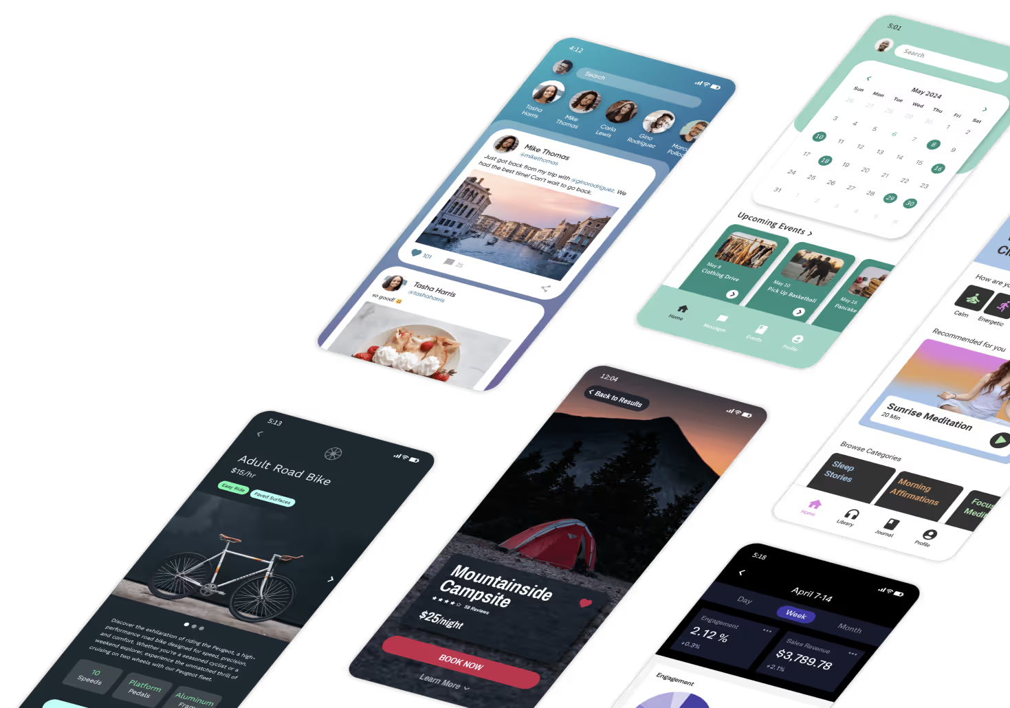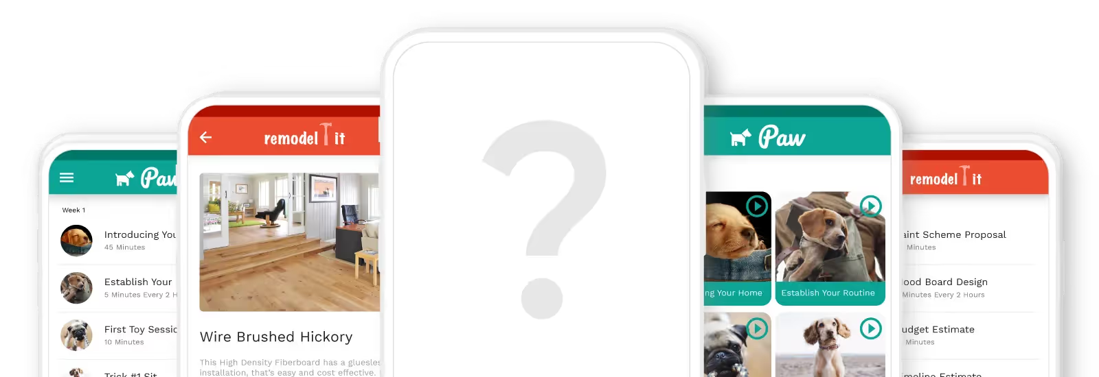
Why Adalo Is Perfect for Crafting User-Centered App Experiences
Adalo is a no-code app builder for database-driven web apps and native iOS and Android apps—one version across all three platforms, published to the Apple App Store and Google Play. This means you can focus less on technical complexity and more on what truly matters: the words that guide users through every screen, button, and interaction in your app.
When your app lives in the major app stores alongside millions of competitors, polished UX copy becomes a critical differentiator. Users form opinions within seconds, and the microcopy on your splash screens, onboarding flows, and navigation buttons shapes whether they stay or delete. With Adalo handling the build and deployment, you have the bandwidth to craft copy that converts casual downloaders into loyal users.
The bits of text that guide you through an app—the splash screen greeting, the sign-up page instructions, the button labels you tap to navigate—these short sentences tell the greater story about your product and why it exists. When you're building an app that will live in the Apple App Store or Google Play Store, every word carries weight.
Adalo, an AI-powered app builder, lets you create database-driven web apps and native iOS and Android apps from a single codebase. With the technical complexity handled, you can focus on what actually shapes user perception: the microcopy on every button, notification, and screen. Users expect polished, professional experiences, and that includes the words guiding them through your app.
Why Adalo Is Perfect for Building User-Friendly Apps
When your app publishes directly to both major app stores, the stakes for user experience increase dramatically. Adalo handles the hard part—compiling native code and managing app store submissions—so you can invest your energy in crafting copy that guides, delights, and converts.
Ada, Adalo's AI builder, lets you describe what you want and generates your app. Magic Start creates complete app foundations from a description, while Magic Add adds features through natural language.
With Magic Start, you can generate complete app foundations from a simple description. Tell it you need a fitness tracking app, and it creates your database structure, screens, and user flows automatically. What used to take days of planning happens in minutes, giving you more time to perfect the words your users will actually read.
User Experience (UX) Copy
You'll recognize bad UX copy immediately—it leaves you confused about which button to press, or wondering whether you'll accidentally get charged for something. The text on buttons is often the last thing designers think about, but it makes a huge difference in how people perceive and trust your app.
While words on a screen can't replace a real conversation, good UX copy can make interacting with an app feel like talking to a friend. The principle is straightforward: if your product sounds human, people are more likely to trust it and use it.
Good Copy + Good Design = Better Apps
Words bridge the gap between the intention of your design and the reality of your user.
If you're a designer, you want to give users an app experience that's smooth and frictionless. But no design can explain itself entirely. That's where words come in—they bridge the gap between what we want people to do, think, or understand versus their current reality.

How Good UX Copy Elevates Your Design
- Direction: It lets your users know what to do next
- Clarity: It explains errors without frustrating people
- Expectations: It sets clear expectations for what happens when they tap
- Delight: It makes people smile and feel connected to your app
Here's something important to remember: you don't need to spend ages on your copy or hire a UX writer. If you're looking for a very specific tone and experience, a professional can help execute your ideas. But if you'd like to give it a shot yourself, these principles will get you there.
How to Write UX Copy Like a Pro
Use these principles to make the UX copy on your app easy to follow, thoughtful, and engaging.
Say It Quick
It's a challenge everyone deals with when trying to simplify something complicated. We want to reassure people with all the details and all the information we think they need. The reality? Most people don't want the details—especially when using a mobile app.
Instead, ask yourself: "What's the most important thing for someone to know at this precise step?" Are they logging in and need to find another username because that one is taken? Do they need to check out another section of the app to find what they're looking for? Do they need to confirm whether they're booking a class?
The answer to that question will help you write quick, snappy, short sentences. Aim for no more than 8 words per button or instruction.
Pro Tip: If you're having a hard time keeping things brief, write everything that needs to be said, then cut out all the fluff.
Say No to Jargon
There's a high chance you may accidentally have language in your app that is very technical and doesn't mean anything to the user. Jargon includes any words or phrases that require the reader to have prior knowledge about something they may not typically know about.
When writing UX copy, stay away from jargon because the last thing you ever want to do is confuse the people you're building an app for. This may surprise you—given that our first point was to keep it short—but the shortest phrase may not always be the most effective.
Sometimes just a little more goes a long way in getting the message across. For example:
| Technical | Human |
|---|---|
| Payment method | Choose how you'd like to pay |
| Authentication required | Please sign in to continue |
| Session expired | You've been signed out—let's get you back in |
Both approaches are correct, but one sounds more personal and more human than the other.
Pro Tip 1: When in doubt, read it out loud. If it sounds unnatural or robotic, change it.
Pro Tip 2: If you're worried about jargon, ask friends and family to check it out. When the text makes sense to people with no insider understanding, it's ready.
Pair Your Visuals with Words
Research from Nielsen Norman Group tells us that nearly 80% of users scan website pages and rely on visuals such as imagery and icons to understand the context. Only 16 percent read the entire copy.
There's no denying the importance of stunning imagery and visuals, but we also need to make sure the visuals and copy work together. In some cases, it helps to include icons AND text if you have a diverse audience that may have different interpretations.
Fun fact: People commonly read text in an 'F-shaped' pattern. They read the first line, then the second line, and then slide down the page while catching only the first or second word of each sentence. Good design helps break that pattern—something interesting pops up at every section.
Use This Formula for First Person and Second Person
Let's do a quick refresher:
- First person = I, me, or my
- Second person = you, or your
First person is a good way to show the user what's distinctly theirs on the app (e.g., 'My Profile', 'My Account'). Second person is an easy way to guide your users through a process or journey (e.g., enter your account number, choose your avatar), or simply add a personal touch (e.g., "Oops… you've run out of credits!").
Be Consistent
Stick to your terminology. More consistency equals less confusion. If you decide to call the process of arranging something "Scheduling" in one part of your app, do not call it "Booking" elsewhere.
Here's an easy way to nail consistency: proofread your app screens to make sure the language you're using is consistent. You may want to standardize whether your login screen buttons say 'Next' or 'Continue'.
Title case vs. sentence case—which should you use?
Title case stands out more. The Capitalized Letters Call Attention To Your Text in a way that can be helpful to give something more emphasis. It's also a way to differentiate your title text from your body text if you don't have many font options.
Sentence case is easier to read, especially when the text gets long. Wherever you have a block of text, it's always easier on the eye when it's in sentence case.

Pay Special Attention to These Screens
You know how an extra special meal can help make an occasion like your birthday or anniversary more memorable? Let's apply that to UX copy. Some important screens provide an opportunity to really wow your users. These are your special occasion opportunities to be unique, helpful, and memorable.
Login Screens
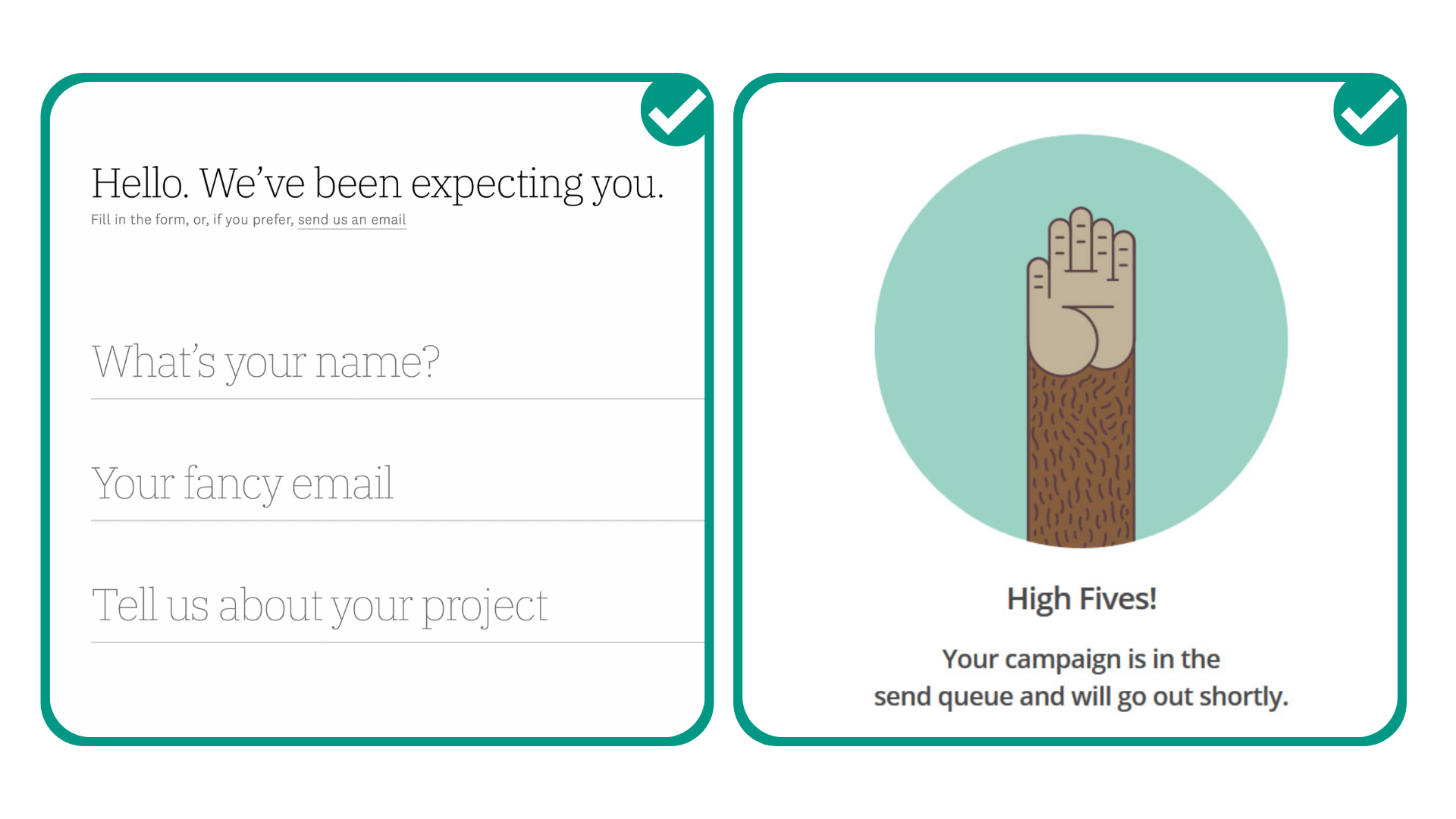
This is your first impression. You have a chance to tell people what you're about, how you can help them, and why they need you—without being overwhelming. Make sure to ask your users to only provide information that is absolutely necessary so these screens don't look daunting.
With Adalo's visual builder—described as "easy as PowerPoint"—you can quickly iterate on login screen designs and test different copy approaches without rebuilding from scratch.
Good News and Confirmations
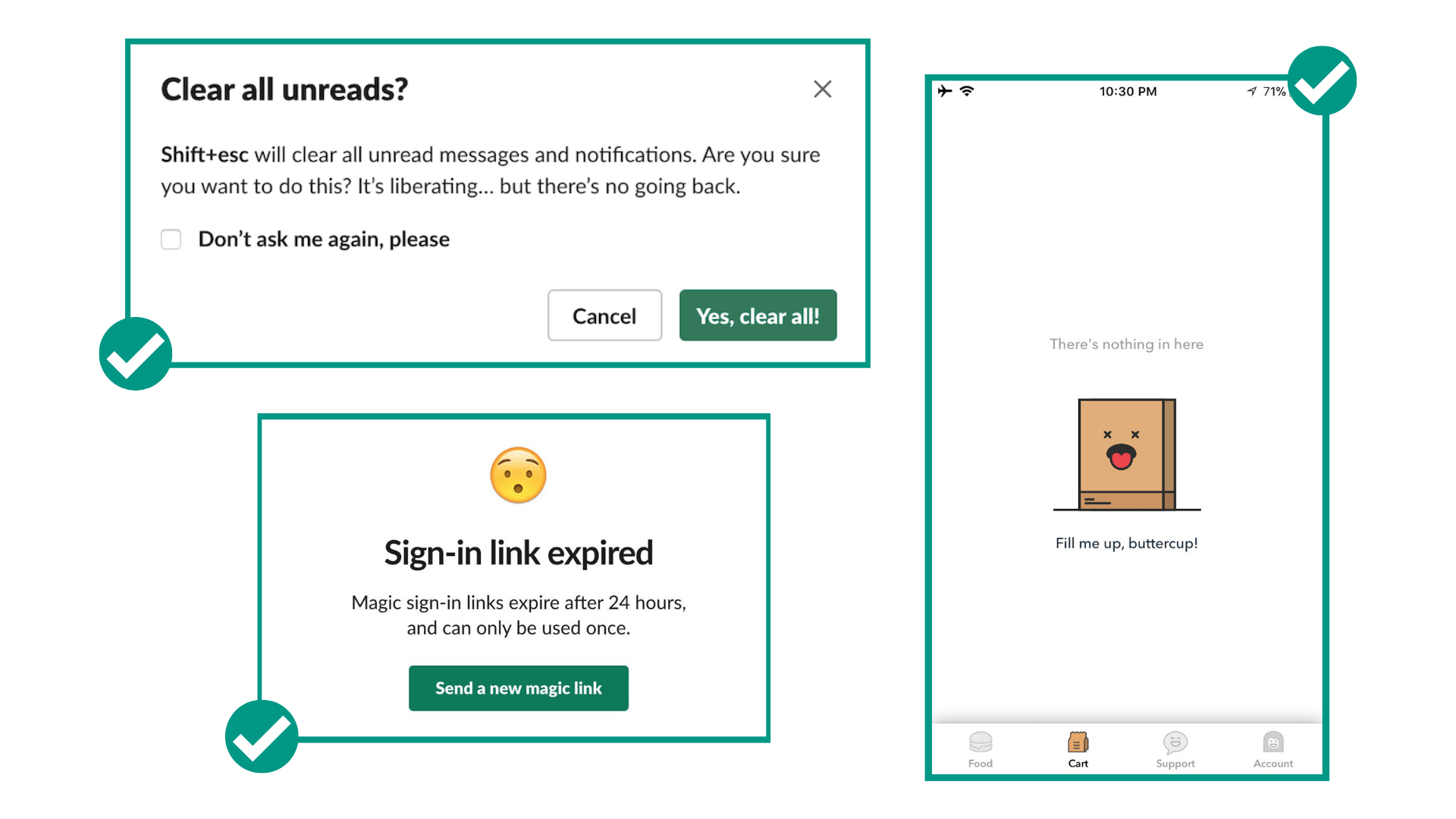
These screens are opportunities to celebrate with your users. You can make the text fun, informal, and enthusiastic. Examples include "Yay! You got this!" or "The results are in: you're the top player this week!" It's an opportunity to show off your app's personality.
Bad News and Error Messaging
This one is trickier, so it helps to play it safe. Keep the text polite but direct. Examples: "Uh oh, that password doesn't match! How about another try?" or "Oh snap! We can't find it!"
Empty States
If there's nothing to show on the screen because the user hasn't started using a particular tool or service yet, this is a good opportunity to add helpful copy, an image, or even humor. Instead of just "No results found," you could try "Aww, your bag is empty!" or "Let's get started!"
Captions and Supplementary Text
This is the supporting text, usually before a button or under an icon, that provides reassurance or explains what happens next. You can squeeze in personality here as well, or use it as an opportunity to be extra helpful.
Building Apps That Scale with Great UX
When you're building an app that might grow to thousands or millions of users, your UX copy becomes even more critical. Every confusing button label or unclear error message gets multiplied across your entire user base.
Adalo's modular infrastructure scales to serve apps with over 1 million monthly active users, with no upper ceiling. Paid plans include unlimited database records, meaning your app can grow without hitting storage constraints. The platform processes over 20 million data requests daily with 99%+ uptime.
This scalability matters for UX copy because you can focus on perfecting your messaging rather than worrying about whether your app can handle success. With Magic Add, you can add new features by describing what you want in natural language—then immediately focus on writing the copy for those new screens.
Getting Started with Your App's UX Copy
You can use Adalo's app templates to build an app within hours, or make one from scratch, customized to perfection. Over 3 million apps have been created on the platform, giving you plenty of examples to learn from.
If you need additional help, you can work with an Adalo expert who has the skills and know-how to help you with everything from creating a brand-new app to debugging and optimizing your existing one. Learn more.
Good luck, and happy building!
FAQ
Why choose Adalo over other app building solutions?
Adalo is an AI-powered app builder that creates true native iOS and Android apps from a single codebase. Unlike web wrappers, it compiles to native code and publishes directly to both the Apple App Store and Google Play Store. With unlimited database records on paid plans and no usage-based charges, you get predictable costs as your app scales.
What's the fastest way to build and publish an app to the App Store?
Adalo's drag-and-drop interface—described as "easy as PowerPoint"—combined with Magic Start lets you generate complete app foundations from a simple description. The platform handles the App Store submission process, so you can go from idea to published app in days rather than months.
Can I easily write effective UX copy for my app?
Yes. Since Adalo handles all the technical aspects of building your app, you're free to focus on crafting the microcopy that guides, delights, and converts your users—from button text to error messages and everything in between. The visual builder makes it easy to iterate on copy without rebuilding screens.
What is UX copy and why does it matter for my app?
UX copy refers to all the text that guides users through your app—splash screens, sign-up pages, buttons, and navigation options. Good UX copy tells your product's story, helps users understand what to do next, explains errors clearly, and makes your app feel human and trustworthy.
How can I keep my app's UX copy simple and effective?
Focus on answering one question at each step: "What's the most important thing for someone to know right now?" Keep sentences short (no more than 8 words when possible), avoid jargon, and read your copy out loud to ensure it sounds natural rather than robotic.
Which app screens deserve the most attention for UX copy?
Pay special attention to login screens (your first impression), confirmation screens (opportunities to celebrate with users), error messages (keep polite but direct), and empty states (perfect for helpful guidance or personality). These moments are opportunities to be unique, helpful, and memorable.
Should I use first person or second person in my app's copy?
Use first person (I, me, my) to show users what belongs to them, like "My Profile" or "My Account." Use second person (you, your) to guide users through processes or add a personal touch, such as "Enter your email" or "You've earned a badge!" Consistency between these approaches is key.
How much does it cost to build an app with good UX on Adalo?
Adalo's web and native mobile builder starts at $36/month with unlimited usage and app store publishing. Unlike competitors that charge based on database records or usage, Adalo's paid plans include unlimited database records and no usage-based charges, so you can focus on perfecting your UX without worrying about scaling costs.
Do I need coding experience to write good UX copy?
No coding experience is needed. Adalo's visual builder lets you edit text directly on your screens, and you can preview changes instantly. The platform handles all technical aspects, so you can focus entirely on crafting copy that resonates with your users.

