User interface (UI) refers to the look and layout of a product—the aesthetic elements you see when using it. Typography, colors, element design, icons, graphics, background images, and information hierarchy all fall under UI.
User experience (UX) encompasses the journey a user takes through a product to achieve their goal. This focuses on app structure and ease of finding solutions. Screen order, text, prompts, and available actions all make it either easier or harder to reach your desired outcome.

Don Norman coined the term "user experience" in the 1990s—he was perhaps the first person to have "UX" in his job title. His research on usability and behavioral science laid the foundation for user experience as we know it today. Here's how he describes it:
"A product is more than the product. It is a cohesive, integrated set of experiences. Think through all of the stages of a product or service—from initial intentions through final reflections, from first usage to help, service, and maintenance. Make them all work together seamlessly."
But how do you actually achieve this?
How Do You Create a Seamless Mobile App UX?
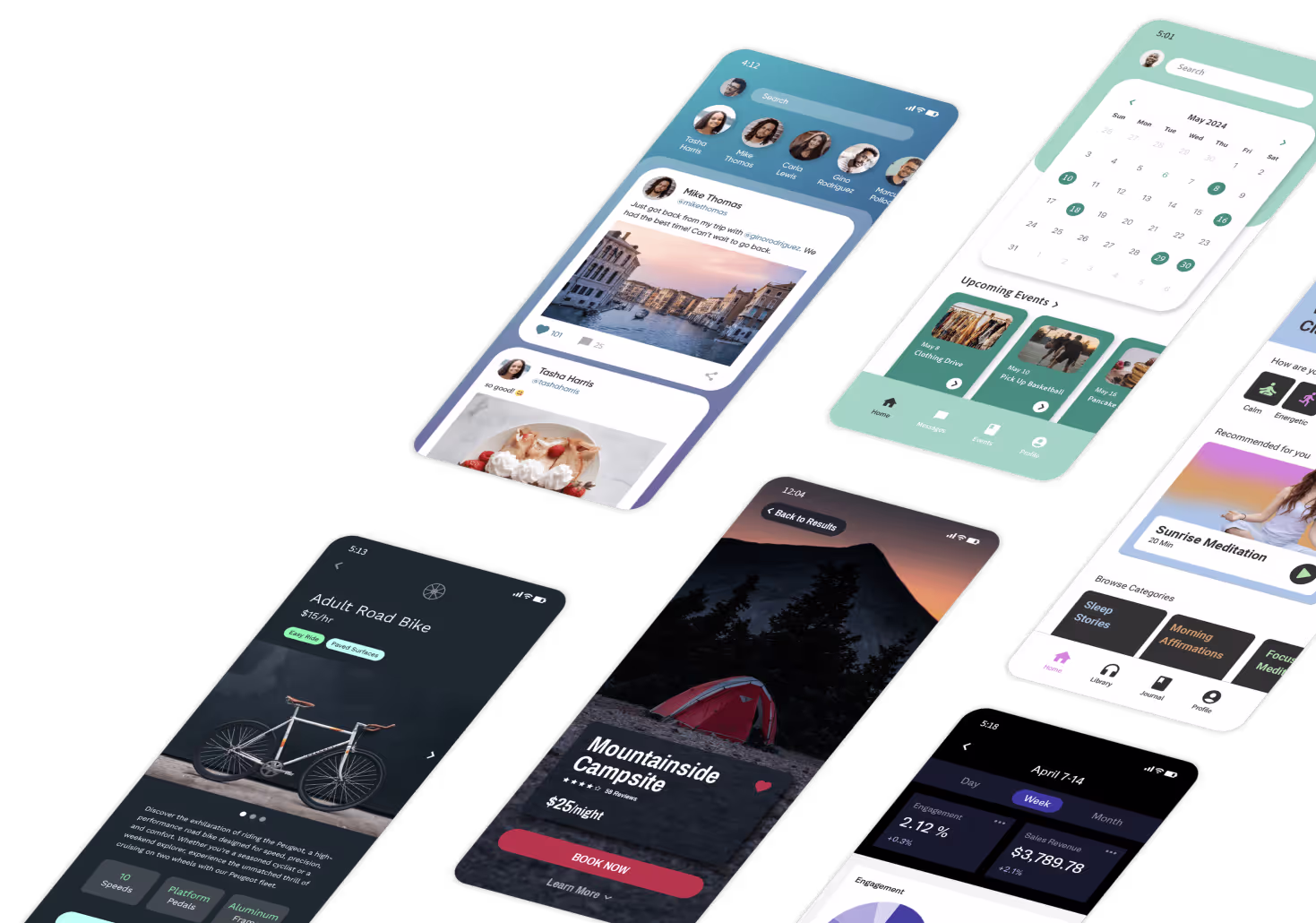
Creating exceptional mobile app UX requires attention to multiple interconnected elements. The following principles will help you build apps that users genuinely enjoy using—whether you're designing from scratch or using an AI-powered app builder like Adalo to accelerate development. Adalo is a no-code app builder for database-driven web apps and native iOS and Android apps—one version across all three platforms, published to the Apple App Store and Google Play.
1. Create an Awesome Onboarding/Login Experience
Onboarding takes users from opening your app for the first time to getting fully set up—whether that means creating an account, signing up, or jumping straight into usage. It's the first impression that sets the tone for everything that follows. If onboarding is swift, efficient, uncomplicated, and pleasant, people are far more likely to stick around.
Ada, Adalo's AI builder, lets you describe what you want and generates your app. Magic Start creates complete app foundations from a description, while Magic Add adds features through natural language.
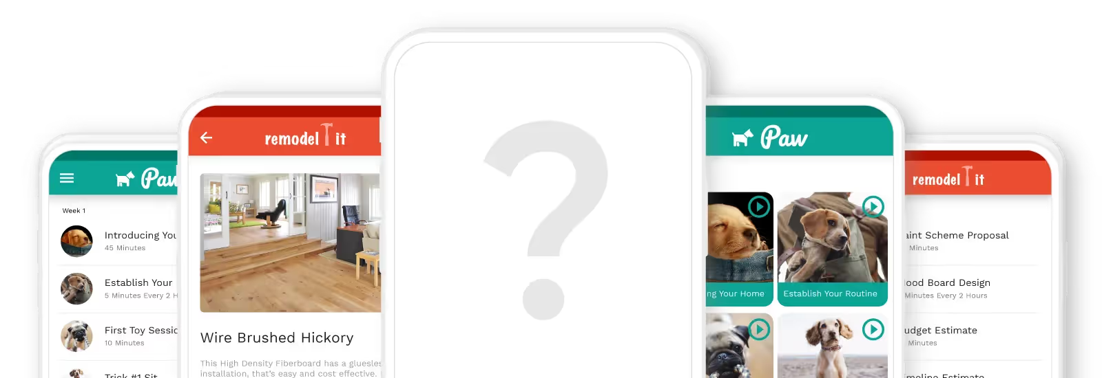
Adalo, an AI-powered app builder for native iOS and Android apps, simplifies this process significantly. The platform offers cloneable onboarding kits with five different versions to choose from. With Magic Start, you can describe your ideal onboarding flow and generate complete screen foundations automatically—what used to take days of planning happens in minutes. One build publishes to web, iOS App Store, and Android Play Store from a single codebase.
2. Make Navigation a No-Brainer
People have used mobile apps long enough to know their way around. Your app navigation must be easy and intuitive so users find exactly what they're looking for in the first place they look. Users should always know where they are and how to get where they want to go. Menu categories, navigation bars, and screen-to-screen movement should all be immediately understandable.
Key navigation tips:
- Allow users to go "back" easily from any screen
- Keep navigation buttons clearly visible at all times
- Use the navigation drawer for Android and the tab bar for iOS to match platform conventions

3. Keep Your Screens Clutter-Free
While visual clarity falls under UI, it directly impacts UX. Can people clearly identify where they need to go? Too many elements—images, icons, buttons, and text—can overwhelm and confuse users.
Guidelines for clutter-free screens:
- Focus on no more than one key action per screen, with up to 7 total options
- Keep headlines and text brief and clear
- Use white space wisely to create visual breathing room
The Science Behind This: Miller's Law states that human immediate memory capacity is approximately 7 items. Apps like Instagram follow this principle—on your feed, you can view stories, interact with posts, search, view reels, check notifications, access DMs, or go to your profile. That's exactly 7 possible actions, keeping the experience manageable.
When building with Adalo's visual builder—described by users as "as easy as PowerPoint"—you can display up to 400 screens at once on a single canvas. This bird's-eye view helps you audit your entire app for screen complexity and ensure each view stays focused on its primary purpose.
4. Keep Your Content Skim-Friendly
Mobile screens are significantly smaller than laptops or desktops. Fitting all necessary information while maintaining readability presents a real challenge. The reality is that users rarely "read" content—they skim, picking up key phrases and words.
To improve readability, keep content brief, concise, and clear. Break up long paragraphs. Use headers to create scannable sections. Highlight key information with bold text sparingly.

5. Make Tap Targets Easy
Tap targets are buttons, links, and interactive elements where users need to tap to engage. Few things frustrate users more than having to fidget to find the right place to tap—especially when they can't do it comfortably with their thumb.
Two factors matter here: size and spacing.
Size: Interface elements should be large enough to capture thumb taps comfortably. Apple's iPhone Human Interface Guidelines recommend a minimum target size of 44 pixels wide × 44 pixels tall. Microsoft's Windows Phone UI Design Guide suggests 9mm/34px with a minimum of 7mm/26px.
Spacing: Tap targets placed too close together increase the chances of missed taps or accidental wrong selections. Keep elements comfortably spaced to minimize errors and user frustration.

6. Accessibility Makes Everyone Happy
Today, people across all age brackets and experience levels use mobile apps. About 15% of the world's population lives with some form of disability, making accessible design essential.
By making designs accessible, you create the same experience for everyone regardless of visual, speech, auditory, or physical differences. As a designer, developer, or maker, you have the opportunity to make technology better—not just for a few people, but for everyone. Accessible design also tends to improve usability for all users, not just those with disabilities.
7. Best Practices for Buttons
Buttons should be easy, familiar, and non-intrusive. Here are key considerations:
- Common button types: Filled rectangles with rounded edges, filled rectangles with square edges, and ghost buttons (outlined with transparent fill)
- Whitespace: Maintain adequate spacing between buttons and other design elements
- Visibility: Place buttons where users can easily see them
- Clear labels: Use direct action words like "Add to Cart," "Sign Up," or "Book Now"
Building Apps with Great UX: The Modern Approach
UX design constantly evolves as technology becomes more essential and accessible. The best app experiences center on one thing: the user. You can't design a product only you want to use, and you can't simply follow trends hoping for the best.
Modern AI-assisted platforms have transformed how quickly you can implement these UX principles. Adalo's Magic Add feature lets you describe features in natural language—"add a settings screen with notification preferences"—and generates the components automatically. X-Ray identifies potential performance issues before they affect users, helping you maintain the smooth experience users expect.
With over 3 million apps created on the platform and modular infrastructure that scales to serve apps with millions of monthly active users, Adalo provides the foundation for building apps that perform well at any scale. The platform's unlimited database records on paid plans and removal of usage-based charges mean you can focus on UX without worrying about hitting arbitrary limits or unexpected bills as your user base grows.
We've broken down the process of user research for you, including helpful tools to make it easier. By focusing on who your target users are, what they want, how they behave, and what makes them happy, you'll build a successful mobile app that attracts a loyal fanbase.
FAQ
Why choose Adalo over other app building solutions?
Adalo is an AI-powered app builder that creates true native iOS and Android apps. Unlike web wrappers, it compiles to native code and publishes directly to both the Apple App Store and Google Play Store from a single codebase. With unlimited database records on paid plans, no usage-based charges, and infrastructure that scales to millions of MAU, it handles the hardest parts of app development automatically.
What's the fastest way to build and publish an app to the App Store?
Adalo's drag-and-drop interface and AI-assisted building let you go from idea to published app in days rather than months. Magic Start generates complete app foundations from descriptions, and the platform handles the complex App Store submission process—certificates, provisioning profiles, and store guidelines—so you can focus on your app's UX.
What is the difference between UI and UX in mobile app design?
UI (User Interface) refers to visual and aesthetic elements—typography, colors, icons, graphics, and overall look. UX (User Experience) focuses on the journey users take through your app to achieve their goals, including screen flow, navigation structure, and ease of use. Both work together to create successful mobile apps.
How many actions should I include on a single app screen?
According to Miller's Law, human immediate memory capacity is about 7 items. Focus on no more than one key action per screen with up to 7 total options. Apps like Instagram follow this principle, keeping screens simple to avoid overwhelming users with too many choices.
What size should tap targets and buttons be in my mobile app?
Apple's iPhone Human Interface Guidelines recommend a minimum of 44 pixels wide by 44 pixels tall. Microsoft suggests 9mm/34px with a minimum of 7mm/26px. Proper spacing between tap targets is equally important—keep elements comfortably spaced to prevent accidental wrong taps.
Why is accessibility important in mobile app design?
About 15% of the world's population lives with some form of disability. Designing with visual, speech, auditory, and physical differences in mind ensures your app provides a great experience for everyone, expanding your potential user base while making technology more inclusive.
How long does it take to build a mobile app with great UX?
With AI-assisted platforms like Adalo, you can build and publish apps in days rather than months. Magic Start generates complete app foundations from descriptions, and the visual builder—described as "easy as PowerPoint"—lets you implement UX best practices quickly without coding knowledge.
Do I need coding experience to build an app with good UX?
No. Adalo's visual builder and AI features like Magic Add let you create professional apps without writing code. You can describe features in natural language and the platform generates the components, letting you focus on user experience rather than technical implementation.
How much does it cost to build a mobile app?
Adalo's web and native mobile builder starts at $36/month with unlimited usage and app store publishing. This compares favorably to alternatives like Bubble ($59/month with usage-based charges and record limits) or Flutterflow ($70/month per user, plus separate database costs). Adalo includes everything needed to publish to both app stores.
Can my app scale as my user base grows?
Yes. Adalo's modular infrastructure scales to serve apps with millions of monthly active users with no upper ceiling. Paid plans include unlimited database records and no usage-based charges, so you won't hit arbitrary limits or face unexpected bills as your app grows.