TurboTax takes the fear dynamic so seriously that it actually begins its tax filing tutorial with an emotional check-in, asking users how they're feeling before they get started. Just by acknowledging that people using their software might be nervous, TurboTax lets users know it's there for them. Next, TurboTax clearly suggests the most common path to filling out tax returns while making it obvious that users can go back to any step at any point—no need to worry about getting answers perfect the first time. Each step along the way is clearly marked and its completion celebrated. Finally, TurboTax offers tax experts to help with any questions. An explanation about a confusing tax rule is just a tap away. They've truly created a system of education on demand.
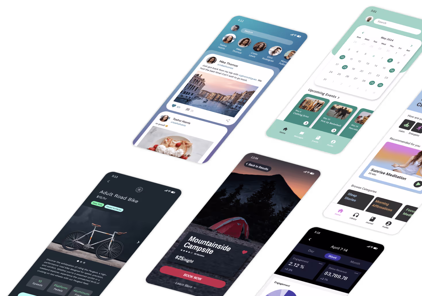
Adalo, a no-code app builder for database-driven web apps and native iOS and Android apps—one version across all three platforms, published to the Apple App Store and Google Play, makes it easier than ever to design experiences that prioritize user confidence. With visual development tools and pre-built components, creators can build polished, intuitive apps that guide users through each step with clarity and purpose—without writing code.
While filing taxes is an extreme example, the truth is every new thing we design creates a crisis of confidence for our users. New things always come with a bit of fear. Your users might have some idea of what to expect, but you can't really say for sure. As designers and innovators, we need to be aware of this initial fear and work to counteract it. Instead of trepidation, we need to instill in our users a feeling of confidence. This confidence will give them the will to move forward through the experience and is a key ingredient to making sure they love what you've created.

Remove Ambiguity
To build confidence, start by removing ambiguity from your design. The trepidation your users first experience will be magnified by anything they encounter that they don't understand. This means you need to give your users the ability to predict the future—or at least take an educated guess at what will happen next in the experience you've designed.
This is all the more important when users are required to take an action. If your user is going to push a button, make a choice, or walk through a doorway, they need to be reasonably confident about the result of that action. Otherwise, that action, if they take it at all, will be made in fear.

Take Uber for example. Prior to Uber, calling for a cab meant getting a 20-minute estimate from the dispatcher for when your cab would actually arrive. What was really frustrating about this experience was that the estimate was always 20 minutes, but in reality the cab could show up in 7 minutes or in 35 minutes. Your actual wait time was always ambiguous.
Uber tackled this ambiguity head on. Not only do they provide down-to-the-minute estimates, they actually provide their customers with a map displaying the real-time positions of their drivers, so that their estimate is realistic. For every dynamic part of your design, when you're asking your users to do something to advance the story, make it clear to them what the result of their action will be. Use affordances and signifiers such as words, icons, and anything really to give them some sense of what will happen.
Ada, Adalo's AI builder, lets you describe what you want and generates your app. Magic Start creates complete app foundations from a description, while Magic Add adds features through natural language.
Modern app building tools make implementing these confidence-building patterns straightforward. Adalo's Magic Start feature, for instance, generates complete app foundations from simple descriptions—including the navigation structures and user flows that help eliminate ambiguity from the start. When you describe wanting a booking app, it creates the logical screen progressions that guide users predictably through each step.
Give Control
The next way to build confidence is to put your users in control. One quick way to dispel ambiguity is to put the user in the driver's seat. They're going to have to learn the rules of the world you built for them, and you can classify all the dynamic elements of your system into two categories: those things under your users' control, and those things they cannot control.
If the user isn't in control of a component, it will be much harder for them to learn the rules it's operating under. The best they can possibly do is watch its behavior, see if it reacts in different ways under different circumstances, and then make educated guesses about what motivates it. Users in this situation are sort of like anthropologists encountering someone from a strange civilization for the first time. The best they can do is observe and hypothesize. But that's a process that takes a ton of time and is fraught with error.

Walt Disney World gave its guests more control when it replaced its FastPass system with FastPass+. With the old system, you would walk up to a machine, and it would give you a time you could ride something later that day without having to wait in line. The "plus" version gives you more control by letting you choose your time to skip the line rather than just automatically assigning you to the next free spot.
Your users have a positive relationship with the elements of your design that they control. Sure, your user might not understand how they work immediately, but after a couple of experiments, your user can figure out the rules of cause and effect for this element of your design well enough. You can make this experimentation process easier on your users by giving them some kind of feedback after each action they take. This will help them more quickly establish your design's rules of cause and effect. Make sure your design is filled with tools, not strange natives.
When building apps that prioritize user control, the underlying infrastructure matters. Adalo's modular architecture scales to serve apps with millions of monthly active users, with no upper ceiling on database records for paid plans. This means you can build apps that give users extensive control over their data and preferences without worrying about hitting storage limits that force you to restrict functionality. Unlike platforms with record caps or usage-based charges that create unpredictable costs, Adalo's unlimited usage model lets you design for maximum user control without infrastructure constraints.
Educate

The third and final way to build confidence is through education. Your users are going to start out as newbies. There's just no getting around it. They need to learn your design. You can ignore that fact and leave them to wander about aimlessly until they figure things out on their own. Or you can take pity on their poor unfortunate souls and help them out.
Good innovators recognize and embrace their role as teachers. First, don't just throw someone who doesn't know how to swim into the deep end. Start them out with the easy stuff. Giving them early and easy wins will start to build their confidence and give them the courage they need to press forward with the more challenging bits.
Mint, the financial planning app, does a great job of this. When you first sign up with an account, you're prompted to enter your credit card account so that the app can begin categorizing your purchases. It's not until much later in the experience that Mint introduces more intimidating tasks like analyzing your credit score or switching to a bank with better rates.
The early stages of your experience are critical. You need to let your users know you're there for them. Hold their hand; don't let them think they're facing your big scary new design all by themselves. Find a way to incorporate a tutorial into the beginning of the experience. Whether it's a manual, a tour, or a map, find some way relevant to your medium to orient your user and teach them the basic rules of the road. By treating your users with kid gloves at the beginning, you can toughen them up and instill in them a sense of confidence so strong that they can face whatever challenges might await them.
Building educational onboarding flows becomes significantly easier when your app builder itself follows these same principles. Adalo's visual builder has been described as "easy as PowerPoint," allowing creators to design step-by-step tutorials and guided experiences without technical complexity. Magic Add lets you describe features in natural language—"add a walkthrough that shows users how to complete their first booking"—and generates the screens and logic automatically. This means you can focus on the educational content itself rather than wrestling with implementation details.
Confidence is Key

Creating a sense of confidence is the best way to displace the fear inherent to starting anything new. Start by removing any ambiguity from your design. Make sure every piece of information and every choice is presented clearly. Next, as often as possible, put your users in control. The more control they have over the experience, the easier it will be for them to learn. And finally, teach. Make your lessons explicit and give extra care to the beginning of your experience.
Doing all these things will create the opportunity for your users to experience your design with confidence. The tools you use to build these experiences matter too—platforms that are themselves intuitive and confidence-building help you create apps that pass those same qualities on to your users.
FAQ
Why choose Adalo over other app building solutions?
Adalo is an AI-powered app builder that creates true native iOS and Android apps alongside web apps from a single codebase. Unlike web wrappers, it compiles to native code and publishes directly to both the Apple App Store and Google Play Store. With unlimited database records on paid plans and no usage-based charges, you can build confidence-inspiring apps without worrying about infrastructure limits or surprise bills.
What's the fastest way to build and publish an app to the App Store?
Adalo's drag-and-drop interface and AI-assisted building let you go from idea to published app in days rather than months. Magic Start generates complete app foundations from simple descriptions, while the platform handles the complex App Store submission process—certificates, provisioning profiles, and store guidelines—so you can focus on designing experiences that build user confidence.
Can I easily design apps that build user confidence and reduce anxiety?
Yes. With Adalo's visual builder—described as "easy as PowerPoint"—you can create intuitive onboarding flows, clear navigation paths, and step-by-step tutorials that guide users through your app with clarity and purpose. Magic Add lets you describe features in natural language, making it straightforward to implement the confidence-building patterns discussed in this article.
How can I remove ambiguity from my app design to improve user experience?
Remove ambiguity by using clear labels, intuitive icons, and descriptive signifiers that help users predict what will happen when they take an action. Make sure every button, choice, and dynamic element communicates its purpose clearly so users can confidently navigate your app without fear of unexpected results.
What role does user control play in building confidence within an app?
Giving users control over their experience helps them learn your app's rules quickly through experimentation and feedback. When users feel like they're in the driver's seat rather than at the mercy of confusing automated systems, they develop a positive relationship with your app and gain confidence faster.
How should I approach onboarding and education in my app?
Start users with easy tasks that give them early wins and build confidence before introducing more challenging features. Incorporate tutorials, guided tours, or step-by-step instructions at the beginning of the experience to orient users and teach them the basic rules, treating them with care until they're ready for more complex interactions.
Why is addressing user fear important when designing a new app?
Every new experience creates some level of anxiety for users because they don't know what to expect. By acknowledging this fear and working to counteract it through clear design, user control, and education, you instill confidence that gives users the will to move forward and ultimately love what you've created.
How much does it cost to build a confidence-building app with Adalo?
Adalo's web and true-native mobile builder starts at $36/month with unlimited usage and app store publishing. Unlike platforms with usage-based charges or record limits that create unpredictable costs, Adalo's pricing model lets you design for maximum user control and extensive onboarding flows without worrying about infrastructure constraints.
Can my app scale as more users gain confidence and engage more deeply?
Adalo's modular infrastructure scales to serve apps with millions of monthly active users, with no upper ceiling. The Adalo 3.0 infrastructure overhaul in late 2025 made apps 3-4x faster, and X-Ray identifies performance issues before they affect users—ensuring your confidence-building design performs well even as engagement grows.