Why Adalo Works for Designing a Color-Consistent App
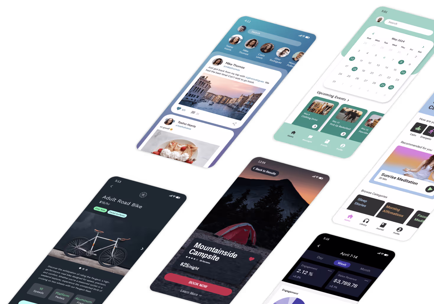
Choosing the perfect color palette for your mobile app is only half the battle—ensuring those colors display consistently across every platform is where many builders struggle. Adalo is a no-code app builder for database-driven web apps and native iOS and Android apps—one version across all three platforms, published to the Apple App Store and Google Play. This unified approach means your carefully selected brand colors will appear exactly as intended whether users access your app on iOS, Android, or the web.
When your app lives in both the Apple App Store and Google Play, maintaining visual consistency becomes essential for brand recognition. Adalo's single-canvas design system ensures that the hex codes you choose render identically across devices, eliminating the frustration of colors appearing differently on various screens. This consistency helps build the professional, polished appearance that keeps users engaged and strengthens your brand identity from the first impression.
Building an app that truly reflects your brand identity—including your carefully chosen colors—requires a platform that delivers consistency across every device. Adalo is an AI-powered app builder for web and native iOS and Android apps, publishing one version across all three platforms to the Apple App Store and Google Play. Design your color scheme once and see it rendered consistently everywhere your users discover you.
With Adalo's intuitive design tools, you have complete control over your app's visual appearance, from primary brand colors to accent shades and background tones. Whether you're launching a consumer app that needs to stand out in a crowded marketplace or a business tool that must align with corporate branding guidelines, having your colors display perfectly across iOS, Android, and web ensures a cohesive brand experience that builds recognition and trust.
Why Adalo Works for Building a Beautifully Branded App
Creating a visually consistent app across multiple platforms traditionally meant managing separate codebases and hoping colors rendered the same way on each device. Adalo eliminates this complexity by compiling true native apps from a single design canvas. Your hex codes, gradients, and color combinations appear identically whether someone opens your app on an iPhone, Android phone, or web browser.
Ada, Adalo's AI builder, lets you describe what you want and generates your app. Magic Start creates complete app foundations from a description, while Magic Add adds features through natural language.
The platform's Magic Start feature generates complete app foundations from simple descriptions—including suggested color schemes that match your brand personality. Tell it you're building a wellness app, and it creates screens with calming color palettes already applied. From there, you can customize every element using the visual editor or natural language requests through Magic Add.
Brand Colors: What Are They?
Brand colors are a palette or set of colors used to represent your brand—the colors on your logo, creatives, social media, business cards, or app design. A consistent and thought-through use of brand colors is extremely effective because it can help improve brand awareness and recognition.
Think of an app: In a crowded app store, your brand colors can help you stand out, communicate who you are, and ultimately help people connect with you. Your brand colors form a part of your app's visual identity, which is a combination of graphic and visual elements that help form a personality around your brand.
With over 3 million apps created on Adalo, makers have discovered that consistent color application across platforms is one of the fastest ways to build professional credibility. When your app looks polished on every device, users trust it more.
Why Do Colors Matter?
Here are some compelling statistics about colors that demonstrate why they make such a significant difference:
- A signature color boosts brand recognition by up to 80%
- Blue, red, and black are the three most common logo colors
- 95% of all purchasing decisions are made subconsciously, and color plays a big role in this response
Color isn't just about aesthetics—your app colors are a powerful branding tool that, when used properly, can improve your app experience dramatically. There's a reason the world switched to color TV and media: it grabs your attention, it's appealing. It's a great way to differentiate yourself from competitors and help you stand out, whether it's in the feed on an app store, on a poster, or placed on a shelf.
The other reason why color is so impactful is because it can influence mood. If you want your app to be associated with a particular emotion, color is a great way to achieve it. Interestingly, a study conducted by Virginia Tech found that the color red on web page backgrounds influenced people's willingness to bid during online auctions.
How Should I Pick Out Colors for My Mobile App?
Step 1: Pick Your Brand Personality Traits
What do you want your app to be associated with? Is it a particular mood, feeling, or expression? How do you want people to feel about using your app? Consider traits like:
- Trustworthy and professional – ideal for finance, healthcare, or business apps
- Fun and energetic – perfect for social, gaming, or lifestyle apps
- Calm and peaceful – suited for wellness, meditation, or productivity apps
- Bold and innovative – great for tech, creative, or startup apps
Step 2: Choose Colors That Communicate Your Brand Personality
According to Dribbble, "Knowing which colors are most popular and which emotions are evoked by each color are vital. The most popular favorite color in the world is blue, which helps explain why it's such a popular color for many brands."
According to a study of the world's top 100 brands, many successful brands have only one or two brand colors, so don't be afraid to keep it simple and stick with that core brand color. Use this guide to figure out which colors correspond to particular emotions or feelings, but remember that many of these associations are cultural:
Red: Red often corresponds with bold or intense experiences. It can represent indulgence—like the obvious associations with love, anger, danger, passion, or prosperity.
Yellow: Yellow has a reputation for being cheerful, bright, and uplifting. It reminds people of summer, which is why it's often associated with warmth.
Blue: Blue is one of the most prominent colors in nature. It's associated with water and air, which is why it's tied to calmness and tranquility. Blue is often used to symbolize stability and trust.
Green: Green symbolizes abundance or freshness, and has become popularly associated with peace, environmental consciousness, and wealth.
Orange: Similar to red and yellow, orange is considered bold, fun, and playful.
Purple: Purple represents power, wealth, and royalty. It's often linked to mystery or magic.
White: Universally, white is connected to light, purity, or cleanliness. It's associated with simplicity and modernity in design.
Black: Black is associated with power, elegance, and sophistication.
Step 3: Pick a Color Scheme for Your App
A color scheme is simply the way colors are combined or arranged. There are several combinations and schemes you can choose from based on the color wheel:
Analogous color scheme: This is a popular choice for designers. It's a combination of colors located next to each other on the color wheel. Generally, one color will be dominant, while the others form the accent colors. This type of color scheme is generally quite pleasing to look at.
Monochromatic color scheme: This color scheme uses one base color, along with its shades or tones as an extended palette. It gives your app a cohesive and elegant appearance.
Triadic color scheme: The triadic color scheme combines three colors located evenly across the color wheel (the Adalo logo uses this approach). Generally, the way to pull off a triadic color scheme for your app is to let one color be dominant, and have the other two colors used for emphasis or to highlight something.
Complementary color scheme: Complementary colors are located on opposite sides of the color wheel. Combinations like red and green, blue and orange—these colors have strong contrast but often work quite well when placed side by side. Designers often use complementary colors if they want a particular element in the mobile app UI to stand out.
Compound color scheme: Also known as split-complementary, this color scheme takes two adjacent colors on the color wheel and pairs them with a color on the opposite side.
Implementing Your Colors Across Platforms
Once you've selected your color palette, the challenge becomes applying it consistently across every platform where your app lives. This is where your choice of app builder matters significantly.
Adalo's visual builder—described by users as "as easy as PowerPoint"—lets you set brand colors once and apply them globally. Change your primary color in one place, and it updates across all screens, buttons, and UI elements simultaneously. The platform's X-Ray feature can even identify visual inconsistencies before they affect users, ensuring your brand colors render correctly throughout the app.
With unlimited database records on paid plans and no usage-based charges, you can build data-rich apps without worrying about hitting storage limits that might force design compromises. Your color-coded categories, tagged content, and visual organization systems can scale alongside your user base.
Helpful Resources for Picking Your Mobile App Colors
Now that you understand color theory, these resources and tools will help you put this information to good use so you can pick the best color scheme and palette for your app:
- Colr.org lets you upload photos of color schemes that you like, and then generates color palettes based on those images.
- Check My Colors is a nifty tool designed to check whether background and foreground color combinations have sufficient contrast. This is especially useful if you're designing apps for people who may have color-identifying deficits.
- Designspiration lets you choose colors that you love, and then generates images with that color combination so you can pick your favorite and save the hex codes for your brand.
- Coolors is a super fast color scheme generator that can be used to instantaneously create color schemes for your brand. With little experience, you can quickly explore color schemes created by other designers and copy them for your own brand.
- Canva's color blog is a treasure trove of helpful information about colors, color trends, and color schemes.
- Adobe Color lets you explore the color wheel and try out options and themes. You can then directly export these onto other programs like Adobe Illustrator or Photoshop.
- Colormind is a great tool to explore and learn about colors while generating a color scheme. You can also see how the colors you choose will look with mobile UI components like buttons or tabs.
- Colordot is a cool color scheme generator that gives you the option to lay out your colors easily. It's great if you have certain colors in mind already and just want a few more options.
From Color Selection to Published App
The colors you choose for your app will make their way throughout the design—from the homescreen to the buttons, icons, and functionality. It's worth putting in the effort to choose the right color palette if it means creating an exceptional visual experience for your users.
Whether it's a social networking app, a security app, or an app for kids, choosing the right colors will help you design a product that attracts a loyal user base. With Adalo's AI-assisted building and streamlined App Store publishing, you can go from color palette selection to published app in days rather than months—focusing your energy on the creative decisions that make your brand memorable.
The platform handles the complex submission process for both the Apple App Store and Google Play, so you can concentrate on perfecting your visual identity instead of wrestling with certificates, provisioning profiles, and store guidelines. One design, three platforms, consistent colors everywhere.
FAQ
Why choose Adalo over other app building solutions?
Adalo is an AI-powered app builder that creates true native iOS and Android apps alongside web apps. Unlike web wrappers, it compiles to native code and publishes directly to both the Apple App Store and Google Play Store from a single codebase. With unlimited database records on paid plans and no usage-based charges, you get predictable costs as your app scales.
What's the fastest way to build and publish an app to the App Store?
Adalo's drag-and-drop interface and AI-assisted building let you go from idea to published app in days rather than months. Magic Start generates complete app foundations from descriptions, and the platform handles the complex App Store submission process—so you can focus on your app's design and user experience instead of technical requirements.
Can I easily customize brand colors across my mobile app?
Yes, Adalo's visual builder lets you set brand colors once and apply them globally across your entire app. Change your primary color in one place, and it updates across all screens, buttons, and UI elements simultaneously—ensuring consistent branding across iOS, Android, and web platforms.
What are brand colors and why do they matter for my app?
Brand colors are a palette of colors used to represent your brand across your logo, creatives, social media, and app design. They matter significantly because a signature color can boost brand recognition by up to 80%, and 95% of purchasing decisions are made subconsciously where color plays a major role.
How do I choose the right colors for my mobile app?
Start by identifying your brand personality traits—how you want users to feel when using your app. Then select colors that communicate those traits, such as blue for trust and calmness, red for bold experiences, or green for freshness. Finally, pick a color scheme like analogous, monochromatic, or complementary to create a harmonious visual experience.
What color scheme options work best for app design?
Popular options include analogous (adjacent colors on the color wheel), monochromatic (one base color with its shades), triadic (three evenly spaced colors), and complementary (opposite colors for strong contrast). Many successful brands use only one or two colors, so keeping it simple often creates the most cohesive app appearance.
Will my brand colors display consistently across iOS, Android, and web?
Yes, when you build with Adalo, you design your color scheme once and it renders consistently across iOS, Android, and web platforms. This ensures your users have a cohesive brand experience regardless of which device or platform they use to access your app.
How much does it cost to build a branded app with Adalo?
Adalo's web and true-native mobile builder starts at $36/month with unlimited usage and App Store publishing. Unlike competitors that charge based on database records or usage, Adalo's paid plans include unlimited database records and no usage-based charges—meaning no surprise bills as your app grows.
Do I need design experience to create a visually appealing app?
No, Adalo's Magic Start feature can generate complete app foundations with suggested color schemes that match your brand personality. The visual builder is described as "as easy as PowerPoint," and you can customize colors using natural language requests through Magic Add.